
Talk:2024 European Parliament election
| This is the talk page for discussing improvements to the 2024 European Parliament election article. This is not a forum for general discussion of the article's subject. |
Article policies
|
| Find sources: Google (books · news · scholar · free images · WP refs) · FENS · JSTOR · TWL |
| This page is not a forum for general discussion about 2024 European Parliament election. Any such comments may be removed or refactored. Please limit discussion to improvement of this article. You may wish to ask factual questions about 2024 European Parliament election at the Reference desk. |
| This article is rated Start-class on Wikipedia's content assessment scale. It is of interest to the following WikiProjects: | ||||||||||||||||||
| ||||||||||||||||||


Adding a graph to the popular vote polls[edit]
I suggest that we add a chart to the popular vote table to provide a 6-day moving average to the polls. Example:
| Graphs are unavailable due to technical issues. There is more info on Phabricator and on MediaWiki.org. |
Union-wide list proposal[edit]
https://oeil.secure.europarl.europa.eu/oeil/popups/ficheprocedure.do?reference=2020/2220(INL)&l=en Kaihsu (talk) 07:10, 4 May 2022 (UTC)
- The text has been approved by the European Parliament and has just been sent to the European Council, it hasn't been passed yet, though we could add some paragraph in the article to mention it. Julio974◆ (Talk-Contribs) 13:32, 4 May 2022 (UTC)
Maps[edit]
What is even the source of the maps? It is not stated anywhere. One could think that they can only be based on the Föderalist projections, but they never give data for sub-national constituencies in Ireland or Belgium. Even in that case, there would be obvious mistakes, such as how come LEFT is winning in France. I think they should be removed if this is not clarified. 2A01:CB04:2C6:5300:9C40:1637:13D9:13C (talk) 16:49, 9 July 2022 (UTC)
- I agree and I removed them provisionally to avoid misleading readers. They can be added back if and when the source has been clarified. Brainiac242 (talk) 14:58, 14 July 2022 (UTC)
- What is the general opinion about having such maps? I could recreate accurate maps based on Föderalist projections if there is a desire. — Preceding unsigned comment added by Gbuvn (talk • contribs) 16:13, 10 September 2022 (UTC)
- I would avoid having them on Wikipedia. At best it just shows which parties are leading in the national polls, since that's what the projections are derived from. That data isn't really relevant to this page since the polling itself isn't for the EP election itself. Gust Justice (talk) 12:59, 7 April 2023 (UTC)
- What is the general opinion about having such maps? I could recreate accurate maps based on Föderalist projections if there is a desire. — Preceding unsigned comment added by Gbuvn (talk • contribs) 16:13, 10 September 2022 (UTC)
Number of constituencies Germany[edit]
For whatever reason, table says there are 16 districts for Germany and their 96 seats. I thought Germany had moved to a single, nationwide constituency since 2019 - has this changed, or is this still true and are the districts for something else? iamthinking2202 (please ping on reply if you would be so kind) 04:06, 8 September 2022 (UTC)
- It has always been divided into just one constituency. The "districts" refer to the fact that parties can choose, instead of having one national list, to have 16 state lists to distribute its seats. I believe only the CDU and CSU use this. In any case, they don't have any effect on how many seats each party receives, only where those seats are won. This is similar to how it works in Italy and Poland. Gust Justice (talk) 16:02, 29 January 2023 (UTC)
New co-leader at Greens/EFA[edit]
Just a note that Ska Keller is not the female leader of the Greens/EFA group anymore but Terry Reintke (also from Germany). Can someone please change it in the infobox? I am not that familiar with the CSS there. Cassandro (talk) 22:11, 6 July 2023 (UTC)
von der Leyen might face some legal challenges ahead[edit]
European prosecutors are investigating her decisions regarding Covid vaccines, she might have engaged in corruption. should be mentioned under the "Controversies" section. 2003:DA:C749:200:DD99:7A3A:C673:9047 (talk) 00:48, 5 April 2024 (UTC)
- Need reliable sources to state that for this to be included in the article. In addition, it would have to be sufficiently related to the election, and not just von der Leyen personally. Gust Justice (talk) 18:04, 10 April 2024 (UTC)
- von der Leyen is the current president of the European Commission and leading candidate of the centre-right EPP group. Therefore you cannot seperate her personal baggage from the upcoming election. 2003:DA:C700:A300:D995:36F:8A61:617B (talk) 23:55, 22 April 2024 (UTC)
Infobox[edit]
Since the European elections are proportional elections of a parliamentary assembly, I think we should consider changing the current {{Infobox election}} with the {{Infobox legislative election}}, as used in other national elections across Europe. Clairos (talk) 19:10, 23 April 2024 (UTC)
- I would disagree with changing the infobox to legislative election. The advantage from using that template, is that it allows you to depict more than 9 parties. Given that there won't be formed more than 9 groups after this election, it is not neccesary to use the legislative election template to show all groups in the European Parliament. In addition, the legislative election template is not perfect. It is not nearly as flexible and it is limited how much information it can be displayed. For instance it can't show the raw number of votes cast for each group, nor the % swing compared to the previous election. So on the aggregate, while I am not wholly opposed to the usage of the legislative election template in all cases, I don't see the argument for it to be compelling for this page. Gust Justice (talk) 10:37, 25 April 2024 (UTC)
- I appreciate your points and agree that the {{Infobox legislative election}} may display less informations. However, I would still consider to think about using this template because it takes up less space and is easier to read. Clairos (talk) 08:37, 28 April 2024 (UTC)
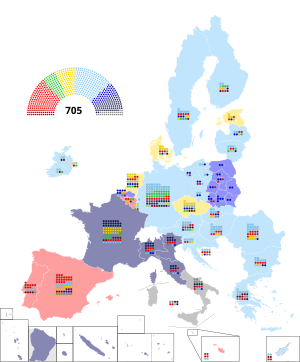
Map[edit]
@Mathew McMullin@Number 57. Ok, I believe we should sort this out first this time.
1. Filling in circles to depict seats again fails to effectively convey the outcome of European elections, given the significant seat magnitudes. It can be misleading too. Imagine a scenario where say a left wing EP party is the plurality “winner” in a given country despite a combined right wing majority. Filling in dots fails to convey that nuance. Ideally, the map should provide readers with an instant understanding of a country's delegation makeup.
2. Indicating plurality EP party vote share may not be as helpful and could too potentially mislead readers. One major concern is overlooking the fact that certain parties from different EP groupings may run under the same alliances, such as GL-PvdA in the Netherlands. 沁水湾 (talk) 20:55, 12 May 2024 (UTC)
- 1. under your own definition there is no way to "effectively convey the outcome of European elections" because in your hypothetical dots, a pie chart or a bar chart will not give an accurate visualization of a combined "left vs right" seat split, on top of this there is Wikipedia pages for every single EU nation which get detailed & mapped out to a much higher local detail than a continental map will (a good example is the 2019 European Parliament election in Italy, the main map is not meant to a "be-all and end-all" visualization of the results and such.
- 2. groups with alliances of parties is easily fixed by using line-coloured fill-ins like the 2019 map does Matthew McMullin (talk) 21:03, 12 May 2024 (UTC)
- I should also point out that if our goal is to visualize the data, using bar charts will not be user-friendly when it comes to visualizing this, the small numbers below indicating seats can only be seen if the map itself is zoomed in closely & cannot be properly assessed from just a glance.
- Using dots in uniform rows lets people get a quicker representation of the results in their heads as human beings are naturally tuned to count objects (this case being dots) and with the rows being uniform rows as I have people can quickly work the quick math in their heads. Matthew McMullin (talk) 21:07, 12 May 2024 (UTC)
- It is very clear how a set of bar charts gives you better insight into the EP grouping making of a country’s delegation: in a horizontally aligned set of barsEPP is always to the left of ECR, and always to the right of RE, and so on. This is not the case with circle filling, where the positions of parties changes in every country depending on their seats/votes.
- These maps are always meant to give you a rough understanding of the situation, which you can get from the relative heights of the bars at a glance. As for the specific seat numbers (which should be a secondary consideration here), zooming in to read it is always faster than forcing readers to zoom in, count tiny circles, and do mental maths. 沁水湾 (talk) 21:28, 12 May 2024 (UTC)
- A bar chart is absolutely not a better insight into the groupings and labelling out their results in each country, I suggest you read up on a few papers such as this one right here on the topic.
- on another thing, calling the circles tiny when they are far larger than the numbers in the previous graphs is not a fair statement at all, the mental math necessary to count en-bloc rows of dots is much less than it is to physically click on the map, zoom it in, read each number individually and them swipe over to another country. numbers are left for the charts in the "results" section of each election. reasons like this is why there's a near-unanimous agreement on Wikipedia between multiple elections spanning continents & language barriers that visual representations such as dots are used. Matthew McMullin (talk) 21:37, 12 May 2024 (UTC)
- The paper you send me talks about using histogram. Histograms are very similar to bar charts, but depicts distribution intensity rather than categories. This is not relevant to the convention here.
- As for the time inefficiency on counting dots, I’m not sure how I can convince you otherwise than for you to try it yourself. Here’s a map of the post-Brexit composition of EP using dots. Juxtapose it with the bar chart, tell me which one is easier to understand?
Circle-filling 
Horizontal bars - Circle filling is perfectly serviceable when the seat magnitude is small (like in Northern Ireland). But (again) it’s less useful elections when there are like 30 seats in a district. The proliferation of these circles along with the overuse of pie charts on election map wiki (which I admittedly am guilty of both in the past) is a problem, not a reason for celebration 沁水湾 (talk) 22:13, 12 May 2024 (UTC)
- I think the example above you've shown is a little disingenuous as the dot map uses sub-national districts for countries such as Ireland, Poland, Italy & Belgium which creates clutter that neither a dot chart or a bar chart could fix. Matthew McMullin (talk) 22:17, 12 May 2024 (UTC)
- That’s again not relevant to the conversation here as it’s comparing apples to oranges. (As I said those circles are perfectly serviceable when the seat magnitude is small). Look at Germany, France, Spain. Which is easier to understand 沁水湾 (talk) 22:22, 12 May 2024 (UTC)
- again, I have to say it's very relevant and it's not "apples to oranges", the example you've used is not a good way to display dot charts, the use of white borders on them for one makes them much less readable than my version, and the use of a light shaded dot on a light shaded background makes it even harder (again, something I did the opposite of on my map).
- it would be like if I used an objectively bad bar chart map to declare that yours was a completely bad example. Matthew McMullin (talk) 22:33, 12 May 2024 (UTC)
- “White borders” and “light backgrounds” are very trivial in the face of dots vs bars. The French shade in the first map is dark enough, I think the answer is obvious.
- if not obvious enough you can take a look at my South Africa maps, which I just updated the provincial lists portion from circle/filling to bars. Look at my first upload (circles) versus my later uploads (bars). Even if you dislike my map making style and skill it should at least give you a somewhat consistent level of badness
- File:2019 South African general election.svg
- which is easier to understand? 沁水湾 (talk) 22:52, 12 May 2024 (UTC)
- being honest, on the level of South Africa I cannot see any real difference in "easiness to understand", given that it's much more compact than a map of Europe would be (though I will point out that I am on PC, so the bar chart numbers on South Africa could be hard for mobile users to view).
- for Europe as a whole though even on a computer screen I can discernibly say the circles are much easier to interpret & work out the strength of each party specifically. Matthew McMullin (talk) 23:03, 12 May 2024 (UTC)
- That’s again not relevant to the conversation here as it’s comparing apples to oranges. (As I said those circles are perfectly serviceable when the seat magnitude is small). Look at Germany, France, Spain. Which is easier to understand 沁水湾 (talk) 22:22, 12 May 2024 (UTC)
- I think the example above you've shown is a little disingenuous as the dot map uses sub-national districts for countries such as Ireland, Poland, Italy & Belgium which creates clutter that neither a dot chart or a bar chart could fix. Matthew McMullin (talk) 22:17, 12 May 2024 (UTC)
- I guess I will try to weight in here.
- Agree in the sense that seat circles really meet their limitations once some constituencies have 50+ seats (and 96 in the case of Germany). Circles aren't completely unusable, but it's obvious that it's not as good at visualising the result compared to if the seat size was lower. I think if circles are to be used, then ideally you would need to be creative with how they were formatted. I wouldn't say a bar format is neccesarily perfect, but I think it does work a bit better at EP elections.
- Yeah this is a big issue in general for how to depict EP results across countries. For some countries (e.g. Austria or France) it may be relatively easy, but for others (e.g. Spain or Poland) it may be downright impossible to definitely say what percentage of the vote a given EP party group got in that country. I do think there is a place for depicting this number, but it is really, really tricky to get right and may be borderline OR, which risks making it less suitable for Wikipedia.
- I think ideally, the map used for the European Parliament election articles should be the same format across all years. So if we were to use @Matthew McMullin's format, it should also have versions from 1979 to 2019.
- As for the maps themselves, while I don't want to conclude which is better, I have some comments:
- For 2024 European Parliament election.svg, there are several issues that I think have to be corrected: The inset for Benelux seems to be bugged, and the color choices for the party groups are in my view questionable, the abbreviation for The Left in the European Parliament is no longer GUE/NGL, and the abbreviation for the European People's Party should be used. Personally I am not a fan of this particular style of key, but that ultimately comes down to personal preference, and I feel it would be wrong to dictate exactly how election maps should be designed on this regard.
- For 2019 European Parliament election, political grouping breakdown by countries.svg there are several inaccuracies (e.g. Denmark having EPP color, Austrian result being wrong, Estonian result being wrong). There may be more as I haven't tried to extensively look for inaccuracies. I think those should in any case be fixed.
- Gust Justice (talk) 21:43, 12 May 2024 (UTC)
- Thanks for your input, I think I've fixed the benelux insert now (no idea how it was broken before) & I've updated "THE LEFT"'s name + the EPP name which was a mistake on my end for not changing it. I'd love to hear some feedback you have about colour suggestions if you wish Matthew McMullin (talk) 22:11, 12 May 2024 (UTC)
- For The Left I think the color should not be orange. While orange does work in the sense that no other group uses that color, most sources and Wikipedia uses a dark red color (like #F0001C). In general I think orange just looks strange. For Greens/EFA I would make the text white like the parties other than Renew Europe (I realise this is a minor thing). For renew Europe I would make the color lighter (like #FFD500). For EPP, ECR, and ID I think the colors are too similar. This is even more so a risk when it is likely each of those groups will receive a plurality of votes in at least one country. The easiest solution to that is by using purple and/or marking one of the groups more clearly dark blue compared to the others.
- Regarding the circles themselves, I think the stroke width of the border is too high. Normally it is around 10% of the radius of the circle - here it is closer to 20%. In addition, normally the gap between circles is around 10% of the circle width - here it is similarly closer to 20%. These two things at makes the circle layout look worse and different than similar maps with circles. Gust Justice (talk) 23:26, 12 May 2024 (UTC)
- alright did a bit of work on this so here's a few things, for the left colour I tried your suggestion of a darker red but I found it ended up looking too much like S&D (which I already had made more pinky-red to begin with), as for if EPP, ID & ERC would get confused I don't think they would, I've submitted an example here to show how it would look and I don't think they look similar enough to be mistaken. Matthew McMullin (talk) 23:39, 12 May 2024 (UTC)
- The issue is that you can't tell the ECR and ID colors apart without looking at and remembering the key. It is not at all intuitively clear that ECR uses that slightly darker blue. Also the example you have isn't for a country where both ECR and ID win seats. In Belgium, Czechia, Denmark, France, Italy, and Slovakia, EPP, ECR, and ID are all likely to win seats. Having colors so similar will make it more confusing for people to read. For S&D and The Left, you could try colors like #ED1B34 and #B00000 for the two groups respectively. Those colors would clearly be distinguishable from each other and would be more in line with the colors most sources use. Also the abbreviation is "The Left" without full capitalisation. Gust Justice (talk) 23:58, 12 May 2024 (UTC)
- the colours you've given as examples for S&D and The Left are only 7 hue points apart from each other, the colours I used for EPP, ECR & ID are all 20 hue points apart from each other. I don't see how you can say the EPP/ECR/ID colours are too similar at 20 hue points and then propose a gap for S&D/TL of only 7? Matthew McMullin (talk) 00:02, 13 May 2024 (UTC)
- The issue is that you can't tell the ECR and ID colors apart without looking at and remembering the key. It is not at all intuitively clear that ECR uses that slightly darker blue. Also the example you have isn't for a country where both ECR and ID win seats. In Belgium, Czechia, Denmark, France, Italy, and Slovakia, EPP, ECR, and ID are all likely to win seats. Having colors so similar will make it more confusing for people to read. For S&D and The Left, you could try colors like #ED1B34 and #B00000 for the two groups respectively. Those colors would clearly be distinguishable from each other and would be more in line with the colors most sources use. Also the abbreviation is "The Left" without full capitalisation. Gust Justice (talk) 23:58, 12 May 2024 (UTC)
- alright did a bit of work on this so here's a few things, for the left colour I tried your suggestion of a darker red but I found it ended up looking too much like S&D (which I already had made more pinky-red to begin with), as for if EPP, ID & ERC would get confused I don't think they would, I've submitted an example here to show how it would look and I don't think they look similar enough to be mistaken. Matthew McMullin (talk) 23:39, 12 May 2024 (UTC)
- Thanks for your input, I think I've fixed the benelux insert now (no idea how it was broken before) & I've updated "THE LEFT"'s name + the EPP name which was a mistake on my end for not changing it. I'd love to hear some feedback you have about colour suggestions if you wish Matthew McMullin (talk) 22:11, 12 May 2024 (UTC)
- Some thoughts from me (as I was pinged): I think this map is better than the two shown to the right, as it gives the clearest indication of how many seats each country has. I would change a few things though – I would get rid of the insets if possible (so the main map can be full width). I certainly don't think insets are required for Malta or Cyprus – the dots can be shown next to or over the islands. I'm also not sure Slovenia really needs one, and perhaps there is a way of fitting the Benelux ones over the respective countries? I would also get rid of the pie chart. Separately, Matthew, I wondered if my screenshot had helped clarify what my point was on the South African map re the width? Cheers, Number 57 23:11, 12 May 2024 (UTC)
- I can see your thinking on Cyprus, for Malta I did it for the reason that the country itself is so small, seeing the colour of it shaded on the map would be difficult. for Benelux/Slovenia I did what the 2019 map did after I also found that trying to cram 3 charts in there (or on slovenia) made it just too cramped to look at. Matthew McMullin (talk) 23:41, 12 May 2024 (UTC)
- Thoughts on my point in filling circles being unhelpful in conveying information? 沁水湾 (talk) 23:44, 12 May 2024 (UTC)
- Dots map convey the idea of how many seats each country has via perception of area, which a set of closely aligned bars also conveys. It's also not as pertinent to emphasize in a map about election results (as oppose to apportionment).
- When it comes to communicating the election outcome itself, our perception tends to grasp one-dimensional representations, such as bars, more accurately than two-dimensional areas. This concept parallels how a fixed volume of liquid appears larger in a taller, narrower container compared to a wider, shallower one.
- In dot-filling election maps, the placement of parties typically reflects their performance in the election, with parties securing more seats or votes being filled in first. This again prompts a consideration of emphasis: the distinction between first and third place may be negligible. For example, in a scenario where all three parties securing 14 seats, with a 2% gap between first and third place, the marginal difference between parties translates to a drastically different placement on the plot of dots. This can convey a misleading picture to readers, since more ideologically similar parties are broken up and more different parties are packed together. And it is for that reason why a set of bars is also useful in comparing results between different years. 沁水湾 (talk) 17:38, 14 May 2024 (UTC)
.svg)

- Bar charts are fundamentally different from pie charts, which represent the absolute values across the board.
- You have to forgive me for being a bit frustrated. I wrote ad nauseam about why things like dots and pie charts can be ineffective on election maps, so much so as maybe I need to compile them into a short article in my sandbox. Yet people keep ignoring my arguments, or responding to them with nonarguments (such as the authors of this map that linked me to a paper about histograms being superior to bar charts in visualizing quantity distribution as proof that dots are superior to bar charts).
沁水湾 (talk) 02:31, 15 May 2024 (UTC)
- Other people having a differing opinion than you on whether dots or bar charts is better isn't other people "ignoring" anything. thinking those with opinions different than your own are somehow ignorant or lesser than is a very immature way of thinking. Matthew McMullin (talk) 03:37, 15 May 2024 (UTC)
- What are your rebuttals to the reasons listed above 沁水湾 (talk) 04:43, 15 May 2024 (UTC)
- the rebuttal is that of those here more agree with dots than bars, trying to say that bars somehow better represent party strength than dots isn't true. the example you've given is not one that exists on wikipedia.
- for all regional breakdowns of dot maps they are all treated differently instead of following the national outcome, if party A got more votes than party B nationwide, but party B got more votes in a specific country/province, party B would then go first in the dot map for that specific country, making your argument on dots being misleading irrelevant. Matthew McMullin (talk) 05:18, 15 May 2024 (UTC)
- Just because something is popular doesn't make it true. As I've stated the overuse of dot maps on this site is a problem. If you think the scenario I stated above isn't happening, you are not paying enough attention. No offence to the creators of these maps, as I was too guilty of these problems
- Here are just a few:
- What are your rebuttals to the reasons listed above 沁水湾 (talk) 04:43, 15 May 2024 (UTC)


- There is very much a norm of using bar charts to represent election result summary in each top-level division (which in the EU would be its member states). With bar charts, you trade the ability to display very minimal gaps between parties (which as the above maps show dot maps can fail at) for the ability for readers to better identify which party is which and more meaningful difference in seat numbers across the board.


沁水湾 (talk) 06:15, 15 May 2024 (UTC)
- I see no problems with the maps of Catalonia, Belgium or Czechia that you've given, they seem perfectly fine. the examples you've given for Canada, Australia & South Africa are all FPTP elections so therefore bars are used to visualize FPTP seats won, not the actual Multi-Member districts like other maps.
- also the USA map is your own, so that's a conflict of interest. Matthew McMullin (talk) 16:34, 15 May 2024 (UTC)
- You see no problem after I quit explicitly pointed them out in the captions? Then tell me from a glance what’s the gap between ANO & SPOLU in the Central Bohemian Region? Is it greater or smaller than its gap with Pirates & Mayors? Ditto with ERC’s seat difference with Junts & PSC in Barcelona. 沁水湾 (talk) 17:24, 15 May 2024 (UTC)
- gap between ANO and SPOLU is about 2 seats, about the same as the gap between it and Pirates, for Catalonia it's easy. the rows are divided into 10 so you go by masses of 10 which gives you the seat gap between PSC & ECR of 4. Matthew McMullin (talk) 17:33, 15 May 2024 (UTC)
- Looks like you have to spend some seconds counting, not the most intuitive job (especially for Czechia which have almost identical colors), right?
- Three bars stands together, you instantly know who’s taller and by how much comparatively, even if they are the same colors. Investing time counting out the precise number is not necessary, at all 沁水湾 (talk) 17:37, 15 May 2024 (UTC)
- sure I have to count the dots, but I'd also have to count bars (and on top of that zoom in, I could easily count the dots without zooming in). Matthew McMullin (talk) 17:40, 15 May 2024 (UTC)
- Really? The dots are tiny in comparison to a set of bars, especially so in infoboxes. We don’t want to force readers to count dots in every country, get the precise numbers, and mentally visualize the political landscape (because you can't always tell the ideology alignment of a party from which place it finished in the popular vote). We can just show them. them to I’ve made a Catalonia map for that exact election. Put side by side that with the dot map from above, see which is more straightforward to understand.

And before you say the texts on top of bar charts in each province is small, 1. It’s still faster to read than counting all the dots from 1 to 23, 2. It’s merely optional, there for the fewer readers those who want to know the precise numbers - If I sound accusatory to you, that’s not my intent. Many of the problems I am guilty of in the past or even helped to popularize. People invest time and energy into this visualization. I don’t want people’s efforts wasted on aesthetically appealing yet not that informative pieces of visualization. 沁水湾 (talk) 17:54, 15 May 2024 (UTC)
- sure I have to count the dots, but I'd also have to count bars (and on top of that zoom in, I could easily count the dots without zooming in). Matthew McMullin (talk) 17:40, 15 May 2024 (UTC)
- gap between ANO and SPOLU is about 2 seats, about the same as the gap between it and Pirates, for Catalonia it's easy. the rows are divided into 10 so you go by masses of 10 which gives you the seat gap between PSC & ECR of 4. Matthew McMullin (talk) 17:33, 15 May 2024 (UTC)
- You see no problem after I quit explicitly pointed them out in the captions? Then tell me from a glance what’s the gap between ANO & SPOLU in the Central Bohemian Region? Is it greater or smaller than its gap with Pirates & Mayors? Ditto with ERC’s seat difference with Junts & PSC in Barcelona. 沁水湾 (talk) 17:24, 15 May 2024 (UTC)
