
Wikipedia:Graphics Lab/Images to improve/Archive/Mar 2008
 | This page, part of the Graphics Lab Wikiproject, is an archive of requests for March 2008. Please do not edit the contents of this page. You can submit new requests here. |
Stale
Coats of Arms of Algeria
.svg)
Article(s):Emblem of Algeria
Request: I created the second image and I'm not very satisfied with the result... Could someone please make it look more like the first image? And now something quite more difficult: Can some vectorize the images 3, 4, and 5? (image no. 4 is the same as no. 3, except that the background is white) Thanks a lot! -- escondites 11:44, 17 January 2008 (UTC)
Graphist opinion: But on Image:Algeria emb (1976).gif the license specifically says: vector versions are not permitted, and you are asking it be converted to scalable vector graphic ? This is just not logical. Jackaranga (talk) 15:31, 17 January 2008 (UTC)
- To speak to the tag-it means that the image specifically from that website may not be used in vector form, as they sell those, so you can't get them free here. However it does not say we cannot redraw it from the base up as a usable wikifriendly version. The images website does not hold the copyrights for the design itself, the Algerian government does. Chris (???) (talk) 20:09, 17 January 2008 (UTC)
Thanks for bringing the images in, Escondites, Redrawing the images in vector for would be allowed. [2] Sagredo⊙☿♀♁♂♃♄ 20:07, 17 January 2008 (UTC)
- Ok, I'll have a go at them. Jackaranga (talk) 20:39, 17 January 2008 (UTC)
- I hope you're right about them being free, and not copyright restricted by the Algerian government though, it seems the source may have in fact copied the images from the internet without much thought of copyright. Also see http://www.fotw.us/flags/dz).html some appear slightly different on that page. Jackaranga (talk) 20:46, 17 January 2008 (UTC)
- Yes, the FOTW website here shows a version with blue background, but also states that the website of the Algerian embassy to the UN shows again the white one, so it is the right one (and as an Algerian, I have to say that I've never seen a blue version of our emblem). However, I'm sure it is useful to the Wikigraphist to take a look at it as it is larger as the one here. BTW: The text on emblem no. 3 and 4 is Arabic and is:
and the one on the first emblem is????????? ????????? ??????????? ???????
. —Preceding unsigned comment added by Escondites (talk • contribs) 09:57, 18 January 2008 (UTC)?
- Yes, the FOTW website here shows a version with blue background, but also states that the website of the Algerian embassy to the UN shows again the white one, so it is the right one (and as an Algerian, I have to say that I've never seen a blue version of our emblem). However, I'm sure it is useful to the Wikigraphist to take a look at it as it is larger as the one here. BTW: The text on emblem no. 3 and 4 is Arabic and is:
- I'm working on the one with the blue background, it's coming, don't worry it's just tedious drawing all the grains and leaves. Here is this one for the now. Jackaranga (talk) 18:24, 20 January 2008 (UTC)
-
 svg
svg -
 svg
svg -
 svg
svg
.svg)

.svg)
- Looks nice till now, , you did an awesome job on vectorizing these tiny bitmaps! (I did some minor changes to these images, I know it must have been a tough job for you to "draw" Arabic) And can please you make the brown hand of Fatima having more symetrical fingers? BTW: During the alterations I did, the star and crescrent got in the BG, can you fix it? TIA. --escondites 17:33, 24 January 2008 (UTC)
- Hi, I've been pretty busy at work lately, I will put the elements back in the right order, but I was wondering why you changed the sun, it doesn't look much like the one in the png image now. Also I think it's deliberate the hand is not symmetrical, but I will try copying the one from the 1971 insignia across and see how it looks. Jackaranga (talk) 23:28, 28 January 2008 (UTC)
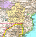
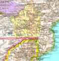
Map of the Battle of Kostiuchnówka
Article(s): Battle of Kostiuchnówka
Request: I have translated a Polish map but it was deleted due to being a replaceable fair use. Leaving aside the fact that the original I scanned was published in a rare newspaper and there are no other maps of the battle I am aware, nor mentions of it (so an individual who would want to make a map would have to start from scratch, most likely), I have reuploaded it off-site here. I hope that somebody can use it to create a free variant. PS. Translation of few items I was unable to do on the old map: 'Polski Lasek' - Polish Forest, 'Polska Góra' - Polish Hill, 'Brygada' - Brigade. -- Piotr Konieczny aka Prokonsul Piotrus| talk 00:16, 30 January 2008 (UTC)
Graphist opinion: Piotr, would you object if the map view was from above rather than the side as it is now? Even rotating the image that way would make it our own, and closer to not having to worry about copyright. Let me know what you think. Krzyzszek Chris (??? • ????) (talk) 04:18, 30 January 2008 (UTC)
- Of course I would not object. It sounds like a good plan, but wouldn't just rotating be a derivative work/modification? Piotr Konieczny aka Prokonsul Piotrus| talk 17:26, 7 February 2008 (UTC)
I don't think so, let me ask Sagredo. Chris (??? • ????) (talk) 02:14, 9 February 2008 (UTC)
PFLP flag
Article(s): PFLP
Request: This was, possibly, made into an SVG from this image which has a slightly messed up circle because of low resolution. I'd like anyone fluent in SVG editing to make a smooth circle of the same width so that it won't look so odd when scaled. Should be relatively easy. Thanks -- gren ??? 06:39, 30 January 2008 (UTC)
Graphist opinion: I'm gonna try now. ----Seans Potato Business 11:14, 30 January 2008 (UTC)
- Operation halted: Is this an official version? The flag already detracts in a few ways from this. Would it be better to start over? ----Seans Potato Business 11:27, 30 January 2008 (UTC)
- Hmm, I think the answer is neither... or both... or all. http://www.pflp.ps/english/ I would imagine the flag in the banner is close to official but if you look at http://www.pflp.ps/img/martyrs/martyrs.jpg you see a version without the notch on the upper left. My guess would be that there is an acceptable amount of variation but I think the one in the banner on the website might be ideal.
- this might be more accurate and I think this one might be reliable because it's actually a printed flag... but I'm not sure if that is an official event and I had seen a different flag which actually included Arabic text. gren ??? 12:09, 31 January 2008 (UTC)
- Maybe you can contact the organisation and ask them for an official SVG? Until then, I've simplified it (the simplify function removes nodes - you can read about it in the Inkscape 'advanced' tutorial; press Shift + S to try it out). It meant moving the arrow in place manually, so you might want to inspect it yourself. The circle still isn't perfect, but it's hopefully a bit better. Maybe a better tactic would be to re-create the whole circle but that doesn't help much with the semi-circle inside. --Seans Potato Business 12:51, 31 January 2008 (UTC)
Another world population chart
-
original version
-
 svg version, currently used
 -
 is something brighter like this what you have in mind?


Article(s): World population
Request: Any way to visually improve this chart would be appreciated. -- Rmhermen (talk) 01:24, 4 February 2008 (UTC)
Graphist opinion:
- For instance? Color? Date milestones? What have you in mind? Chris (??? • ????) (talk) 02:06, 4 February 2008 (UTC)
- We could also zoom it in to make information appear better. Currently you can just see some "noise" in the right-bottom corner. Of course this would lead to some missing years, but there didn't really happen anything before year 2000 BC. --Henrikb4 (talk) 13:28, 15 February 2008 (UTC)
Royal coat of arms of Morocco
Article(s):Many, see image description page.
Request:Can this be vectorized, please? TIA. -- escondites 18:26, 7 February 2008 (UTC)
Graphist opinion: It would be a good idea to find a version of the coat from the Moroccan government, as the image from Vector Images could vary from the correct version. As happened in the Indonesian COA above. 168.103.39.226 (talk) 00:41, 8 February 2008 (UTC)
Cliffwood Beach, New Jersey
-
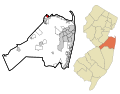 Monmouth County New Jersey Incorporated and Unincorporated areas Cliffwood Beach Highlighted

Article: Cliffwood Beach, New Jersey
Request: Please create a map that portrays both the Aberdeen Township, Monmouth County and Old Bridge, Middlesex County portions of Cliffwood Beach, New Jersey. The current map only shows the Monmouth County portion. The area west of Whale Creek and east of Laurence Harbor, between Route 35 and the Raritan Bay, and bisected by Ocean Blvd, is Cliffwood Beach in Middlesex County. Even the small area south of Route 35 may be CB. -- Pat (talk) 07:21, 9 February 2008 (UTC)
Graphist opinion:
Zimbabwe COA
Article(s):Zimbabwe and others...
Request: Could the images be SVGd and the Zimbabwe COA enlarged. Thanks Mangwanani (talk) 20:12, 19 February 2008 (UTC)
- Note to whoever takes this: The bird is already SVGified on the flag of state. 68.39.174.238 (talk) 03:56, 20 February 2008 (UTC)
- It is however a different bird. The more upright bird has different uses to the, for want of the word, "squashed" version in the flag... Mangwanani (talk) 16:15, 20 February 2008 (UTC)
- How many different of these birds are there? 68.39.174.238 (talk) 19:40, 28 February 2008 (UTC)
- Well, two really. The "squashed" version and the "upright" version. The actual carvings of the birds at Great Zimbabwe are upright and hence the image above is to reflect this. Mangwanani (talk) 19:49, 28 February 2008 (UTC)
- How many different of these birds are there? 68.39.174.238 (talk) 19:40, 28 February 2008 (UTC)
- It is however a different bird. The more upright bird has different uses to the, for want of the word, "squashed" version in the flag... Mangwanani (talk) 16:15, 20 February 2008 (UTC)
Graphist opinion:
Capital punishment request
-
 New base image
 -
 To be updated or replaced?
 -
 how about four nice neutral colors?
 -
 svg
svg -
 includes Puerto Rico as though it were a state, but not DC (Also erroneously out of date)
.svg)


Articels: Capital punishment and other related pages
Request: The current SVG is unfortunately very garish looking (IMAO) in colors and state labels. Could a new map be created, possibly showing the method(s)? Currently, I'm thinking of the following designations:
- No provision for executions in state law
- Declared unconstitutional (Functionally, no provision for executions)
- Has not been used since Gregg
- Actively used (Since Gregg) and the primary method
I know its probably a real tall order to integrate all of the methods into a colored map; so I'm thinking it may be better and easier to have a map of the 1st 5, and then a map of the method(s) of those states that have legal provisions on the books for it. Thanx, 68.39.174.238 (talk) 19:57, 9 February 2008 (UTC)
- Follow up: I should've done more research, see Image:Death penalty statutes in the United States.svg. Would removing the state text labels be better, for internationalization? 68.39.174.238 (talk) 20:04, 9 February 2008 (UTC)
- Also, per Image:Death penalty statutes in the united states.png, PR should be included as having none, or should we limit this to states only? 68.39.174.238 (talk) 20:08, 9 February 2008 (UTC)
The colors are quite POV. I don't think I've ever seen black used on a map. -- I. Pankonin (t·c) 23:52, 9 February 2008 (UTC)
- That's been brought up before (They also make it near impossible to see the state lines). I prefer the colors in Image:Death penalty statutes in the United States.svg: Much less garish, and also used on many other types of maps (Image:Unibicameral Map.png, for instance). 68.39.174.238 (talk) 02:02, 10 February 2008 (UTC)
- Also note (Sorry for all of this), the title of the 3rd image is erroneous: It purports to show the methods of the states, but in reality only mentions lethal injection. 68.39.174.238 (talk) 02:28, 10 February 2008 (UTC)
Whoever added the image with the "neutral colors": I have no attachment to any of these color sets (Although I heartily dislike the pitch black v. bright green one), so you can pick more appropriate ones if you wish. 68.39.174.238 (talk) 18:03, 10 February 2008 (UTC)
- Shortened list so it's not so hard (Only 4 things now), so as to encourage help? 68.39.174.238 (talk) 02:07, 18 February 2008 (UTC)
Logo of the ministry of Agriculture and Forestry of Laos
-
 SVG attempt
 -
 Laos COA, from a while back


Article(s): Ministry of Agriculture and Forestry of Laos
Request: I'd appreciate if someone could clean up that logo and then convert it to SVG format. A big part of the logo is the same as on the Coat of arms of Laos. That's a good start! Thanks a lot! Emilaca (talk) 06:49, 10 February 2008 (UTC)
Graphist opinion:
- User:DTR did a great job on the Coat of arms of Laos, perhaps he could be persuaded to work his magic here again! Chris (??? • ????) (talk) 10:14, 10 February 2008 (UTC)
- I had a small ounce of time to spare, so I made a rough start on the pic, but I'd prefer it if someone else could make the finishing touches. I took the Laos Coat of Arms and salvaged as much as I could, then added the new stuff. I had trouble with the people and animal (bull?) in the foreground, and with guessing which characters to use for the text (I left in the text from the COA for a guideline). See here for a scaled-up version and a link to the font used.
- I also embedded the guide image, so that if anyone else would like to tidy up and refine then they have the original raster stretched to the same size and same ratio as I did. --Dave the Rave (DTR)talk 13:40, 10 February 2008 (UTC)
- I'll finish it if somebody could give me the text so I don't have to trace it. DTR gave us the font, but my keyboard doesn't do that language, and I wouldn't know what keys to press if it did. -- I. Pankonin (t·c) 02:29, 16 February 2008 (UTC)
- Here is the text: ?????? ??? ??????. You can copy it and then paste it in your document. Then you have to put the text in an Unicode font (Saysettha Unicode, for example). If you have more questions or if you have another font like Saysettha 95 or Saysettha 2000, I can tell you which keys to press. Emilaca (talk) 11:12, 16 February 2008 (UTC)
- Still working out some kinks. -- I. Pankonin (t·c) 06:54, 22 February 2008 (UTC)
- Hopefully it's good now. -- I. Pankonin (t·c) 03:04, 23 February 2008 (UTC)
- Still working out some kinks. -- I. Pankonin (t·c) 06:54, 22 February 2008 (UTC)
- Bon travail! You did a great job on the small details. There are two things that "could" be improved: first, the kind of wheel (colour and size). The second thing, that I'm taking in charge, is the font. I have a lot here and I'll see if I can find a more suitable font that looks more like the original. Thanks again, User:Ipankonin! Emilaca (talk) 10:44, 23 February 2008 (UTC)
Cuban flag
-
 Raster
 -
 SVG of coat
 -
 my humble attempt


Articels: President of Cuba
Request: SVGify the flag. The coat on it is already SVG, so it can be dropped into a square w/ the stars and color. 68.39.174.238 (talk) 01:44, 20 February 2008 (UTC)
Oppinion:Here's my attempt. --escondites 10:44, 20 February 2008 (UTC)
- The proportion of the stars WRT the coat looks a little off. 68.39.174.238 (talk) 12:09, 20 February 2008 (UTC)
- And now? --escondites 17:26, 20 February 2008 (UTC)
- I see the problem: The size ratio is wrong, it should be 1:1 (per the raster), that's why the stars looked squished in. 68.39.174.238 (talk) 19:04, 20 February 2008 (UTC)
Coat of arms of Somalia

Article(s):Somalia, and dozens more.
Request: SVGify please. Thanks in advance.-- escondites 06:27, 20 February 2008 (UTC)
Graphist opinion:
Council Logo of the Christmas Islands


Article(s): Christmas Island, Shire of Christmas Island, Coat of arms of Christmas Island-- escondites 10:26, 20 February 2008 (UTC)
Request: SVGify, please. The map and the bird are already vectorized in the flag. TIA. --escondites 10:26, 20 February 2008 (UTC)
Graphist opinion:
- Can't vectorise copyrighted logos, need to try and find one already in a vector format such as a PDF document. Jackaranga (talk) 16:05, 20 February 2008 (UTC)
- But on WP:Logos they say:
Overly high-resolution versions of copyrighted logos should be avoided, however, as they are less likely to be fair use. For SVG formats, versions of the logo that contain significantly more detail than is necessary to display at the desired (low) resolution should be avoided.
- So vectors are allowed except if they're to detailed AFAIK. PS: How exactly do you extract an image from a PDF? --escondites 16:56, 20 February 2008 (UTC)
- The best way I believe is to open it in Adobe Illustrator, however if you don't own that software (which is very expensive), you can use the development version of Inkscape. Go to http://inkscape.modevia.com/win32/?M=D and choose the one with the newest date from the list at the bottom if you are a windows user. Extract the archive using winrar or 7zip, start Inkscape by launching the Inkscape.exe from the extracted folder.
- Then open the file in the version of Inkscape you just downloaded (make sure you choose the right page number, select embed images, and text as text), select the logo, by drawing a box around it, go to edit> invert selection, press the Del key, and then go to File>Document properties, go to the "page" tab and click Fit page to selection. Jackaranga (talk) 17:36, 20 February 2008 (UTC)
- Click save as, and make sure the extension is SVG not PDF. Jackaranga (talk) 17:37, 20 February 2008 (UTC)
Egypt Flag
-
 Egyptian revolutionary flag
 -
new better uploaded image
.svg)
Article(s): Flag of Egypt and others
Request: SVG flag. Not sure where you can get clearer bird from though... Mangwanani (talk) 19:03, 20 February 2008 (UTC)
Graphist opinion:
PUK logo
-
 Logo of the Patriotic Union of Kurdistan
Article(s): General article about the Patriotic Union of Kurdistan and Iraqi Kurdistan
Request: A simple .SVG will do, you can try puk.org for a better image and updates image -- ~ Zirguezi 21:37, 20 February 2008 (UTC)
Graphist opinion: The second one is a simple SVG that i created my self, but i'm stuck here. Someone please take over Its this one ~ Zirguezi 16:31, 25 February 2008 (UTC)
Zimbabwe Defence force flag
-
 Defence Force of Zimbabwe
 -
 Elements from here


Article(s): Zimbabwe, Military of Zimbabwe
Request: Some more SVGery. Thanks Mangwanani (talk) 18:58, 23 February 2008 (UTC)
Graphist opinion:
Portuguese Forest
I'm sorry, my english is fairly poor, I prefer to write my demand also in French
-
 1
1 -
 2
2


Article(s):
Request: Hello, I would like to know if it were possible to make three charts, one with the rate arborisation by city and other, the various types species (trees) in the areas (in Portugal) and the last with all the zones left in fume.
The charts will be in French, Portuguese and English, thank you, Cancelos (talk) 11:20, 27 February 2008 (UTC)
Bonjour, je voudrais savoir si il était possible de faire trois cartes, une avec le taux d'arborisation par commune et l'autre, les différents types d'espèces (d'arbres) dans les régions (au Portugal) et la dernière avec toutes les zones partit en fumées.
Les cartes seront en français, Portugais et Anglais, merci, Cancelos (talk) 11:20, 27 February 2008 (UTC)
Graphist opinion:
Resolved
Ring circuit
-
 Circuit diagram of a UK-style ring circuit
 -
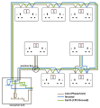 SVG verison


Article(s): Ring circuit
Request: An SVG version would be nice -- Markus Kuhn (talk) 13:27, 9 February 2008 (UTC)
Graphist opinion:
- This shouldn't be that difficult, I'll give it a shot.-Andrew c [talk] 16:00, 12 February 2008 (UTC)
- OK, here is my attempt.-Andrew c [talk] 17:11, 12 February 2008 (UTC)
- Thanks, excellent work. Markus Kuhn (talk) 20:09, 3 March 2008 (UTC)
- OK, here is my attempt.-Andrew c [talk] 17:11, 12 February 2008 (UTC)
Copt cross

Articels: Copt, etc.
Request: SVGify. The text can be taken from the SVGs on Coptic alphabet. The drop shadow is not required and can be removed. 68.39.174.238 (talk) 18:00, 23 February 2008 (UTC)
Oppinion: I'll work on this. Sagredo⊙☿♀♁♂♃♄ 06:47, 29 February 2008 (UTC)
I used this to draw from. Sagredo⊙☿♀♁♂♃♄ 04:20, 3 March 2008 (UTC)
- Nice work Sagredo. May I suggest switching to a different blue, perhaps one that is less garish? Jeff Dahl (Talk • contribs) 05:49, 3 March 2008 (UTC)
- I thought about that too, but then considered the heavy use of lapis lazuli in artwork throughout the region, maybe it's _supposed_ to be that bright ultramarine. Registan Square in Samarkand at noon will give you that same brilliance. Chris (クリス • フィッチ) (talk) 05:59, 3 March 2008 (UTC)
- The colors came (mostly) from this, but if 68 wants the color from the first image, they're easy enough to change. 67.42.172.193 (talk) 22:03, 3 March 2008 (UTC)
- I thought about that too, but then considered the heavy use of lapis lazuli in artwork throughout the region, maybe it's _supposed_ to be that bright ultramarine. Registan Square in Samarkand at noon will give you that same brilliance. Chris (クリス • フィッチ) (talk) 05:59, 3 March 2008 (UTC)
- It looks as though there's no absolute standard for the Copt logo. I would use the original (JPG) colors, just so it doesn't appear to be a massive change. However, if you want to leave it that way for now, it'll be fine. it's definitely better than the JPG we currently have. 68.39.174.238 (talk) 14:48, 4 March 2008 (UTC)
- Here it is. But please note that small images may appear to have consistant colors, often they do not. As above. The jpg image may have black outlines amalgamated into its blues, making the fine lines look darker. The tan has compression artifacts and tends to give random results. If you want more adjustment, I'll try again. Sagredo⊙☿♀♁♂♃♄ 23:02, 4 March 2008 (UTC)
- We really need a real Copt to check this out. Personally it looks OK by me (compared to the previous version). I'm marking the old one VVA. 68.39.174.238 (talk) 01:57, 5 March 2008 (UTC)
- Correction, why is the text in the upper right gray while the other 3 are black? 68.39.174.238 (talk) 01:57, 5 March 2008 (UTC)
- The technical reason is that the opacity of that text was set at less than 100%. This old computer has minimal (mis-matched) RAM, which I suspect is the source of a number of errors.
Either that or an operator headspace error. This should fix it.
- So, you're gonna call the Copts on me, eh? ; ) Not a bad idea, I prefer not to be an unintentional Salman Rushdie. The image I drew from was from a Copt church, but we now have altered the coloring. Sagredo⊙☿♀♁♂♃♄ 20:24, 5 March 2008 (UTC)
- I think it's OK now that the text is corrected. Anyway, if someone objects, I can try and figure out what's "wrong" and bring it back for correction. 68.39.174.238 (talk) 02:06, 7 March 2008 (UTC)
Lunar eclipse
-

-

-
 Solar Eclipse


Articels: Lunar eclipse and todays eclipse.
Request: SVGify and prettyfy (IE. The SVG doesn't have to look exactly like this GIF, IE. It's not a coatofarms ;)). 68.39.174.238 (talk) 00:25, 21 February 2008 (UTC)
Oppinion: Here's a quickie before I go out to watch. Sagredo⊙☿♀♁♂♃♄ 01:21, 21 February 2008 (UTC)
- Does that mean you'll keep working on it after its over, or that it's done? 68.39.174.238 (talk) 05:09, 21 February 2008 (UTC)
Notes: After the earth's shadow tapers to a cone, the area is brighter. A really good diagram would show the earth's atmosphere refracting and dispersing some light into the umbra. Sagredo⊙☿♀♁♂♃♄ 01:21, 21 February 2008 (UTC)
- I'll keep working on it. Also, it has a bug where the sun is Times New Roman in Wiki and Arial in Netscape and Inkscape. Perhaps give the earth a bright side and a dark side. Sagredo⊙☿♀♁♂♃♄ 15:20, 21 February 2008 (UTC)
- That actually looks alot better. If there's nothing else you want to do, I'd say that 3rd one should supersede the other 2 and this be marked done. 68.39.174.238 (talk) 02:40, 29 February 2008 (UTC)
- The 3D is pretty. It would seem most to "beg" for a similar solar eclipse image, with the moon between the earth and sun and the penumbral and umbral shadow projected onto the earth! :) Tom Ruen (talk) 03:45, 29 February 2008 (UTC)
- Like Image:Solar_eclipse.svg already does, but ought to keep the sizes such that the penumbral shadow doesn't cover too much of the earth's surface. WELL, of course then there's showing between total and annular too, unsure if it makes sense to show both, but maybe. Tom Ruen (talk) 03:47, 29 February 2008 (UTC)
- I'll put Image:Solar_eclipse.svg in my queue. The only ways I see to make the penumbra
smaller relative the earth are, making the earth larger than the sun (I think workable), making the drawing MUCH longer, closer to the actual scale (not practical) or bending the lines (undesirable) If I understand correctly, the the penumbra is around 4000 miles at the earth, the and umbra at most 60 to 100 miles, (if it reaches the earth) Sagredo⊙☿♀♁♂♃♄ 02:25, 2 March 2008 (UTC)
Waterboarding
Article(s): Waterboarding
Request: correct for perspective, reduce glass glare, and participate in the discussion about the need for this image at its AfD. -- Chris (??? • ????) (talk) 20:20, 9 February 2008 (UTC)
:For the record, the debate is here: Wikipedia:Images_and_media_for_deletion/2008_February_8#Image:NonFreeImageRemoved.svg and seems to be very one sided right now. 68.39.174.238 (talk) 02:26, 10 February 2008 (UTC)
- Vote has concluded in keep, will someone please do this? Chris (??? • ????) (talk) 06:00, 17 February 2008 (UTC)
Graphist opinion: I've done this one. Hope it looks nice. XcepticZP (talk) 18:47, 19 February 2008 (UTC)
- Sorry, I totally didn't see this. Someone had removed the image from here. Whoever did that, stop.
- XcepticZP, thank you so much for the improvement! Chris (??? • ????) (talk) 20:09, 7 March 2008 (UTC)
Mohammad Reza Pahlavi 1977


Article(s): Mohammad Reza Pahlavi
Request: lighten for detail and crop to encyclopedic -- Chris (??? • ????) (talk) 08:05, 24 February 2008 (UTC)
Graphist opinion: I dicided to crop the image and to remove Mohammad's wife I also took out much of the light glare out of his skin and glasses.Justinpauloberg (talk) 04:17, 25 February 2008 (UTC)
- It almost gives him an unnatural look on that side of his face. Thank you for your efforts! Chris (??? • ????) (talk) 05:58, 25 February 2008 (UTC)
- Thanks for the trim, Sagredo! With this flu, this escaped me. Oops. Chris (??? • ????) (talk) 20:27, 7 March 2008 (UTC)
Perry's flag

Article(s) it would most likely appear in: Battle of Lake Erie, USS Niagara (1813), U.S. Brig Niagara (replica), James Lawrence, Oliver Hazard Perry
Request: I'm surprised there isn't one yet, but would it be possible for someone to draw Oliver Hazard Perry's famous "Don't Give Up The Ship" flag, preferebly vector. -- ????D??tbohrer????talk•contribs 06:14, 27 February 2008 (UTC)
Graphist opinion: Here's a start. It would be good to have a higher resolution image to draw a svg from. Sagredo⊙☿♀♁♂♃♄ 22:51, 28 February 2008 (UTC) Found one. This should be close to the original flag. Sagredo⊙☿♀♁♂♃♄ 04:02, 29 February 2008 (UTC)
- Would it be possible to crop a bit off the bottom or center the text? --????D??tbohrer????talk•contribs 00:53, 2 March 2008 (UTC)
- How's this. Sagredo⊙☿♀♁♂♃♄ 02:34, 2 March 2008 (UTC)
- Thats good. Will the now transparent piece be removed? --????D??tbohrer????talk•contribs 02:48, 2 March 2008 (UTC)
- Shoulda caught that, sorry. Sagredo⊙☿♀♁♂♃♄ 07:26, 3 March 2008 (UTC)
- Looks good. I can't think of anything else that needs to be done. --????D??tbohrer????talk•contribs 21:37, 3 March 2008 (UTC)
- Shoulda caught that, sorry. Sagredo⊙☿♀♁♂♃♄ 07:26, 3 March 2008 (UTC)
- Thats good. Will the now transparent piece be removed? --????D??tbohrer????talk•contribs 02:48, 2 March 2008 (UTC)
- How's this. Sagredo⊙☿♀♁♂♃♄ 02:34, 2 March 2008 (UTC)
Ohio Collage
-
 Similar to this, with flag on one side and quarter on the other
 -
 With Text similar to this
Article(s): Portal:Ohio
Request: I would like a banner for the Ohio portal if possible. Something along the lines of Kentucky's with the State Quater and Flag. But more along the lines of the foreign one, I like the shape and text better. I hope that makes some sense. Some similar banners can be found Here, by different portal links. Thanks! -- Stepshep (talk) 16:53, 27 February 2008 (UTC)
Made one myslef: Doens't look extremely great, but I made one...
- Sorry to bud in on your "resolved", Stepshep. But I'll do this one for them. It doesn't seem like a lot of work. XcepticZP (talk) 07:52, 7 March 2008 (UTC)
Diss Crest. Easy?
-
Diss crest
-
 requested svg

Article(s): Diss
Request: SVG shield on inside of circle, ommitting the two circles and the words Diss Town Council and the fish. Please blank background. Thanks-- Mangwanani (talk) 18:48, 29 February 2008 (UTC)
Graphist opinion: I will do this one. It's already coming along good. XcepticZP (talk) 13:15, 1 March 2008 (UTC)
- Hope that looks fine. If you intend on using it as part of the COA of Diss, you should use a better copyright tag than the one I used. XcepticZP (talk) 13:52, 1 March 2008 (UTC)
- Thanks. Could you remove the circle so its just the shield? Yes, Diss does have a funny COA - goes with the weird name. Thanks Mangwanani (talk) 16:59, 1 March 2008 (UTC)
- Think I've managed to do it myself...Mangwanani (talk) 19:02, 1 March 2008 (UTC)
- Thanks. Could you remove the circle so its just the shield? Yes, Diss does have a funny COA - goes with the weird name. Thanks Mangwanani (talk) 16:59, 1 March 2008 (UTC)
Massachusetts Seal
-
 Flag
Flag -
from Mass state gov
-
 SVG
SVG


Article(s): Hundreds, including Massachusetts
Request: Can the seal (which is requested for deletion BTW) be vectorized, the elements can be found in the flag of the state. Thanks.-- escondites 17:36, 1 March 2008 (UTC)
Graphist opinion: Does anyone know what the three objects at the top are, and what is the inner circle. My guess is a chain. Sagredo⊙☿♀♁♂♃♄ 19:32, 2 March 2008 (UTC)
- I think it is a double headed arrow with a starburst in the middle and two points at each end. I honestly can't tell for sure, but that's what the 1st (PNG) seal looks like. 68.39.174.238 (talk) 20:13, 2 March 2008 (UTC)
- God that's nice work! How do you have the patience? Chris (??? • ????) (talk) 02:00, 3 March 2008 (UTC)
- Very nice! Thank you! --escondites 13:42, 3 March 2008 (UTC)
- Thanks for the kind words. The chain (256 links) was made by making a flat link and one on edge on the left side, and copying the same pair to the right side. They were then all grouped together, duplicated and the duplicate group rotated slightly. Then all eight links were grouped, duplicated and the duplicates rotated twice as much. and so on and so on. It doesn't actually take that long before they're all done. The rope(s) in the Kansas Seal was done basically the same way.Sagredo⊙☿♀♁♂♃♄ 16:58, 3 March 2008 (UTC)
- Very nice! Thank you! --escondites 13:42, 3 March 2008 (UTC)
Some US seals
-
 Gilbert, AZ SVG
 -
 Leavenworth, KS Seal
 -


.JPG)

Article(s): Phoenix, Arizona, Gilbert, Arizona, Leavenworth, Kansas
Request:
- For Phoenix, AZ seal, ectorize please. The bird (the "phoenix") is already vectorized in the flag. The text which encircles the seal reads "PHOENIX, ARIZONA * INCORPORATED FEB 25 1881"
- And for Gilbert seal, vectorize, too.
- For Leavenworth seal, remove the background of the image and the electricity cable in the image and these 4 "things" at the top of the image, if possible. Thanks. --escondites 17:51, 1 March 2008 (UTC)
Graphist opinion: Gilbert done. What's the Phoenix seal supposed to look like—black and white? Any colors? It looks like it was scanned from a notarized document. As for Leavenworth, I will honestly say it's out of my league; perhaps someone with more artistic flair :) Fvasconcellos (t·c) 18:28, 1 March 2008 (UTC)
- Thanks for the Gilbert logo, It's on the page now! For Phoenix's seal, it's golden. (PS Leavenworth's seal doens't have to be a vector.) --escondites 18:42, 1 March 2008 (UTC)
Here's a version of Leavenworth with the wire (and more) removed, and some color adjustment. Sagredo⊙☿♀♁♂♃♄ 03:46, 4 March 2008 (UTC)
- Thanks! And can you do the Phoenix seal please? --41.201.181.44 (talk) 12:24, 4 March 2008 (UTC)
- Of course, sorry! Mind if I lose the embossed look?
- Sagredo—I'm very glad you have raster editing skills :) Thanks for taking the Leavenworth one. Fvasconcellos (t·c) 14:39, 4 March 2008 (UTC)
- OK, how's this? Fvasconcellos (t·c) 21:41, 4 March 2008 (UTC)
- Perfect! Well, almost. Don't you think it should be a darker color? Like the one in the raster? And what about the spikes? --ANONYMOUSPUSSY 06:39, 5 March 2008 (UTC)
- Adding the "starburst" is easy enough, though I'm not sure if it's necessary. As for the color, Escondites said it should be golden; I've been looking for another image to use as the source, but no luck yet—the raster looks like an actual impression of the seal, so I really can't use it as a basis for the colors. Fvasconcellos (t·c) 12:57, 5 March 2008 (UTC)
- I am Escondites BTW. I've changed my username, and the signature is also different from both usernames, that's irritating, I know. --ANONYMOUSPUSSY 09:58, 6 March 2008 (UTC)
- Oh, right! That's quite confusing :) I'll add the starburst; I would really like to get my hands on a more "official" image if the colors are to be changed, though. Fvasconcellos (t·c) 20:41, 6 March 2008 (UTC)
- I am Escondites BTW. I've changed my username, and the signature is also different from both usernames, that's irritating, I know. --ANONYMOUSPUSSY 09:58, 6 March 2008 (UTC)
- Adding the "starburst" is easy enough, though I'm not sure if it's necessary. As for the color, Escondites said it should be golden; I've been looking for another image to use as the source, but no luck yet—the raster looks like an actual impression of the seal, so I really can't use it as a basis for the colors. Fvasconcellos (t·c) 12:57, 5 March 2008 (UTC)
- Confusing? That's downright annoying... O well, each after their own. nice work on Phoenix, however I have to give them (Phoenix) credit for specifying a simple seal. 68.39.174.238 (talk) 01:32, 7 March 2008 (UTC)
- Thanks; it was indeed easy, especially compared to some of the COAs that show up here! I've added the starburst—all 49 corners :)—is that OK? Fvasconcellos (t·c) 14:22, 7 March 2008 (UTC)
- Confusing? That's downright annoying... O well, each after their own. nice work on Phoenix, however I have to give them (Phoenix) credit for specifying a simple seal. 68.39.174.238 (talk) 01:32, 7 March 2008 (UTC)
- Yes! Thanks - I've changed the color to brown, tought. --ANONYMOUSPUSSY 16:59, 7 March 2008 (UTC)
Remove wire from image
-
 Original
 -
 no wire, no glare


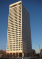
Article(s): 110 West 7th Building, Buildings of Tulsa, Oklahoma
Request: Can anybody remove the wire that runs in the foreground of the image?-- ?NMajdan•talk 15:47, 2 March 2008 (UTC)
Graphist opinion: this might be going a bit far. Sagredo⊙☿♀♁♂♃♄ 08:37, 3 March 2008 (UTC)
- Are you referring to the request or the removal of glare. Either way, the image looks great. Thanks!?NMajdan•talk 13:00, 3 March 2008 (UTC)
Polar ice packs
-

-
 5fps version


Article(s): Polar ice packs
Request: slow this bad boy down, and as an aside, please explain the mechanism by which one speeds up or slows down an animated gif. -- Chris (??? • ????) (talk) 06:36, 3 March 2008 (UTC)
Graphist opinion: One makes an animated gif by putting together a series of frames in an appropriate editor, which allows you to specify the delay time for each frame. A setting of "no delay" or similar will display the frames at maximum speed, which in my experience is something like 12 frames/second. If you had each of the frames available, you could re-make the animation but setting a longer delay time, say 0.5 seconds/frame or so. Jeff Dahl (Talk • contribs) 07:15, 3 March 2008 (UTC)
- Someone already uploaded a slower version on July 1st 2006, let me know if that one is still too fast, and what speed you would like the frames to be at. To do it yourself just open the file in GIMP and change the delay in ms, in the frames attributes box. Jackaranga (talk) 13:21, 3 March 2008 (UTC)
- I couldn't seem to find the version from 2006, so I did one of my own. GIMP didn't seem to be very good at optimising it (it came out at 650KB as opposed to 450KB for the original) so I ended up opening it in a hex editor and editing the times by hand down to 200ms per frame. Let me know if that's still too fast and I'll slow it down a bit more. Time3000 (talk) 17:22, 3 March 2008 (UTC)
- Someone already uploaded a slower version on July 1st 2006, let me know if that one is still too fast, and what speed you would like the frames to be at. To do it yourself just open the file in GIMP and change the delay in ms, in the frames attributes box. Jackaranga (talk) 13:21, 3 March 2008 (UTC)
- That is much better, the first version was making me seasick. All the sloshing and rocking and *gulp* oh god be right back... Chris (??? • ????) (talk) 21:56, 3 March 2008 (UTC)
New Mexico desert
Article(s): New Mexico
Request: -- Remove the date please. --ANONYMOUSPUSSY 06:47, 5 March 2008 (UTC)
Graphist opinion: It's blurry and its low quality. I see no point in putting any effort into it. Sorry. Maybe someone else here will do it. XcepticZP (talk) 12:38, 5 March 2008 (UTC)
- Surely a better starting image for such a beautiful state can be found somewhere. Here's a place to look. [3]. Do check the licensing, some can be used, but not all. Sagredo⊙☿♀♁♂♃♄ 21:25, 5 March 2008 (UTC)
- All these ones should be usable on the project from a license point of view, unless the flickr user lied of course. Jackaranga (talk) 00:49, 6 March 2008 (UTC)
DoD photo cleanup
-
-
 Noise Reduction


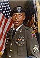
Articles: Louis Jones, Jr.
Request: Removal of strange red dot noises, especially above his head. 68.39.174.238 (talk) 02:47, 11 February 2008 (UTC)
Opinion:
- How does my edit look? I've removed the dots, in addition to a general noise reduction and slight sharpen. The image is rather poor to begin with, and there is a lot of compression artifacts. Hopefully my edit is a slight improvement and to your likings.-Andrew c [talk] 15:19, 12 February 2008 (UTC)
- Excellent work; can you overwrite the current image with the edit? Its definitely superior to the current one. 68.39.174.238 (talk) 22:45, 12 February 2008 (UTC)
- Andrew c, please overwrite this over the original so we can close this, thanks! Chris (??? • ????) (talk) 20:11, 7 March 2008 (UTC)
- Excellent work; can you overwrite the current image with the edit? Its definitely superior to the current one. 68.39.174.238 (talk) 22:45, 12 February 2008 (UTC)
- Marking as done as Andrew c refuses to overwrite original. Chris (??? • ????) (talk) 23:35, 7 March 2008 (UTC)
- I don't overwrite files that are not my own, except in few instances. If you want my edit overwritten over the original, do it yourself (clicking "save" then clicking "upload" probably takes as much time as writing me these messages). If it hasn't been made clear, I'm taking a bit of a wikibreak from graphic work.-Andrew c [talk] 01:58, 8 March 2008 (UTC)
Gram-negative_cellwall-schematic.png
-

-
 Redrawn SVG


Article(s): Gram-negative bacteria, Cell envelope
Request: This is a very good image, but the articles are using a PNG version because the equivalent SVG original Image:Cellwall-GN.svg is too large (6 MB). Can somebody fiddle with the SVG to make it small enough to use? I tried to edit myself, but can't get it to load in inkscape. - Neparis (talk) 21:46, 24 February 2008 (UTC)
Graphist opinion: In addition to the file size, I noticed some rendering problems, so I tried saving the file as a plain svg. This did not fix the rendering problems. I would say that the best solution is to make the drawing simpler, with fewer elements. Having tens of thousands of phospholipid units shown in the membrane is overkill, and somewhat confusing. I would probably try redrawing with larger, simpler, and fewer phospholipid units. I also don't understand the pink half-tint background with rounded corners and some of the other design elements. I'll see if I can redraw it so that it looks nicer and is a reasonable file size. Jeff Dahl (Talk • contribs) 04:30, 28 February 2008 (UTC)
- Here is a redrawn version. Happy to make any modifications. Jeff Dahl (Talk • contribs) 01:08, 2 March 2008 (UTC)
- Thank you. I think you've created a very interesting new version, but the original author (Twooars) is probably the one who should be commenting here (he was notified of the discussion). The new version looks good and it may be a good substitute, though I feel it would probably be better — clearer and more attractive — as a more three-dimensional drawing like the original. Also, while it has several additional labels that the original lacked, it seems to have lost several useful text labels that were in the original. The original had a color key box and an enlargement indication, which were very helpful, the latter showing the relationship between the magnified part of the cell and the whole cell. Could you add a color key box and an outline of the whole cell with enlargement indication? - Neparis (talk) 04:05, 8 March 2008 (UTC)
- New version uploaded that has a whole cell view with a call-out. I've used different colors in the diagram, but I don't think a key for each color is necessary as every element has a direct label. If someone wants to, they could try a 3D view. Jeff Dahl (Talk • contribs) 05:16, 8 March 2008 (UTC)
- hi Neparis. I too liked the 3D view of the cell wall, but Jeff's image has greater detail and is more informative than the previous one, so I think we should use this in articles. Thanks for your efforts to improve the image. - TwoOars 06:10, 8 March 2008 (UTC)
T. Canby Jones
-
Edit
Article(s): T. Canby Jones
Request: When I edit and resave jpgs it puts in artifacts. Please lighten for details and trim out white to right side -- Chris (??? • ????) (talk) 17:26, 1 March 2008 (UTC)
Graphist opinion: How does this look? Mangwanani (talk) 20:30, 7 March 2008 (UTC)
- Much better, thank you! Please overwrite original, thanks! Chris (??? • ????) (talk) 23:44, 7 March 2008 (UTC)
- Overwritten as requested. Mark as done? Mangwanani (talk) 17:34, 8 March 2008 (UTC)
- Done as it Canby! ;) (pardon the stupid pun) Chris (??? • ????) (talk) 19:08, 8 March 2008 (UTC)
Chalco glyph
-
 Glyph for Chalco
 -
 SVG version


Article(s): Chalco and possibly others
Request: A neat SVG version of the Aztec glyph for Chalco. The box around it can be ignored; a simpler version without it is in the bottom right of folio 17v of the Codex Mendoza. Could be used as the equivalent of a flag, in conflict infoboxes (if we ever get some articles on Aztec battles) and the like. -- Ptcamn (talk) 01:14, 27 February 2008 (UTC)
Graphist opinion: I've done this image. Hope it looks good. Wasn't sure about the size of the boxes, so I did 12 in a symmetric pattern. Let me know if this is good. XcepticZP (talk) 14:29, 1 March 2008 (UTC)
- Perfect. Thanks! --Ptcamn (talk) 23:58, 1 March 2008 (UTC)
- Do you want a light brown background, for your flag idea? Chris (??? • ????) (talk) 00:22, 2 March 2008 (UTC)
- XcepticZP, before you archive this, would you please move your snazzy new image to Commons? Thanks! Chris (??? • ????) (talk) 20:36, 7 March 2008 (UTC)
- Do you want a light brown background, for your flag idea? Chris (??? • ????) (talk) 00:22, 2 March 2008 (UTC)
Rhodesia Scouts
-
JPG image 1
-
JPG image 2
-
Redrawn 1
-
Redrawn 2
Article(s): The_Boy_Scouts_Association_of_Zimbabwe Request: -SVGify these plese. :) XcepticZP (talk) 19:40, 6 March 2008 (UTC)
Graphist opinion:Here's the first one, second coming soon. Jeff Dahl (Talk • contribs) 20:15, 6 March 2008 (UTC) Here is the second. I've been uploading only raster images of these non-free logos. I do have the vector versions available, but I'm reluctant to upload over licensing concerns. Jeff Dahl (Talk • contribs) 20:37, 6 March 2008 (UTC)
- Marking as done. Jeff Dahl (Talk • contribs) 18:09, 9 March 2008 (UTC)
- Those are stunning, by the way, it just wasn't my request to mark. Thanks as always! Chris (??? • ????) (talk) 18:24, 9 March 2008 (UTC)
The Scout Association of Papua New Guinea
-
brighter variant but rattier badge
Article(s): The Scout Association of Papua New Guinea
Request: Normally I am careful not to put emblems younger than 25 years up here, but since we're doing the above... SVGify this please. :) -- Chris (??? • ????) (talk) 01:37, 7 March 2008 (UTC)
- In the meantime please at least lighten image. Chris (??? • ????) (talk) 09:37, 7 March 2008 (UTC)
Graphist opinion: I lightened up the original. Details can now clearly be seen. XcepticZP (talk) 19:59, 7 March 2008 (UTC)
- Thank you for the lighten! :) Chris (??? • ????) (talk) 20:02, 7 March 2008 (UTC)
- It looks like the central element is a drum, which is used on the country's seal. I tried to redraw the drum but I can't get it to look convincing. If you could find a larger example I could maybe try again. Jeff Dahl (Talk • contribs) 17:49, 8 March 2008 (UTC)
- I looked up and down the 'net, no dice. All the international publications show the World Crest, which means this badge is fairly rare, but it is used. Failing SVGification, would it be possible to put a solid border on the existing jpg, so it doesn't look so unfinished? One variant has green, the other has brown, whichever you like better. Thanks, Chris (??? • ????) (talk) 06:45, 9 March 2008 (UTC)
- Just got on a better monitor and checked the colors, it's great, thank you!
- I had to go see them fast, both were speedy-tagged by overzealous deletionist User:Bjweeks. Chris (??? • ????) (talk) 23:17, 9 March 2008 (UTC)
Easy Icelandic SVGification
-

-
 done
done -
 try to use this one as a base (already SVG)


.svg)
Articels: Icelandic Commonwealth
Request: SVGification 68.39.174.238 (talk) 22:41, 7 March 2008 (UTC)
Oppinion: I'll take this one. "Easy" is an understatement :D Fvasconcellos (t·c) 22:51, 7 March 2008 (UTC)
- Done. I'd already started when I came back here, so I didn't use the example above :) Fvasconcellos (t·c) 12:27, 8 March 2008 (UTC)
- Thanx. 68.39.174.238 (talk) 18:44, 8 March 2008 (UTC)
Kyrgyzstan Scout
-
 improved by Jeff, please change flag to process yellow FFEF00
 -
svg logo

Article(s): Scouting in Kyrgyzstan
Request: SVGify and brighten blue to the ultramarine Sagredo used on the Coptic cross. This one is kind of a strange situation. I am actually the designer of this emblem, inadvertantly. When I lived there a decade ago, I was showing their Scouts what other countries' emblems looked like, and sketched out some designs they could play with as they came up with their own. Instead of using their own, they took mine down to the Ministry of Justice and registered it that afternoon. So this is a Scout logo, yet I am the creator of it and give permission for it to be SVGified, if that makes any sense. -- Chris (??? • ????) (talk) 00:07, 8 March 2008 (UTC)
- I am adding to this request, as in looking for details on the center device, I found that the flag on Commons is wrong; the rays should be touching, there is a construction sheet at http://www.crwflags.com/fotw/flags/kg.html. Also, it's not that orangey-all of the flags I brought home have a much lighter yellow like the FOTW page. Thanks. Chris (??? • ????) (talk) 08:45, 8 March 2008 (UTC)
Graphist opinion: I redrew the main flag, I can do the scout logo next. Jeff Dahl (Talk • contribs) 18:08, 8 March 2008 (UTC)
- Here is the vector logo, if you have a different yellow color in mind, just post the hex code and I can change the drawing to match. Jeff Dahl (Talk • contribs) 18:43, 8 March 2008 (UTC)
- I pulled out all my Kyrgyz flags and held them up to the color chart. The bulk of them were a primary yellow, the deepest came only to process yellow FFEF00, none at all approached the orange of the current flag image. Please lighten the flag. The red itself will deepen the yellow, optical illusion together. Thanks! Chris (??? • ????) (talk) 20:53, 8 March 2008 (UTC)
- Brilliant, thanks once again! On your first emblem iteration, it viewed larger. How do you set the perameters for viewing the SVG itself? Thanks, Chris (??? • ????) (talk) 23:13, 8 March 2008 (UTC)
- The page size is set on the svg file itself, which can be done in inkscape and probably could be edited manually in the XML file too. I decided 450 px was too big for a fair use image and even though it's your design it is still registered as a Logo. Jeff Dahl (Talk • contribs) 23:18, 8 March 2008 (UTC)
- I agree, just thought it was neat you could do that. The SVGs for Burmese and Laotian Scouting come out minuscule. Chris (??? • ????) (talk) 23:24, 8 March 2008 (UTC)
- It's not possible that a non-free image, has source: self-made, when you contribute to wikipedia the free encyclopedia, you must agree to license your work under a free license. Jackaranga (talk) 23:30, 9 March 2008 (UTC)
- How would you change the licensing? The image is indeed non-free (due to the fact that it is a logo) yet the source is that I drew it. What combination of licensing tags and source:text should I be using? I guess I don't see the problem or a better way to do it. Jeff Dahl (Talk • contribs) 23:40, 9 March 2008 (UTC)
- Simply list the source as "Vector version of Image:--KyrgyzstanScoutChrisFitch.jpg. You can't really release a logo under a free license. Fvasconcellos* (t·c) 00:59, 10 March 2008 (UTC)
- It's not possible that a non-free image, has source: self-made, when you contribute to wikipedia the free encyclopedia, you must agree to license your work under a free license. Jackaranga (talk) 23:30, 9 March 2008 (UTC)
Chuuk islands
.JPG)

Article(s): Chuuk
Request: make islands stand out better if you can. Also, trim out the code at the bottom, thanks. -- Chris (??? • ????) (talk) 00:07, 8 March 2008 (UTC)
Graphist opinion: It was a bit tricky and the adjusted version isn't perfect, but it is an improvement (I think). I selected the ocean and clouds from the hue and saturation channels in the image with a feather select, inverted the selection to get the islands, and reduced the blue channel to make the islands less hazy. Some of the clouds (especially down in the bottom left) aren't quite right though. Btw, there was a larger version available from the NASA website so I uploaded that one as well, then uploaded the modification over it. I think that might have been a mistake because Mediawiki's refusing to show the new version but it'll probably sort itself out eventually. Time3000 (talk) 12:55, 8 March 2008 (UTC)
- I'll have to take a look at this from a better monitor. Chris (??? • ????) (talk) 19:25, 8 March 2008 (UTC)
- Just got on a better monitor and checked the colors, still dark but much better, it's great, thank you! Will you overwrite, or do you want to leave them as two separate images? Chris (??? • ????) (talk) 23:20, 9 March 2008 (UTC)
Celts WP


Article(s): {{Celts WP invite}}, several templates
Request: SVGify, make background clear instead of white -- Chris (??? • ????) (talk) 23:41, 8 March 2008 (UTC)
Graphist opinion: I've had a go at this one. I was reluctant to "tidy up" the original dogs too much so they are still a bit raggedy, but the circular features are cleaner in the svg – ch1902 13:55, 9 March 2008 (UTC)
- Perfect, just what was needed, thank you so much and welcome to the Lab! :) Chris (??? • ????) (talk) 17:26, 9 March 2008 (UTC)
Buoy.gif
-
 Original
 -
 SVG
SVG


Article(s): Surface weather observation
Request:I uploaded this image, and after it uploaded a checkerboard pattern showed up in the background. To make things worse, it doesn't even show up properly on the page it was meant for, surface weather observation. Any help would be appreciated to make this image viewable, particularly at a 200 pixel width. Thegreatdr (talk) 16:01, 9 March 2008 (UTC)
Graphist opinion: (moving comments into template form) The checkerboard indicates the background is transparent, which is sometimes desirable. I will try redrawing it. Jeff Dahl (Talk • contribs) 16:38, 9 March 2008 (UTC)
- I think that making the lines thicker would make it shrink down better. Shoemaker's Holiday (talk) 16:40, 9 March 2008 (UTC)
Matabeleland
-
 Map
Map -
 Writing removed


Article(s):Several
Request: Is there a way to get rid of the brightly coloured writing britisch and portu-giesisch to just have the unspoilt map? Also, is gif the best format for the image? Thanks -- Mangwanani (talk) 16:48, 9 March 2008 (UTC)
- GIF, according to some policy here @ Wiki, should be used for animations only. So JPG or PNG would be better suited. --ANONYMOUSPUSSY 18:05, 9 March 2008 (UTC)
Graphist opinion: I'll take this one. Some text accuracy will be lost in the labels that were covered by the writing, but that's that. GIF is not the best format IMO—this would be better a a PNG, though converting one compressed format to another is never a good idea :) Fvasconcellos* (t·c) 18:14, 9 March 2008 (UTC)
- How's this? Fvasconcellos* (t·c) 19:29, 9 March 2008 (UTC)
- Much better. Thanks Mangwanani (talk) 20:48, 9 March 2008 (UTC)
Zimbabwe National Army - Easy
-
 My SVG
 -
![[1]](//upload.wikimedia.org/wikipedia/commons/e/ed/Pix.gif)

![[1]](/wiki/File:Pix.gif)
Article(s):Zimbabwe, Zimbabwe National Army
Request: Add the text from here. Thanks. -- Mangwanani (talk) 18:08, 2 March 2008 (UTC)
Graphist opinion: Text added. Jeff Dahl (Talk • contribs) 16:12, 9 March 2008 (UTC)
- Thank you. Mangwanani (talk) 16:03, 10 March 2008 (UTC)
LCD #

Articels: 88 (number)
Request: SVify, if possible. 68.39.174.238 (talk) 21:17, 8 March 2008 (UTC)
Opinion: Hey, look, a super-easy one for this aspiring graphist to cut his teeth on. I'm on it. -- ʞɔıu 21:53, 8 March 2008 (UTC)
- How's this? -- ʞɔıu 02:33, 9 March 2008 (UTC)
- OK, but actually, the right way to solve this problem is not to create a new .svg for every number we might want to make, but merely to use the 10 seven-segment numbers we already have:
- [[Image:Seven-segment_8.svg]][[Image:Seven-segment_8.svg]]
- I've fixed the problem on the 88 page, and the one on 800. (This one guy really likes his 8s.) -- ʞɔıu 06:28, 9 March 2008 (UTC)
- Looks good (The multiple use 8s). I suggest then that both "88" images be suppressed in their favor. 68.39.174.238 (talk) 03:32, 11 March 2008 (UTC)
- I agree. I'm not sure how to remove images from wikipedia/wikimedia commons, though...— ʞɔıu 18:08, 14 March 2008 (UTC)
- Looks good (The multiple use 8s). I suggest then that both "88" images be suppressed in their favor. 68.39.174.238 (talk) 03:32, 11 March 2008 (UTC)
Paddington Green Police Station
-
 A view of Paddington Green Police Station in London

Article(s): Paddington Green Police Station
Request: Very minor edit required - the photographer has caught a triangle of black in the top-left corner, which should be removed.-- McGeddon (talk) 12:22, 10 March 2008 (UTC)
Graphist opinion: Done - Is it OK? --ANONYMOUSPUSSY 18:44, 10 March 2008 (UTC)
Martin Amis in León, Spain in 2007
-
 Martin Amis gives a speech in León, a small village in northern Spain, in 2007.
 -


Article(s): Martin Amis
Request: Very minor edit required - the image is to be used as a portrait for the article about Martin Amis, but has a lot of additional stuff around his face. If you could crop it and focus the image on a portrait of Martin Amis that would be excellent.-- Dwindle dwindle (talk) 03:55, 11 March 2008 (UTC)
Graphist opinion: I gave it a try... --ANONYMOUSPUSSY 14:47, 11 March 2008 (UTC)
- Thanks. That's perfect.-Dwindle dwindle (talk) 14:57, 11 March 2008 (UTC)
Super Tuesday 2008 Maps
-
 Super Duper Tuesday voting states
 -
 svg - What color for D. C?
 -

-

-
 raw map


Article(s): Super Tuesday, Super Tuesday (2008), Wikipedia:In the news section on the Main Page/Candidates
Request: These should be SVGified ASAP. These will be highly trafficked tonight and are particularly ugly PNGs at the moment. —Ben FrantzDale (talk) 01:22, 6 February 2008 (UTC)
Graphist opinion: This is close. D. C. was red when I found the map. Not sure I can get it to change. Sagredo⊙☿♀♁♂♃♄ 04:36, 6 February 2008 (UTC)
- Sag old boy, on your new map (better colors, by the way!), I'm pretty sure Nova Scotia is sitting this one out. :) Chris (クリス • フィッチ) (talk) 05:20, 6 February 2008 (UTC)
The first map is done. The other two have better quality and I suspect the original uploaders have copies of them in SVG form. I've put notes on their talk pages requesting that they upload the maps in that form. Sagredo⊙☿♀♁♂♃♄ 21:47, 6 February 2008 (UTC)
Currently I am drawing the delegate cartogram on MS paint pixel-by-pixel, and streching into a photoshop file. I do not have an SVG. Maybe one can be made once the delegate voting is finished. I lack the ability to make or edit SVG at this moment. Does someone else want to step up to the plate? --- Rogsheng (talk) 21:48, 6 February 2008 (UTC)
- My concern is that I would have to edit it after every primary, and I don't want to be stuck doing that. -- I. Pankonin (t·c) 11:43, 12 February 2008 (UTC)
- The first map did have bad quality, but the second two are fine IMO. The creators of those two maps seem interested in keeping them up to date, so at this point I see two sleeping dogs I think we can let lie. Let's mark it finished. Sagredo⊙☿♀♁♂♃♄ 19:06, 12 February 2008 (UTC)
- An SVG version of the primary results map has been made, but the creator of the map shown here continues to place the old one back on the page.--Ibagli rnbs (Talk) 03:25, 18 February 2008 (UTC)
- The first map did have bad quality, but the second two are fine IMO. The creators of those two maps seem interested in keeping them up to date, so at this point I see two sleeping dogs I think we can let lie. Let's mark it finished. Sagredo⊙☿♀♁♂♃♄ 19:06, 12 February 2008 (UTC)
I've asked the requester whether the request has been fulfilled, and what, if anything, still needs work on this request. Jeff Dahl (Talk • contribs) 04:06, 16 March 2008 (UTC)
- I wasn't asking for my own good, I was asking because these seemed like important maps at the time. I'm fine with closing this request. —Ben FrantzDale (talk) 14:15, 16 March 2008 (UTC)
- As a side note on election maps, it appears that SVG can refer to external style sheets. It seems appropriate to use this (or a similar) mechanism to have the SVG election maps use the appropriate party colors, e.g., the DEM and the GOP colors that are defined in templates (Template:Democratic_Party_(United_States)/meta/color and Template:Republican_Party_(United_States)/meta/color). Do any of you SVG experts out there know how to do that? —Ben FrantzDale (talk) 15:05, 16 March 2008 (UTC)
Correction in Flag of Kosovo
-
 Flag of Kosovo (V1; SVG)
 -
Flag of Kosovo (V1; PNG)
-
 Flag of Kosovo (V2; PNG)
 -
 Flag of Kosovo SVG(V2)


Article(s): Kosovo, Flag of Kosovo and List of flags of Kosovo
Request: The SVG rendering of the the first version of the Flag of Kosovo is wrong. The borders of Kosovo looks boxy in full view, which in reality is not, nor is Kosovo that small. The second version of the Flag, however, is more precise in Kosovo's borders when in full view and the size of Kosovo looks just about right and I request that this version is rendered for the SVG version of the Kosovar Flag. --Prevalis (talk) 17:38, 22 February 2008 (UTC)
Graphist opinion: Here is my humble attempt at it... the only thing I changed from the original V2 was the colour. The flag has a yellower colour on its map. I can of course change it back to the original colour. Λua∫Wise (Operibus anteire) 12:33, 23 February 2008 (UTC)
- By the way, the yellow colour that I have chosen is based on this web site. :)
Λua∫Wise (Operibus anteire) 17:54, 23 February 2008 (UTC)
- So, what is the good one ? and some admin may him delete the bad ones. 220.135.4.212 (talk) 15:04, 16 March 2008 (UTC)
Fūrinkazan
Article(s): Fūrinkazan
Request: equalize brightness of text down right column to match that of left column -- Chris (クリス • フィッチ) (talk) 17:26, 1 March 2008 (UTC)
Graphist opinion: How's this? Sagredo⊙☿♀♁♂♃♄ 01:48, 6 March 2008 (UTC)
- Brilliant, thank you! Please overwrite the original as an improvement! Thanks once again as always! :) Chris (クリス • フィッチ) (talk) 01:55, 6 March 2008 (UTC)
- Overwritten. Mangwanani (talk) 19:52, 14 March 2008 (UTC)
- Thank you! Chris (クリス • フィッチ) (talk) 20:46, 14 March 2008 (UTC)
J. S. Wilson
-
Original
-
Without white stain and without brown color at the top.
Article(s): J. S. Wilson, others
Request: remove stain artifacts _without_ removing age patina -- Chris (クリス • フィッチ) (talk) 17:26, 1 March 2008 (UTC)
- This one should be fairly simple, someone please take this Chris (クリス • フィッチ) (talk) 01:20, 12 March 2008 (UTC)
Graphist opinion:There seems to be a tree between the two of them. The details of the tree were eroded by the stain, which I'm guessing is the white. But I am unsure whether or not the white on either side of them is part of the stain or not. Because it appears to be cutting another tree on the left in half two. Such detail can not be recovered. I can just make the white look like the background XcepticZP (talk) 16:20, 13 March 2008 (UTC)
- I'm sorry, I'm not seeing where you see the tree between them. Can you make a temp copy and mark where you mean? Chris (クリス • フィッチ) (talk) 00:16, 14 March 2008 (UTC)
- Right by their shoulders theres a small line that looks like a telegraph pole or a tree. Look close... Mangwanani (talk) 19:50, 14 March 2008 (UTC)
- Wow, you're right, what a difference a better monitor makes! :) Actually, the staining I mean is the top, where 50 years of fingers have gotten it grubby, not the rest of the photo. Chris (クリス • フィッチ) (talk) 20:46, 14 March 2008 (UTC)
- I kinda see that. Its not hugely noticeable and almost adds to the effect of the pic. Mangwanani (talk) 20:37, 15 March 2008 (UTC)
- I agree with you on this one. The effect is, for lack of a better word, effective :) Zoomed out, the white really does catch your eye as something that does not belong. I'll post a version without the white in the middle for comparison. XcepticZP (talk) 20:45, 15 March 2008 (UTC)
- There, what do you guys think? XcepticZP (talk) 21:01, 15 March 2008 (UTC)
- Your new version makes the people stand out more... Mangwanani (talk) 22:30, 15 March 2008 (UTC)
- There, what do you guys think? XcepticZP (talk) 21:01, 15 March 2008 (UTC)
- I agree with you on this one. The effect is, for lack of a better word, effective :) Zoomed out, the white really does catch your eye as something that does not belong. I'll post a version without the white in the middle for comparison. XcepticZP (talk) 20:45, 15 March 2008 (UTC)
- I kinda see that. Its not hugely noticeable and almost adds to the effect of the pic. Mangwanani (talk) 20:37, 15 March 2008 (UTC)
- Oh, I see the white you're speaking of, that's Mount Fuji, and it needs to stay back there. Everyone famous who comes to Japan gets their photo taken there. Really what I need done is just the staining at the top, that's it. (or explain how it adds to the effect, because for me it draws the eye away) Chris (クリス • フィッチ) (talk) 00:04, 16 March 2008 (UTC)
- Perfect, just what was needed, thank you so much, closing this one with my thanks! Chris (クリス • フィッチ) (talk) 19:06, 16 March 2008 (UTC)
-

-
 SVG flag


Article(s): Rally for Culture and Democracy
Request: SVGify please. --escondites 14:01, 3 March 2008 (UTC)
- Flag done. The logo is, well, a logo, so it can't be vectorized; a vector version must be found, either in a website such as Brands of the World or in a PDF file from which it can be extracted. Fvasconcellos (t·c) 16:40, 3 March 2008 (UTC)
- Yes, you can use the svg, regardless of where you found it. You just need to put the proper fair use rational etc... 137.215.6.50 (talk) 17:22, 3 March 2008 (UTC)
St. Andrew's Ambulance Association Logo
-
Original
-
Article(s): St._Andrew's_Ambulance_Association
Request: -- Hi, please can you convert this to an svg? Thanks 137.215.6.50 (talk) 17:15, 3 March 2008 (UTC)
Graphist opinion: Done. It looks a bit squished, but that's how it was in the PDF I extracted it from. Fvasconcellos (t·c) 20:52, 3 March 2008 (UTC)
- That looks great. The raster version looks like it was stretched, so the svg is much better. XcepticZP (talk) 20:30, 4 March 2008 (UTC)
- Presume this is done then? Mangwanani (talk) 19:44, 14 March 2008 (UTC)
Burma peacock
-
 SVG
SVG

Article(s): image used all over the Burma WikiProject
Request: SVGify for scaling, give this bad boy legs, there appears to be a break. -- Chris (クリス • フィッチ) (talk) 00:07, 8 March 2008 (UTC)
Graphist opinion: I gave it my best shot, first time with SVG. Sorry if you don't like it. §tepshep • ¡Talk to me! 18:20, 16 March 2008 (UTC)
- That's a great start, and very faithful! Would you give him more of a beak, and match the foot that doesn't look like one to the one that does? Thank you! Chris (クリス • フィッチ) (talk) 18:56, 16 March 2008 (UTC)
There you go, hope that's better. §tepshep • ¡Talk to me! 03:17, 17 March 2008 (UTC)
- Great, thank you, will you overwrite your take 2 on top of take 1, so the name is the same, just the extension changes? Thank you! Chris (クリス • フィッチ) (talk) 05:38, 17 March 2008 (UTC)
There you go! §tepshep • ¡Talk to me! 21:01, 17 March 2008 (UTC)
- Thank you so much! I've replaced it everywhere it goes, and I appreciate this! This is the first I've seen of you here at the Lab, I hope you like it and decide to stay! Chris (クリス • フィッチ) (talk) 04:40, 18 March 2008 (UTC)
I gave it a transparent background, if you don't like it that way please feel free to revert it. §tepshep • ¡Talk to me! 20:46, 18 March 2008 (UTC)
New graph: Channel Tunnel traffic
-
 Finished graph

Article(s):In Channel Tunnel
Request: I have prepared some statistics at User:Commander_Keane/Channel_Tunnel_stats, I would like them converted into a graph. I guess this could be done with a spreadsheet program. Some ideas: the graph should have four charted lines of different colours with little diamonds for each data point, with Year running along the x-axis (bottom). The left y-axis should be "Millions of passengers", the right y-axis should be "Million tonnes". I'm not sure how to indicate which data set goes with which y-axis, maybe color coordination. Feel free to ask questions. Don't worry if no one wants to do this task, I will get my sister to do it if neccessary.-- Commander Keane (talk) 08:36, 11 March 2008 (UTC)
- Never mind I have done it myself (Image:Channel_Tunnel_traffic_graph_1a.jpg).--Commander Keane (talk) 01:44, 13 March 2008 (UTC)
Graphist opinion: Oh no, you don't :D You may have done it yourself, but some of us could have done it in SVG format ;) Can anyone with gnuplot take this? Fvasconcellos (t·c) 14:41, 13 March 2008 (UTC)
- I have just spent the last hour playing with gnuplot, and I would be most pleased to create an SVG plot of this data. I've removed the Resolved template.— ʞɔıu 07:03, 14 March 2008 (UTC)
- Here you go. I made the scale of the two y variables the same, but differentiated between the variables with line width and point style. Does this work for you?— ʞɔıu 17:32, 14 March 2008 (UTC)
- I love the new version, looks more professional and also makes it easier to update (with the gnuplot file stuff, very nifty). The point style differentiation is great too. I will make sure the new version is displayed in the article on my next edit. Thank you so much, I love the Graphic Lab.
- Here you go. I made the scale of the two y variables the same, but differentiated between the variables with line width and point style. Does this work for you?— ʞɔıu 17:32, 14 March 2008 (UTC)
Zimbabwean Exports
-
 Zimbabwean Exports
 -
 Base image
 -
 SVG version


Article(s): Zimbabwe, Economy of Zimbabwe
Request: SVG image please. Thanks-- Mangwanani (talk) 17:08, 11 March 2008 (UTC)
Graphist opinion: How's that? I used Image:BlankMap-World6, compact.svg for the base since it was the same projection and smaller in size.
- That's fine. Could you add the text next to the key to the SVG? Thanks Mangwanani (talk) 17:03, 14 March 2008 (UTC)
- I left the text off deliberately so it can be used on foreign language wikis, the key text is still in the summary on the image page. I can add it back if it really needs to be included — ₪₪ ch1902 ₪₪ 18:02, 15 March 2008 (UTC)
- Aah! That's a good idea. I had not thought of that. Will mark as done. Thanks. Mangwanani (talk) 18:48, 15 March 2008 (UTC)
- I left the text off deliberately so it can be used on foreign language wikis, the key text is still in the summary on the image page. I can add it back if it really needs to be included — ₪₪ ch1902 ₪₪ 18:02, 15 March 2008 (UTC)
McCain


Article(s):John McCain
Request: I uploaded these two images from Flickr and cropped them.[4][5] Did my crummy software lose some of the resolution? If so, can you please upload and crop a higher-resolution picture from Flickr? Also, the color balance may be off a bit since he appears a bit yellow (and part of his face does not seem perfectly in focus). Thanks for any pointers and/or assistance.-- Ferrylodge (talk) 23:47, 11 March 2008 (UTC)
Graphist opinion: I don't see much difference, other than the cropping, of the photos here and the photos on flickr...Mangwanani (talk) 19:41, 14 March 2008 (UTC)
- Thanks very much for the info.Ferrylodge (talk) 02:21, 15 March 2008 (UTC)
Tag removal


These are historical public domain photos (1880's) of Hyderabad, India taken by Lala Deen Dayal, uploaded onto the commons from the British Library website
Article(s): Hyderabad, India, Lala Deen Dayal, Chowmahalla Palace, Falaknuma Palace , Bashir Bagh Palace (more soon)
Request: Can someone help remove the "British Library" tag from the bottom right hand corner of these image ? Thanks. -- Abecedare (talk) 02:15, 15 March 2008 (UTC) Graphist opinion:
- I'm wondering if the tag is there for a reason. At the bottom of the source page it does say : Copyright © The British Library Board. Now I know I'm sounding like one of the Copyright freaks but has the The British Library Board extended the copyright? Mangwanani (talk) 17:11, 15 March 2008 (UTC)
- Your concern is logical and something I wondered myself. I therefore asked about the issue at the Media copyright help desk before uploading the images, and User:Sarcasticidealist confirmed that the images are public domain under {{PD-old}}, since the photographer died Lala Deen Dayal died in 1905 according to the British Library itself, i.e., more than 100 years back.
- So the images are indeed free and we are well withing our rights to remove the tag, or manipulate them in any other way. Any volunteers ? Abecedare (talk) 17:26, 15 March 2008 (UTC)
- Is good enough for me. Well there's two ways to go about this:
- 1) Someone with better know-how than me can magically disappear the red box and make it look like there was nothing there to begin with
- 2) Crop the image to the left just enough to remove the box.
- I'm up for the first but don't have the software on this computer to do it. Mangwanani (talk) 17:30, 15 March 2008 (UTC)
- The first option would be great, since we will lose some interesting details if we simply crop the image from the left (especially in the interior photographs). I think as long as the tag box is replaced by some greyish box that is not as distracting as the bright red British Library tag, that should be fine. Abecedare (talk) 18:18, 15 March 2008 (UTC)
- There is another option: on the BL website, there's a link to "zoomable image" which is a Flash thing but doesn't have the tag on it, so in theory a screenshot could be taken, cropped, then superimposed over the original. I'll do this at some point unless someone beats me to it. Time3000 (talk) 18:49, 15 March 2008 (UTC)
I can do it. I'm bored and have nothing better to do... Mangwanani (talk) 18:52, 15 March 2008 (UTC)- Its smaller than I thought and my computer will only make it that size which is tiny. Still waiting on better software... Mangwanani (talk) 18:54, 15 March 2008 (UTC)
Madame Nhu
-
 Image now fixed.
 -
my grayscaled version

Article(s): Madame Ngo Dinh Nhu
Request: fix ghosting above her head -- Chris (クリス • フィッチ) (talk) 20:47, 15 March 2008 (UTC)
Graphist opinion:Ok, I did this one. Removed the noise and blurred the image slightly to make it look better. I had to rebuild her shoulder and head, argh. It was a good call converting it to black and white, btw! XcepticZP (talk) 21:53, 15 March 2008 (UTC)
- great, thank you! Chris (クリス • フィッチ) (talk) 22:21, 15 March 2008 (UTC)
Ogasawara


Article(s): Ogasawara clan
Request: Make symmetrical -- Chris (クリス • フィッチ) (talk) 20:47, 15 March 2008 (UTC)
Graphist opinion:How does that look? I've vectorised it at the same time... Mangwanani (talk) 20:52, 15 March 2008 (UTC)
- Splendid, and that was fast, thank you so much! Chris (クリス • フィッチ) (talk) 21:02, 15 March 2008 (UTC)
PCMCIA cards
-
 Original
 -
 Completed SVG


Articels: PCMCIA card, etc.
Request: Simple SVGification. I don't think the dropshadow needs to be retained though. 68.39.174.238 (talk) 01:49, 16 February 2008 (UTC)
Oppinion: Ok, I'm on this one... XcepticZP (talk) 15:34, 16 February 2008 (UTC)
Yes, that's fine. Thanx. 68.39.174.238 (talk) 01:27, 19 March 2008 (UTC)
Algeria geo stub (easy!)
-

-

-
 Howzat?


Article(s): All Algerian geo stubs
Request:Create a better version of the flag-map used for the stub template for Algeria, also, rename to something more detailed like "Algeria-geo-stub.svg" (Yes, there's, indeed, no country called "Algieria" in English AFAIK) using the flag shown here. TIA. -- ANONYMOUSPUSSY 18:40, 18 March 2008 (UTC)
Graphist opinion: This would have been easy, if Inkscape had sane rules for Patterns. Or if they documented those rules. But anyway, I figured it out.— ʞɔıu 07:55, 19 March 2008 (UTC)
Shapour Bakhtiar
Article(s): Shapour Bakhtiar
Request: trim out frame as unwikilike -- Chris (??? • ????) (talk) 06:29, 19 March 2008 (UTC)
Graphist opinion: Fix0red.— ʞɔıu 07:35, 19 March 2008 (UTC)
- Thank you so much! Chris (??? • ????) (talk) 07:46, 19 March 2008 (UTC)
International recognition of the Republic of Kosovo : add small icones

Article(s): 2008 Kosovo declaration of independence, International reaction to the 2008 Kosovo declaration of independence
Request: -- 61.228.30.208 (talk) 11:48, 25 February 2008 (UTC)
- Source : http://www.lemonde.fr/web/infog/0,47-0@2-3214,54-1013803,0.html
- translation of the legend:
To understand why each country support or is oppose to Kosovian independance, it may be great to add the a/ "explosion-icon" , b/ the name of the area : example "icone + Basque (under the icone, in small and half-translucid)" to localize local independentist movements (es:Basque, es:Cataloña , fr:Corsica, ru:tchecheni , cn:tibet, etc, etc.).
Add small icons and mostly tranparent icons may be great because :
- the miniature display in article will not be affected , and so will continue to display an "overview" ;
- when enlarge, users may see areas with independents movements and their respective name ;
Many thanks for your help ! 61.228.30.208 (talk) 10:48, 25 February 2008 (UTC)
- Problem. Can it be proved that the countries in question rejected Kosovo because of these local movements? If not, it'll be hard to prevent people calling it on original synthesis. 68.39.174.238 (talk) 19:16, 27 February 2008 (UTC)
Graphist opinion:
- No rush : I finaly work on it : that's really a basic and stupid "copy-past" of a fire-star icon -> I can manage this !.
- Bye 210.203.61.15 (talk) 17:10, 26 February 2008 (UTC)
- So you'll make an account ;-) ? --escondites 16:28, 27 February 2008 (UTC)
- 61.228.30.208 = 210.203.61.15 , I already had an account for years which I leaved "recently". User:68.39.174.238 never add any. Don't mix up : there are 2 friendly IPs here ;) 210.203.61.15 (talk) 17:18, 27 February 2008 (UTC)
- So you'll make an account ;-) ? --escondites 16:28, 27 February 2008 (UTC)
- Partially did : I added Basque, Cataloña, Corse, Scotland ; Georgia, tchetchenia, Kurds, Pashmir, Tibet, Taiwan ; south of Mexico ;
- But :
- I didn't wrote name : I'm affraid to make spelling mistakes. But feel free to add name... in really small !
- Do you know other "strong" independentist movement ? (in latin america, Africa, Asia ?)
- 210.203.61.15 (talk) 17:37, 27 February 2008 (UTC)
I strongly object to the addition of these "icones". There is something such as too much information, or bad information. In this case, the map cannot possibly contain impartially, or in an easily verifiable and documented way, an indication of well over 200 ethnic/separatist conflicts around the world; furthermore, such a map is beside the point for a map that is supposed to indicate international recognition by states. Furthermore, assessing what constitutes an internal ethnic conflict vs. other kinds is laden with POV implications, as is also the exact placement of the conflict-designating "icone" in some places. And the present implementation includes an "icone" somewhere in Scotland (?!) and no indication of confllicts anywhere in Indonesia, which is curious. Best to leave this feature off. I will revert the graphic to last version showing just states, where, for great majorit of cases, simplified indication of boundaries on global maps is not POV-sensitive. Also, the legend already in wide use on many Wikipedias has no provision the "icones". Incidentally, there is no such word as "icones". One icon, two or more icons. And we already have POV/OR issues with just indicating the color of the country in accordance with the legend actuallly used. Best wishes, --Mareklug talk 18:06, 27 February 2008 (UTC)
- I must agree with Mareklug, this will result in simply violating WP:NPOV. If you want to do this, do it on another map, not this one. Λua∫Wise (Operibus anteire) 18:00, 28 February 2008 (UTC)
Since people seem to say that this is impossible to do in the remit of the site, should this be marked "{{resolved|Impossible}}" or similar? 68.39.174.238 (talk) 01:34, 7 March 2008 (UTC)
Emblem of Algeria (again)
Article(s): Algeria, and many more for the first one, and Emblem of Algeria for the second one. -- escondites 10:26, 20 February 2008 (UTC)
Request: There is already this request at the top of the page, but I tought I'll add the remaing thing to do here as the old request might get "lost". So, these two seals actually contain Arabic text, which encircles the content inside, but the image uses a "drawing" of the text, which isn't very clear as I guess Jackaranga, who made these, isn't Arabophone, which is probably why he drew it. So I tried inputting the Arabic text into Inkscape and then vectorizing it, but the letters showed up wrongly. Perhaps it needs a special font or so, and I also don't know how to make text so circular. And now the request: can someone do the text please? The text is: الجمهورية الجزائرية الديمقراطية الشعبية. Thanks in advance. -- escondites 10:26, 20 February 2008 (UTC)
Graphist opinion: I changed the blue one, let me know if that is any better. I don't have any Arabic fonts on my computer, only the default one, I tried uploading the image with the writing as a text element, but the wiki software didn't like it and couldn't generate the thumbnail correctly, also the image only showed correctly in Inkscape not in Firefox.
- Anyway here is an explanation of how to bend text round a circle in Inkscape and convert the text to a path (necessary because the wiki can't generate a thumbnail of curved arabic text it would seem).
- Draw a circle with the circle tool, expand it to the correct size, (holding down the Ctrl key so it keeps the correct proportions)
- Add the text using the text tool and Ctrl+V, expand the text with the arrow (while holding down Ctrl to avoid distortion). Select the text and the circle using the Shift key, go to the menu on the top Text > Put on Path. Rotate the text, until it is correctly positioned (click it once, then use the rotate arrow)
- Select only the text, (not the circle), go to Path > Object to Path
- Delete the circle
- (In case you choose not to convert to a Path, but to leave as text, then you must not delete the circle, or the text will be flat again, so you can change the circle's opacity to 0, or move it to a hidden layer, use Shift+PgUP, or Shift+PgDwn to change an object to a different layer. ) Jackaranga (talk) 15:21, 20 February 2008 (UTC)
- Let me know if the text is back to front ! Jackaranga (talk) 15:27, 20 February 2008 (UTC)
- Yes, it's great like this, I've also done the second one. PS: About the plants which are partly hidden by the text: shouldn't they be on top instead? --escondites 17:20, 20 February 2008 (UTC)
- I don't know Jackaranga (talk) 17:46, 20 February 2008 (UTC)
- It should in my opinion. escondites 17:35, 22 February 2008 (UTC)
This text looks miles better than the original "handwritten" version. 68.39.174.238 (talk) 05:15, 21 February 2008 (UTC)
Is this one actually done? It looks like it, since the new image is on the politicsof template. 68.39.174.238 (talk) 03:02, 15 March 2008 (UTC)
- Of course it is! I just forget to put the "resolved" template. Thanks Jackaranga
 --ANONYMOUSPUSSY 10:12, 20 March 2008 (UTC)
Coat of arms of Tunisia

Article(s): Tunisia and dozens more.
Request: Mainly the same thing as for the request for Algeria here: the text on this Coa is drawn, and it should be remade using a computer font. The text is:نظام, حرَِية, عدالة -- escondites 17:20, 20 February 2008 (UTC)
Graphist opinion: How's this? The text is a trace of a font in MSWord, as Inkscape (at least my copy) doesn't do Arabic. If it's OK, then we'll need to re-upload over the correctly named file. If it's not what you want, experiment win MSWord with fonts until you find one you like, and let me know. Sagredo⊙☿♀♁♂♃♄ 07:27, 6 March 2008 (UTC)
- The second one is half-ways correct, the other ones are totally wrong: they're written from left to right, and in Arabic, we write in the contrary direction; also, the letters must be connected to each other... I don't know how Jackaranga did it, I'm gonna ask him. --Ahuskaytalk 13:03, 15 March 2008 (UTC)
- My Mac can do the connected Arabic text. How's that? I wasn't sure if it would botch the letterforms too much if I stretched the center word, so I only did it so much. If I should change any part of this, let me know.— ʞɔıu 08:33, 20 March 2008 (UTC)
Fed districts
-

-
 Final map.


Articels: Federal Reserve
Request: SVify and maybe use te more common projection wit a curved International Boundary. 68.39.174.238 (talk) 19:27, 14 March 2008 (UTC)
Oppinion: I'll take this one (Image:US Court of Appeals and District Court map.svg can provide some inspiration). Is the color scheme OK? Fvasconcellos (t·c) 19:49, 14 March 2008 (UTC)
- Actually, I'm way too pressed for time—will just end up leaving this in the queue. Sorry, but someone else can take this one :( Fvasconcellos (t·c) 19:52, 14 March 2008 (UTC)
- Ooh, this looks fun, and I'm looking for something to do. I'll take this one.— ʞɔıu 21:24, 14 March 2008 (UTC)
- OK, I've finished. What a cool project, I learned a ton about Inkscape. :-) Two questions though:
- Do you guys like the map better with cities containing a federal reserve branch labeled or unlabeled? I think the city names add too much clutter, personally, and the districts are almost always referred to by the city name, so I prefer the unlabeled version. I added the labels to see what it would look like, though, and because they were there in the old version.
- Anybody know what font was used in the original? I fudged it with Helvetica Neue in the subhead and the city names, but I prefer the font used in the original.
- Any other comments are welcome. Once I figure out which version to use, of course, I'll upload it to Commons.— ʞɔıu 07:16, 16 March 2008 (UTC)
- Image:US Court of Appeals and District Court map.svg uses Myriad (one of my favorite sans typefaces). It's unsupported by MediaWiki though, so text would have to be converted to outlines if you decide to go with it. Aren't those weird subdivisions in the GIF (maybe blocks of counties?) necessary? Fvasconcellos (t·c) 13:41, 16 March 2008 (UTC)
- Ah hah, so it does. Yeah, Myriad is a great face. Thanks for the tip. As for the district borders, I thought I could get away with leaving them out, since I showed that with color. I'd be happy to come up with a version that included a border around each of the 12 districts (and yes, they're defined at a county level), but I'm looking for opinions on whether to include the city names first, since that will determine which version of the map I move forward with.— ʞɔıu 17:54, 16 March 2008 (UTC)
- I personally think they're overkill—too much clutter, as you said, and a legend can easily go in the image description page. Fvasconcellos* (t·c) 18:28, 16 March 2008 (UTC)
- OK, let's give these two a shot. Instead of those hideous black lines, I tried exploding the districts. Here's the same version, but unexploded. Personally, I like it unexploded. Louisiana is a big reason why. Also, I just feel like more labeling is needed in the exploded version. Unless there's a clamor for more differentiation than color can provide, I'm inclined to upload the unexploded version and give this a big ol' Resolved template.— ʞɔıu 07:48, 18 March 2008 (UTC)
- I personally think they're overkill—too much clutter, as you said, and a legend can easily go in the image description page. Fvasconcellos* (t·c) 18:28, 16 March 2008 (UTC)
- Ah hah, so it does. Yeah, Myriad is a great face. Thanks for the tip. As for the district borders, I thought I could get away with leaving them out, since I showed that with color. I'd be happy to come up with a version that included a border around each of the 12 districts (and yes, they're defined at a county level), but I'm looking for opinions on whether to include the city names first, since that will determine which version of the map I move forward with.— ʞɔıu 17:54, 16 March 2008 (UTC)
- Image:US Court of Appeals and District Court map.svg uses Myriad (one of my favorite sans typefaces). It's unsupported by MediaWiki though, so text would have to be converted to outlines if you decide to go with it. Aren't those weird subdivisions in the GIF (maybe blocks of counties?) necessary? Fvasconcellos (t·c) 13:41, 16 March 2008 (UTC)
- OK, I've finished. What a cool project, I learned a ton about Inkscape. :-) Two questions though:
- Ooh, this looks fun, and I'm looking for something to do. I'll take this one.— ʞɔıu 21:24, 14 March 2008 (UTC)
I personally prefer unlabeled unexploded. The dots can have their names superimposed over top with a template. You might want to upload both exploded and unexploded to Commons since other wikis might like it differently. 68.39.174.238 (talk) 01:23, 19 March 2008 (UTC)
- I'm going to stick with the unlabeled, unexploded, larger map. I would have to do some further tweaking of the exploded map, and I just want to be done with this. :-) Thanks for pointing this map out and giving me a chance to work on it, 68!— ʞɔıu 17:12, 19 March 2008 (UTC)
- This one's done; Any of them would have been better than that unnatural projection and hideously colored GIF from 1995! 68.39.174.238 (talk) 00:20, 20 March 2008 (UTC)
Old easy SVG request
-
 completed svg

Articels: Catabolism
Request: An SVG of this image with better formatting (EG. Separate the three different paths out, rather than use commas), or just an SVG representation of catabolism. 68.39.174.238 (talk) 16:47, 19 March 2008 (UTC)
Oppinion: That image has already been vectorised, Image:Catabolism_schematic.svg, granted it still uses commas though. — ₪₪ ch1902 ₪₪ 20:31, 19 March 2008 (UTC)
- Who vectorized this, didn't mark it as VVA, and left the old one on the articel it's describing?! 68.39.174.238 (talk) 00:16, 20 March 2008 (UTC)
- Urgh, it really frustrates me when that happens. Particularly when I only notice when I'm trying to upload my version to Commons and it tells me that I'm overwriting an existing file, or trying to find a category and see the SVG version of the image in the category I'm going for. Stannered (talk) 00:21, 20 March 2008 (UTC)
- That was me, let me have it. I vectorized this over a year ago upon request from the PNG's creator, and can't for the life of me think of why (a) I didn't mark the PNG as superseded or (b) left the PNG in the article. I'm sure there was a good reason—it's probably in my Talk archives :P Fvasconcellos* (t·c) 01:46, 20 March 2008 (UTC)
- Tim (creator of the PNG) added it to the article himself. In which article was the PNG now? Fvasconcellos* (t·c) 01:53, 20 March 2008 (UTC)
- That was me, let me have it. I vectorized this over a year ago upon request from the PNG's creator, and can't for the life of me think of why (a) I didn't mark the PNG as superseded or (b) left the PNG in the article. I'm sure there was a good reason—it's probably in my Talk archives :P Fvasconcellos* (t·c) 01:46, 20 March 2008 (UTC)
- Urgh, it really frustrates me when that happens. Particularly when I only notice when I'm trying to upload my version to Commons and it tells me that I'm overwriting an existing file, or trying to find a category and see the SVG version of the image in the category I'm going for. Stannered (talk) 00:21, 20 March 2008 (UTC)
- It's been removed now. I forget where I 1st found it now. I looked @ catabolism expecting to find the SVG on it, but it wasn't. 68.39.174.238 (talk) 18:33, 20 March 2008 (UTC)
ZebraHighRes_labeled.png
-
 Labelled image of a budgerigar.
 -
 Original
 -
 Done
Done


Article(s): Budgerigar
Request: Could use redrawing with neater lines and captions, and possibly replacing the words with numbers (as in Image:Lampanyctodes hectoris (Hector's lanternfish)2.png) for accessibility, and usage on foreign-language Wikipedias. -- McGeddon (talk) 12:19, 10 March 2008 (UTC)
Graphist opinion: Do you have access to the original image? If so, then making these changes would be quite straightforward. — ʞɔıu 18:35, 10 March 2008 (UTC)
- Heh, should have looked before asking. :-) I'll fix this. — ʞɔıu 18:37, 10 March 2008 (UTC)
- How's this? I considered not making it black and white, but the range of shades in the original image made choosing a label stroke color difficult.— ʞɔıu 06:11, 14 March 2008 (UTC)
- Oh, also, please note that I did this in svg (excepting the b&w image, of course). If I should upload the svg instead of the png, I can do that. I wasn't sure, since this is predominantly an image, not vector data.— ʞɔıu 17:52, 14 March 2008 (UTC)
- Thanks, that looks great. I'll add it to the article and label it up properly when I've got a moment. --McGeddon (talk) 11:26, 16 March 2008 (UTC)
- I think it could be kept in colour if you go for the two-tone red dot and black line approach. Any chance of that? --Seans Potato Business 15:03, 21 March 2008 (UTC)
- How's this? I considered not making it black and white, but the range of shades in the original image made choosing a label stroke color difficult.— ʞɔıu 06:11, 14 March 2008 (UTC)
3 Algerian CoAs
-

-

-

-

-
 This might be useful for the last one. ~~~~


Article(s): Mostaganem, Tissemsilt, Aïn Témouchent respectively.
Request:Create the coats of arms of these Algerian cities, they can be seen on these websites: Aïn Témouchent, Tissemsilt, Mostaganem, these are PD, and should be put in [[Category:Coats of arms of Algeria]] on commons. (the elements here might be useful). Thanks. -- ANONYMOUSPUSSY 10:30, 20 March 2008 (UTC)
Graphist opinion: How are these? Just want to check that the one below is actually of the city Tissemsilt, because the website labels it as Vialar instead... — ₪₪ ch1902 ₪₪ 00:04, 21 March 2008 (UTC)
- Perfect! Thanks. Yes, Vialar is the former name of Tissemsilt. --ANONYMOUSPUSSY 09:14, 21 March 2008 (UTC)
-
 Aïn Témouchent
 -
 Tissemsilt
 -
 Mostaganem
.svg)
.svg)
.svg)
Confederate States of America
-
 The Confederate States of America
 -
 Another version
 -


Article(s): Confederate States of America
Request: The original image is over 2 MB and is correct, the one that has been in use off and on has been converted but is historically inaccurate. Please convert to SVG. Red Harvest (talk) 03:17, 16 March 2008 (UTC)
Graphist opinion: Or we could just use this one? Or is that the inaccurate one you were talking about?— ʞɔıu 07:23, 16 March 2008 (UTC)
- There are quite a few differences. My U.S. history is quite rusty, but I presume the PNG is the inaccurate one Red Harvest mentions? Fvasconcellos (t·c) 13:47, 16 March 2008 (UTC)
- There are differences: The most significant is West Virginia, which should probably be listed as "claimed, but not controlled". Also, The claim about the NM territory is questionable, since they lost control of that during the war. 68.39.174.238 (talk) 01:19, 19 March 2008 (UTC)
- The other map is showing something different and has some problems of its own. The problem with the one that is being put up in the Csa5-3.gif is that the smaller (MB wise) image is showing Marlyand and Delaware as claimed by the CSA--basically every state or territory that allowed slavery (except New Jersey that still had a few slaves as the result of gradual emancipation decades before IIRC.) Delaware and Maryland were not claimed by the CSA. The others were border states or territories claimed by the CSA although not under their control. At any rate if someone could convert the larger file to whatever format wiki likes best (gif, png, svg) to put it in place of the 2 MB bitmap, then everything would be set. Thanks. Red Harvest (talk) 03:45, 20 March 2008 (UTC)
- Which is that? Both seem to end at Virginia. 68.39.174.238 (talk) 18:34, 20 March 2008 (UTC)
- Take a look at the file links for Csa5-3.gif and it should be obvious. The inclusion of Maryland and Delaware make the .gif version wrong. I guess I'm going to have to convert the .gif myself and upload it. This has been a waste of time. Red Harvest (talk) 23:30, 20 March 2008 (UTC)
- Nevermind. Did the conversion to a .gif myself. Red Harvest (talk) 23:55, 20 March 2008 (UTC)
- The only version of that that had Maryland and Delaware in light green was the one from 10 days ago that you already had reverted the image to. In any case this still needs SVGifying, similar to Image:US Secession map 1865.svg (Which was also botched up recently). 68.39.174.238 (talk) 03:18, 21 March 2008 (UTC)
- Nope, if you look through it more carefully you can see what happened. Another user made a corrected 2 MB bitmap which I reverted to. As it is, I've fixed the problem doing the .gif conversion myself, the .gif size is just fine and I won't be wasting time trying to get SVG's in the future. Red Harvest (talk) 05:36, 21 March 2008 (UTC)
- Well, I'm sorry you had a bad experience with the Lab. I, for one, wanted to do this before now, but felt there was confusion about exactly what was being asked for. Anyway, I see the .gif you've uploaded and I have recreated it in SVG. I hope this fits with your needs.— ʞɔıu 09:00, 21 March 2008 (UTC)
- Hmm, there appears to have been a conflict. I uploaded the file to commons but User:ViperSnake151 had already uploaded another version to Image:Confederate States of America.svg last year. D'oh! I leave it up to Red Harvest to figure out which map is more historically accurate.— ʞɔıu 09:06, 21 March 2008 (UTC)
- The one you made and put in commons looks fine although it is several times as many KB as the .gif. (The other one made by another user and shown at the top of this section has several problems.) Image type doesn't matter to me as long as Wikipedia prefers it. I'm not picky about the name either. Just let me know what name is settled on and I'll substitute that in the article. I added a legend, but the colors on the legend need tweaking. Thanks. Red Harvest (talk) 17:28, 21 March 2008 (UTC)
- OK, it looks like ViperSnake151 OKed the deletion of the old .svg to let the new Commons version show through. (The preview above hasn't been re-done due to an SVG preview caching bug in Wikimedia.) So you should be able to use it now with the file name of Image:Confederate States of America.svg.— ʞɔıu 21:33, 22 March 2008 (UTC)
Free software logos
-

 DoneAudacity Logo
 -
 DoneGnumeric icon
 -
 DoneVLC icon/logo
 -
 Seamonkey Logo Statut: ?
 -
-
OpenML's logo ( Done because rejected, see image's fair use license)


SVG found on the Web (All this 4 images are now in their Wikipedia article 220.135.4.212 (talk) 15:47, 22 March 2008 (UTC))


Article(s): Dia, Audacity, Gnumeric, VLC, SeaMonkey, Mozilla_Thunderbird, OpenML
Request:
- Dia:SVGfy the image & clean it up. One of the inspirations could be the one on its homepage http://www.gnome.org/projects/dia/images/dialogo.jpg but I have seen better representations on the web itself. See whatever u can do. -- [[User:Shirishag75|Shirishag75]] (talk) 03:30, 16 March 2008 (UTC)
SVGfy it & clean it up a little. -- [[User:Shirishag75|Shirishag75]] (talk) 05:11, 16 March 2008 (UTC)
- Further sources
- Gnumeric: Google to the rescue! I'm not sure what the copyright/trademark status of application icons is. Is there a reason we're using low-resolution versions?— ʞɔıu 07:25, 16 March 2008 (UTC)
- VLC: Unofficial version.— ʞɔıu 07:31, 16 March 2008 (UTC)
- Thunderbird: Official version.— ʞɔıu 07:32, 16 March 2008 (UTC)
Graphist opinion:
I encourage someone to convert the 3rd one where SVG convertion is really need, and the last one where convertion will take 2 min.
For others, I don't see the need, sorry. Other will be too complex to redraw in SVG (lost lot of time, good result not wanranty) while the current PNG version are often really correct. I sum : the tiny comparative gain that we will get is not interesting compare to the one or 2 hours lost by someone. Generous graphist, if you want to do these request : close your computer and go to drink a Tea ! 220.135.4.212 (talk) 12:14, 17 March 2008 (UTC) (be free)
- Here are 4 logos for you, I got the first three from Nkocharh's links, the last one from Tango. --ANONYMOUSPUSSY 18:16, 17 March 2008 (UTC)
| The gallery of SVG file have been move upper. |
- Nice work. Don't forget Mozilla logos are basically non-free, and should therefore not hang around projectspace longer than necessary :) Fvasconcellos (t·c) 20:45, 17 March 2008 (UTC)
- You mean we can have either the vector alone or the raster logo alone at the same time? --ANONYMOUSPUSSY 18:09, 18 March 2008 (UTC)
- Basically—when a raster fairuse image is replaced by a vector one, the raster one becomes orphaned and suitable for speedy deletion after a week. Unfree images should also never be outside of articlespace, and the Graphic Lab is in projectspace (like all pages starting with Wikipedia:). It's OK to leave one here while we're working on it, but after the work's been done, it has to go :) Fvasconcellos (t·c) 11:39, 19 March 2008 (UTC)
- You mean we can have either the vector alone or the raster logo alone at the same time? --ANONYMOUSPUSSY 18:09, 18 March 2008 (UTC)
- Nice work. Don't forget Mozilla logos are basically non-free, and should therefore not hang around projectspace longer than necessary :) Fvasconcellos (t·c) 20:45, 17 March 2008 (UTC)
-
 The Kinsey Sicks

Article(s): The Kinsey Sicks
Request: Anything that will improve the image, this likely was a cell phone photo taken during a live performance but seems to be the only image available for the article. Benjiboi 18:43, 17 March 2008 (UTC)
Graphist opinion:I've made some minor edits. --ANONYMOUSPUSSY 11:16, 21 March 2008 (UTC)
-
 what about this?

Article(s): Darren M Jackson
Request: Yikes! Another wonky photo from someone who needs to learn a bit. Could the general quality be improved? It's a decent photo except the lighting being so unbalanced. Benjiboi 19:28, 18 March 2008 (UTC)
Graphist opinion: This is all I could do, Benjamin. --ANONYMOUSPUSSY 11:11, 21 March 2008 (UTC)
Lake Malawi

Article(s): Lake Malawi
Request: trim out border that makes it look like a slide, lighten -- Chris (クリス • フィッチ) (talk) 02:15, 22 March 2008 (UTC)
Graphist opinion: Completed, hope its good! XcepticZP (talk) 15:33, 22 March 2008 (UTC)
- Perfect, just exactly what was needed, thank you so much, you do great work! Chris (クリス • フィッチ) (talk) 17:44, 22 March 2008 (UTC)
Asturian church floor plans
-
 floorplan for the Church of San Miguel de Lillo
 -
 floorplan for the Church of San Salvador de Valdediós
 -

-


Article: Asturian architecture
Request: Since the layout of these churches is explicitely detailed in the article on Asturian architecture, I think there's value in saving these images from deletion. The designs themselves are ancient, so copyright shouldn't be an issue. The images are lo-rez, but could someone try to vectorize them? Thanks, ˉˉanetode╦╩ 06:16, 9 February 2008 (UTC)
- I boldly changed the copyright tags on them as I don't think they are eligible for copyrighting: They're exact representations of the building with no additional creative work (IE. The scale marking doesn't count, IMAO) and hence are not eligible for the copyright, nor is the scanner eligible per BvC. Obviously if this is incorrect you may revert me. 68.39.174.238 (talk) 18:14, 10 February 2008 (UTC)
- Wait, so do you or don't you want these vectorized? I'm a little confused @ what exactly happened here, I just changed the copyright tag to what seemed more appropriate, I didn't make any changes to the images themselves. 68.39.174.238 (talk) 19:26, 14 February 2008 (UTC)
- Vectorization would still be appreciated, but at least now these images won't be deleted. ˉˉanetode╦╩ 00:35, 17 February 2008 (UTC)
- Since that's the case, I've removed the resolved template, as that would just get it archived. 68.39.174.238 (talk) 01:03, 17 February 2008 (UTC)
- Vectorization would still be appreciated, but at least now these images won't be deleted. ˉˉanetode╦╩ 00:35, 17 February 2008 (UTC)
- Wait, so do you or don't you want these vectorized? I'm a little confused @ what exactly happened here, I just changed the copyright tag to what seemed more appropriate, I didn't make any changes to the images themselves. 68.39.174.238 (talk) 19:26, 14 February 2008 (UTC)
Graphist opinion: The first plan wasn't too bad and the svg is an accurate trace. The second, however, had a lot of artefacts making tracing difficult, I'd say it was reasonably accurate though — ₪₪ ch1902 ₪₪ 17:52, 15 March 2008 (UTC)
- Boldly marking this as done. I asked the requester whether this was done but no reply in 5 days. Images have been swapped on the article pages and raster image pages are updated with proper templates. And it looks satisfactory to me. Jeff Dahl (Talk • contribs) 05:08, 23 March 2008 (UTC)
Please help editing this photo
-
 Marshall Hall

Article(s): East Texas Baptist University/Temp
Request: I think this picture can be improved. Please help in improving this picture. Thank you. -- Kushal 16:28, 9 March 2008 (UTC)
- I would like to see the image rotated a bit so that it looks horizontal. I don't know if it is possible but I would like the little plants in the foreground to not be there. Please let me know if it can be done. If it cannot be done without a lot of pain, I will try to upload a newer version when I go there.
However, I am not good with photography or photo editing. If you had taken the photo, what editing would you do to it before you uploaded to Commons? Thank you very much. Kushal 14:27, 15 March 2008 (UTC)
Graphist opinion:So what would you like to be done to this image? I am really unsure. You need to tell us what you think is wrong with the picture. XcepticZP (talk) 19:40, 13 March 2008 (UTC)
- I got the orange strip when I logged in to Wikipedia to notify me. Thank you, XcepticZP for leaving me a message. I really appreciate it.Kushal 14:27, 15 March 2008 (UTC)
- If it is possible, I would like to see the plants in the foreground magically removed. (I am not talking about erasing with eraser in ms paint, that I can do.)
- If it is not possible to remove the plant in the foreground, please let me know. I will try to take a better picture next time and send it to commons. Kushal 02:23, 20 March 2008 (UTC)
- Well, I'm no Photoshop expert, but I would guess that "magically" removing the plants won't really be possible as there's nothing to replace it with. We could straighten the image (with a limited degree of success, I'm guessing, since there's also some foreshortening to fix), and maybe do something about the overexposure at the top. But we can't create data where there is none. Someone who actually has experience cleaning up photos, though, should make sure I'm not underpromising here.— ʞɔıu 09:21, 22 March 2008 (UTC)
- Thanks Nick. By the way, this is not an irreplaceable photo. I think I just need to take a better photo next time. I will do it by the end of Summer. Do you have any specific suggestions that I could take to take a better picture next time? A link or wikilink would be just as helpful as well. Thanks. Kushal 12:13, 22 March 2008 (UTC)
- That's great that you'll be able to re-take it. I have two main suggestions:
- Try to make sure the hall isn't backlit by the sun. Just get there at the right time to take the shot when the stairs and everything have sunlight on them.
- Stand to the left of where you took the last photo. There's a tree in the way on the right and some sort of bush on the left; if you can get in front of that, it would be good. If you're standing directly in front of the building, centered, that will solve the foreshortening problem too.
- Good luck! If taking another picture is the solution we're going to go with, we can probably Resolve this...— ʞɔıu 21:42, 22 March 2008 (UTC)
- That's great that you'll be able to re-take it. I have two main suggestions:
- Thanks Nick. By the way, this is not an irreplaceable photo. I think I just need to take a better photo next time. I will do it by the end of Summer. Do you have any specific suggestions that I could take to take a better picture next time? A link or wikilink would be just as helpful as well. Thanks. Kushal 12:13, 22 March 2008 (UTC)
Thanks a lot for the specific tips. I hope I can do a better job next time. I tagged it as resolved.
Just a curiosity: I wonder if you have to move it manually or are resolved issues automatically moved to archive. Kushal 22:15, 23 March 2008 (UTC)
Western Reserve Including the Fire Lands 1826
.

Article(s): Firelands
Request: lighten staining, bring out detail -- Chris (クリス • フィッチ) (talk) 20:47, 15 March 2008 (UTC)
Graphist opinion:I did this image. Lemme know how it looks. XcepticZP (talk) 13:51, 16 March 2008 (UTC)
- Can the yellow just be softened, instead of removed entirely? Otherwise it's much crisper! Thanks! Chris (クリス • フィッチ) (talk) 16:10, 16 March 2008 (UTC)
- Beautiful, just what I wanted, thank you so much! Chris (クリス • フィッチ) (talk) 23:39, 23 March 2008 (UTC)
Hommachi Station
.

Article(s): Hommachi Station
Request: fix perspective on sign for frontal view -- Chris (クリス • フィッチ) (talk) 06:29, 19 March 2008 (UTC)
Graphist opinion:There we go. I took it one step further and removed the black border a bit. Hope its good! :) XcepticZP (talk) 21:14, 23 March 2008 (UTC)
- Beautiful! Way better than I had hoped, actually! Chris (クリス • フィッチ) (talk) 23:42, 23 March 2008 (UTC)
Crop, straigten, and fine tune
-
 Shows Meadows Hall, everything else is optional information
 -
 my attempt

Article(s):East Texas Baptist University
Request: Please straighten, crop, and fine tune image so that it can be used to showcase Meadows Hall. The parking space shown does not need to be in the final edited version. Thank you very much. It would be great if the shadow (seen in the foreground) could be removed too. -- Kushal 02:00, 20 March 2008 (UTC)
Graphist opinion: I gave it a try. --ANONYMOUSPUSSY 11:12, 21 March 2008 (UTC)
- Great job, there! better than I could have imagined. Thanks a lot. Kushal 04:30, 22 March 2008 (UTC)
More Algerian coats of arms (11)


- SVG versions
-
 Mondovi
 -
 Beni Mered
 -
 El Kerma
 -
 Bouzaréah
 -
 Béni Saf
 -
 Biskra
 -
 Béjaïa
 -
 Mercier-Lacome
 -
 Touggourt
 -
 Boufarik
 -
 Algiers
.svg)
.svg)
.svg)
.svg)
.svg)
.svg)
.svg)
.svg)
.svg)
.svg)
.svg)
Article(s): Touggourt, Dréan, Bouzaréah, Béjaïa, Boufarik, Biskra, Béni Saf, Algiers... etc
Request:Please make SVG coats of arms for the following cities in Algeria (PD) using the ones that can be seen on these sites. The elements shown here might be useful (more such elements can be found in the French Wiki) -- ANONYMOUSPUSSY 10:56, 21 March 2008 (UTC):
- Touggourt
- Dréan/Mondovi
- Mercier-Lacome/Sfizel
- Bouzaréah
- Béjaïa/Bougie
- Biskra
- Boufarik
- Béni Saf
- Beni Mered
- Valmy/El Kerma
- Algiers
Graphist opinion: Three completed ones below above :) — ₪₪ ch1902 ₪₪ 17:37, 21 March 2008 (UTC)
That country has the most bizzare coats. However they are better done than most of my countries'... 68.39.174.238 (talk) 21:10, 23 March 2008 (UTC)
African Great Lakes
.
-
 And Chris said, Let there be light: and there was light.

Article(s): African Great Lakes
Request: lighten for detail -- Chris (クリス • フィッチ) (talk) 02:15, 22 March 2008 (UTC)
Graphist opinion:
Love it, thanks, marking as done! :) Chris (クリス • フィッチ) (talk) 20:53, 24 March 2008 (UTC)
Wikipedia
-
 Screenshot of Wikipedia portal

Article(s): Wikipedia
Request: The screenshot of the portal be SVGfied. Apart from that the Wikipedia Logo of the planet as a giant puzzle should be a seperate image & be svgfied as well. -- [[User:Shirishag75|Shirishag75]] (talk) 02:07, 16 March 2008 (UTC)
Graphist opinion: I disagree, screenshots aren't the sort of thing that SVG makes sense for. I think this should be left as a png.— ʞɔıu 07:19, 16 March 2008 (UTC)
- Idem. No need. That's like vectorised a picture : no comparative gain.
- A solution may be to simply copy the HTML code of the page into a SVG. I never tried, but I think it's possble. 220.135.4.212 (talk) 07:54, 16 March 2008 (UTC)
- This should be kept in png. There is no reason to convert it to svg.--Henrikb4 (talk) 13:49, 25 March 2008 (UTC)
Smokey hat
.
-

-
 rendering problems in old version
 -
 shows depth of shading


.gif&action=edit&redlink=1)
2.png)
Article(s): multiple templates
Request: make a little more natural looking, rotate fleur-de-lis so it looks like it sits naturally on the hat -- Chris (クリス • フィッチ) (talk) 00:38, 24 March 2008 (UTC)
Graphist opinion: Uploaded new version over the old. I skewed and rotated the emblem and removed the brown boxes in favor of simple lines to denote the curves in the hat. Jeff Dahl (Talk • contribs) 03:34, 26 March 2008 (UTC)
- Brown boxes? I am sorry, I don't follow. Chris (クリス • フィッチ) (talk) 05:43, 26 March 2008 (UTC)
- Ah, I think that was meant to be puckering or shading, like the photo above. Chris (クリス • フィッチ) (talk) 04:16, 27 March 2008 (UTC)
- Also, I really prefer the buff color of her hat to the chamois color of the present graphic, can that be brought over? Chris (クリス • フィッチ) (talk) 20:55, 27 March 2008 (UTC)
- Changed to a more tan color. The only thing I can guess is that those strange boxes were supposed to be shading or gaussian blur elements. Since blur and effects aren't supported in many browsers or unpredictably by the media wiki software, I made them simple lines. Jeff Dahl (Talk • contribs) 00:06, 28 March 2008 (UTC)
- Also, I really prefer the buff color of her hat to the chamois color of the present graphic, can that be brought over? Chris (クリス • フィッチ) (talk) 20:55, 27 March 2008 (UTC)
- Cool, thanks, and thanks for explaining the rendering problems. :) Chris (クリス • フィッチ) (talk) 00:15, 28 March 2008 (UTC)
Burma
.
Article(s):
Request: lighten for detail -- Chris (クリス • フィッチ) (talk) 00:38, 24 March 2008 (UTC)
Graphist opinion: Some really horrendous JPEG artefacts on this - if this is the best image we have to work with, I don't think we'll get any more detail from simple level adjustments. Shoemaker's Holiday (talk) 05:41, 27 March 2008 (UTC)
- Ah, wait - I see Kintetsu's the uploader - I'll e-mail him. Shoemaker's Holiday (talk) 05:43, 27 March 2008 (UTC)
- I wish I could help. This was sent to me as a scan in an e-mail in 2006, from the regional Scout office. It took up fully a quarter of my available space, and when printed was 11 pages. I had to immediately shrink it to usable, then delete it. I am sorry.
- The lighten for detail is actually because I have a crappy monitor at home that darkens everything, but at work and library they are light, so I figure the most useful thing would be to consider it for a wide range of monitors. Sorry I can't be more help, and thank you so much for yours! Chris (クリス • フィッチ) (talk) 07:52, 27 March 2008 (UTC)
- I really don't think there's anything that can be done - any tweaking is just going to bring out the artefacts and make it look worse =/ —Preceding unsigned comment added by Shoemaker's Holiday (talk • contribs) 18:31, 27 March 2008 (UTC)
- Bummer. Chris (クリス • フィッチ) (talk) 20:54, 27 March 2008 (UTC)
Wiktionary Logo
-
 Raster version
 -
 SVG
SVG
Article(s): 100's of articles.
Request: -- Convert to SVG, please. XcepticZP (talk) 11:11, 26 March 2008 (UTC)
- That's already on commons :) — ₪₪ ch1902 ₪₪ 14:16, 26 March 2008 (UTC)
- Hehe, thanks... I just thought it a common courtesy by the person that converts a raster to SVG to change all references to the new version. I really hate it when they don't put an effort. Thanks for letting me know XcepticZP (talk) 19:02, 26 March 2008 (UTC)
- Hold on there, that's a trace! Anyone with Times New Roman and Lucida Sans on their system can whip up another version of this. I'll see what I can do. Fvasconcellos (t·c) 19:16, 26 March 2008 (UTC)
- Hehe, thanks... I just thought it a common courtesy by the person that converts a raster to SVG to change all references to the new version. I really hate it when they don't put an effort. Thanks for letting me know XcepticZP (talk) 19:02, 26 March 2008 (UTC)
Graphist opinion: OK, how's this (far right)? There's not much visible difference, but it doesn't look traced, and the file size has been halved :) If you think it's an improvement, let me know and I'll overwrite the SVG on Commons. Fvasconcellos (t·c) 01:50, 27 March 2008 (UTC)
- I approve, if it matters. 68.39.174.238 (talk) 03:25, 27 March 2008 (UTC)
- So do I, I think it looks much better your way! Go ahead and overwrite... XcepticZP (talk) 18:21, 27 March 2008 (UTC)
- Done :) Fvasconcellos (t·c) 19:39, 27 March 2008 (UTC)
- So do I, I think it looks much better your way! Go ahead and overwrite... XcepticZP (talk) 18:21, 27 March 2008 (UTC)