
Wikipedia:Graphics Lab/Illustration workshop/Archive/Oct 2009
 | This page, part of the Graphics Lab Wikiproject, is an archive of requests for October 2009. Please do not edit the contents of this page. You can submit new requests here. |
Stale
Coat of arms of Antigua and Barbuda

Article(s): Coat of arms of Antigua and Barbuda
Request: SVGify... Chris (クリス • フィッチュ) (talk) 16:07, 3 August 2009 (UTC)
Graphist opinion:
:Possible copyright issues. Wait until resolved. /Lokal_Profil 22:32, 5 August 2009 (UTC)
- The discussion is at Wikipedia:Files for deletion/2009 August 5, and a simple change of tag would fix it. Chris (クリス • フィッチュ) (talk) 07:55, 12 August 2009 (UTC)
- Discussion was resolved as keep. Anyone? Chris (クリス • フィッチュ) (talk) 17:52, 23 August 2009 (UTC)
- Trying to not let it go stale... yes I still want this please. Chris (クリス • フィッチュ) (talk) 15:49, 16 September 2009 (UTC)
- This would be near impossible to turn into a SVG, so noone is likely going to do it. Plus there is still copyright issues for providing a SVG of a non-free image here. The size of the image seems decent enough for illustrative purposes in the article? — raeky (talk | edits) 08:27, 27 September 2009 (UTC)
- Trying to not let it go stale... yes I still want this please. Chris (クリス • フィッチュ) (talk) 15:49, 16 September 2009 (UTC)
Easy Texan
-
 Source
 -
 To be SVGified, w/better title


Articels: Republic of Texas
Request: SVGify 76.117.247.55 (talk) 04:47, 22 August 2009 (UTC)
Request for Further Info for the Taker: Does it need to be in the same style, or with color? Connormah (talk) 22:06, 22 August 2009 (UTC)
- As a seal, it should be monochromatical (The official State Seal is, according to the state government, not colored. So "same style". 76.117.247.55 (talk) 17:38, 23 August 2009 (UTC)
Opinion:
Provisional Gov't of Oregon Seal

Article(s): Provisional Government of Oregon
Request: Please vectorize. Connormah (talk) 22:34, 22 August 2009 (UTC)
Graphist opinion(s):
Coat of arms of Sikkim
-
 color version
 -
 b/w version
 -
 top detail
 -
 wheel for color and center detail


.svg)
Article(s): Coat of arms of Sikkim
Request: cleanup using the two large variants, please remove the yellow swoosh from the red emblem, but replace the center prayer wheel with the gold one from the flag; SVGify... Chris (クリス • フィッチュ) (talk) 06:35, 13 September 2009 (UTC)
Graphist opinion:
This is probably an impossible task, the Coat of arms is very intricate and the source images are very small, an official vector version would need to be sourced because I highly doubt anyone can recreate it accurately with the provided information. — raeky (talk | edits) 06:24, 27 September 2009 (UTC)
Fantasyland Logo

Article(s): Fantasyland
Request: Please clean the edges. Connormah (talk) 23:52, 14 September 2009 (UTC)
Graphist opinion(s):
- I'm not sure that would be possible, the graphic size is tiny and to clean up something like that would probably require recreating the logo in vector form or to find a better quality (bigger & cleaner) source. I tried searching for it but I can't find any official logo for it on the Disney website, and from other logos this might not be the current logo they use but a very old one. As poor as it is it may be the best we got at this moment. — raeky (talk | edits) 05:26, 15 September 2009 (UTC)
![]() Request taken by ZooFari. I'll try... ZooFari 14:17, 15 September 2009 (UTC)
Request taken by ZooFari. I'll try... ZooFari 14:17, 15 September 2009 (UTC)
Marysville Historical Society
Article(s): History of Marysville, Washington (future expansion), Marysville Historical Society (future article)
Request: Convert JPG logo into SVG logo, please. Thanks, –CG 21:07, 18 September 2009 (UTC)
Graphist opinion(s):
- Unfortunately, this image is going to be copyrighted... a picture of a copyrighted logo is still copyrighted and the image license needs to be corrected (unless there is evidence that the original image is available under that license). gren グレン 23:49, 20 September 2009 (UTC)
YYC Logo
Article(s): YYC
Request: Please vectorise. Connormah (talk) 15:31, 19 September 2009 (UTC)
Graphist opinion(s):
- Why? The image is fairly high resolution for a logo as it is. It's only use is a thumbnail in an infobox. Since this image is from an official source, and I don't see the point in creating a "bootleg" SVG, it isn't clear to me how an SVG would benefit in this situation. Perhaps we could search from an official source for an official vector version of the logo instead? -Andrew c [talk] 15:16, 25 September 2009 (UTC)
- This PDF has a vector version of the logo, however cause "Calgary Airport Authority" is still text, and I don't have that proper font installed it messes up the spacing when I open it in Illustrator. --Svgalbertian (talk) 18:44, 25 September 2009 (UTC)
USSTRATCOM emblem (convert to SVG)
-
 USSTRATCOM emblem
 -
 Artwork


Article(s): used on 63 pages in 9 projects, main article: United States Strategic Command
Request: Convert to SVG, some artwork provided. Svgalbertian (talk) 16:04, 20 September 2009 (UTC)
Graphist opinion(s):
Coat of arms...
Article(s): Royal Borough of Kingston
Request: Vectorise? Sorry if it's really difficult! Larger version can be found here ╟─TreasuryTag►quaestor─╢ 14:42, 17 September 2009 (UTC)
Graphist opinion: There is some concerns about uploading vector versions of non-free media... since it's not low-rez and can be reproduced at any size. In most cases it's generally preferable to only have the MINIMUM necessary size for the illustrative purpose in the article it displays in in a raster format not vector. At least I believe thats the general feeling for non-free media, there exists a lot of vector non-free media on here though. Either way to vectorize such an image as this logo would be near impossible to perserve the same exact likeness. It's basically a painting and would have to remain raster. — raeky (talk | edits) 08:38, 18 September 2009 (UTC)
- Re the problems of uploading vectorised non-free logos, hundreds of them exist... there can't be a problem with it... ╟─TreasuryTag►Chancellor of the Duchy of Lancaster─╢ 12:35, 18 September 2009 (UTC)
- The subject has been discussed recently at Wikipedia talk:Image use policy/Archive 12#File:Man Utd FC .svg and elsewhere. The only consensus seems to be that WP lacks a clear policy on SVGs of non-free images. Certes (talk) 22:59, 19 September 2009 (UTC)
- It's a problem because there is no NEED for a vector version in almost all cases where these logos are used on WP. A good quality PNG that has great screen display resolution but is far to small for print resolution (300dpi) is a all that is needed in all these cases for the article. There is no NEED for a SVG. Since it's a copyrighted/trademarked logo that some possible legal issues could arise from it's use then why have a version that can be used for print media quality when there is no need for it for a web application like wikipedia? Theres a reason why fair-use rules on WP have a low-resolution clause, SVG is by definition high-resolution. — raeky (talk | edits) 07:59, 20 September 2009 (UTC)
- Raeky; Wikipedia has hundreds, that continued to be allowed. We have bots that tag all sorts of images for deletion for the most petty of reasons, but this is not one of them. I understand your point, but there is clearly no consensus to adopt it as policy. ╟─TreasuryTag►co-prince─╢ 08:11, 20 September 2009 (UTC)
- It's a problem because there is no NEED for a vector version in almost all cases where these logos are used on WP. A good quality PNG that has great screen display resolution but is far to small for print resolution (300dpi) is a all that is needed in all these cases for the article. There is no NEED for a SVG. Since it's a copyrighted/trademarked logo that some possible legal issues could arise from it's use then why have a version that can be used for print media quality when there is no need for it for a web application like wikipedia? Theres a reason why fair-use rules on WP have a low-resolution clause, SVG is by definition high-resolution. — raeky (talk | edits) 07:59, 20 September 2009 (UTC)
- The subject has been discussed recently at Wikipedia talk:Image use policy/Archive 12#File:Man Utd FC .svg and elsewhere. The only consensus seems to be that WP lacks a clear policy on SVGs of non-free images. Certes (talk) 22:59, 19 September 2009 (UTC)
Nitrogen cycle
-

-
 SVG Version


Could someone have a go at making a new image for the nitrogen cycle using this as the source? The current diagram (right) is very misleading. It is a little too complicated for me to get my head round! Thanks Smartse (talk) 14:55, 26 September 2009 (UTC)
- In my opinion (being of a science background) the image you think is confusing is by far easier to understand than the much more abstracted image from Nature.com. One thing I see is there is translated versions of the original image already in SVG but no English translation, so I'll create an English SVG version of this. I don't think another image needs made as the existing one is fairly well made to explain the cycle to a layman. — raeky (talk | edits) 05:07, 27 September 2009 (UTC)
- Added a SVG English version. — raeky (talk | edits) 05:48, 27 September 2009 (UTC)
- Thanks for converting it to an svg. The problem with this diagram though is that it doesn't illustrate more than half of the nitrogen cycle (that consisting of human inputs). I agree that this is easy for the layman to understand and that the nature image is over complicated but feel strongly that the diagram should accurately depict all parts of the cycle. Something with a similar layout to File:Carbon_cycle-cute_diagram.svg would be ideal. Smartse (talk) 20:07, 27 September 2009 (UTC)
- I don't disagree that a more in-depth graphic should be made covering the whole aspect of the nitrogen cycle, but this simplified version does serve a purpose too. Doing another more detailed image is of course a lot more work then just taking a German svg and putting English on it. :P I'll give a crack at it if I get time (if someone else wants to take a crack at it feel free, I haven't started anything until I post something else here.) — raeky (talk | edits) 21:32, 27 September 2009 (UTC)
- Thanks for converting it to an svg. The problem with this diagram though is that it doesn't illustrate more than half of the nitrogen cycle (that consisting of human inputs). I agree that this is easy for the layman to understand and that the nature image is over complicated but feel strongly that the diagram should accurately depict all parts of the cycle. Something with a similar layout to File:Carbon_cycle-cute_diagram.svg would be ideal. Smartse (talk) 20:07, 27 September 2009 (UTC)
- Added a SVG English version. — raeky (talk | edits) 05:48, 27 September 2009 (UTC)
Resolved
African vectors
-
-

-
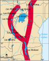
 Great Rift Valley.svg (translated)


Articels: Lake Victoria and others.
Request: For the first, translate and upload under a better name, for the second, fix the atrocious text on the French version and also translate and upload an English version. 76.117.247.55 (talk) 03:07, 25 August 2009 (UTC)
Oppinion:
1st ![]() Done under the name File:Map of Great Rift Valley.svg. Also changed all text to web safe fonts. ZooFari 23:23, 31 August 2009 (UTC)
Done under the name File:Map of Great Rift Valley.svg. Also changed all text to web safe fonts. ZooFari 23:23, 31 August 2009 (UTC)
- "Lake Edouard" should be "Lake Edward" though. 76.117.247.55 (talk) 23:07, 1 September 2009 (UTC)
SVGify please
-
 Army Public Affairs Branch Insignia
 -
 SVG traced and cleaned version
 -
 Army Quartermaster Branch Insignia


Article(s):United States Army branch insignia
Request: Please SVGify - Jameson L. Tai talk ♦ guestbook ♦ contribs 09:24, 3 September 2009 (UTC)
- Trying to not let it go stale... yes I still want this please. - Jameson L. Tai talk ♦ guestbook ♦ contribs 22:37, 6 September 2009 (UTC)
Graphist opinion(s):
![]() Request taken by slashme.: I'll do the Army Public Affairs insignia, but I don't have time to do the other one. --Slashme (talk) 16:54, 25 September 2009 (UTC)
Request taken by slashme.: I'll do the Army Public Affairs insignia, but I don't have time to do the other one. --Slashme (talk) 16:54, 25 September 2009 (UTC)
![]() Done first one --Slashme (talk) 17:42, 25 September 2009 (UTC)
Done first one --Slashme (talk) 17:42, 25 September 2009 (UTC)
svg edit
-
 Japanese Prefectures with National Treasures in the shrine category marked in orange
.svg)
Article(s): List of National Treasures of Japan (shrines)
Request: Please mark Nagano and Yamaguchi in the same color as Kyoto (orange). bamse (talk) 19:25, 7 September 2009 (UTC)
Graphist opinion(s):
![]() Request taken by ZooFari.
Request taken by ZooFari.
- It's been a week, so I whipped up a change. I hope that's OK, ZooFari. — ʞɔıu 00:17, 16 September 2009 (UTC)
KT logo
-
 PNG Low-rez version
 -
SVG Vector version
-
PNG Low-rez version
-
SVG Vector version
Article(s): KT (telecommunication company)
Request: I got new logos of KT from their website. There are .ai and .jpg versions for each file in the ZIP files. As I have no ability to convert .ai file into SVG format, I have uploaded .jpg version of it. So, can anyone convert two .ai files below into SVG format?:
- "KT_logo_W.ai" in http://file.kt.com/kthome/pr/data/cibi/ci/KT_logo_02.zip
- The first top one with white background, on the "KT_logo.ai" in http://file.kt.com/kthome/pr/data/cibi/ci/KT_logo_02.zip
If done, please replace File:KT logo.jpg and File:Olleh KT.jpg on the article KT (telecommunication company) with the SVG files. JSH-alive talk • cont • mail 12:57, 8 September 2009 (UTC)
Graphist opinion(s):
![]() Request taken by raeky.: I'll do it, but I'm not sure what the legality of uploading vector versions of trademarked logos is to wikipedia. I think it's to be avoided. a decent size (but still unprintable quality) PNG would probably be better for legal reasons? I'll make the SVG and PNG versions. — raeky (talk | edits) 01:48, 14 September 2009 (UTC)
Request taken by raeky.: I'll do it, but I'm not sure what the legality of uploading vector versions of trademarked logos is to wikipedia. I think it's to be avoided. a decent size (but still unprintable quality) PNG would probably be better for legal reasons? I'll make the SVG and PNG versions. — raeky (talk | edits) 01:48, 14 September 2009 (UTC)
 Done: The zip file didn't contain the art for File:Olleh KT.jpg, does it already exist or do I have to try to recreate it from non-vector art? — raeky (talk | edits) 02:01, 14 September 2009 (UTC)
Too glossy. -- JSH-alive talk • cont • mail 13:37, 17 September 2009 (UTC)
- There seems to be an issue with how the artwork is rendered... — raeky (talk | edits) 08:28, 18 September 2009 (UTC)
Recoloring
-
 The entrails of a thermostat
 -
 Changed number's color to white and add shadow/glow.


Article(s): Thermostat and bimetallic strip
Request: The numbers do not contrast very much with the image. I don't really care how they end up, but yellow's a bad choice. Headbomb {ταλκκοντριβς – WP Physics} 19:37, 9 September 2009 (UTC)
Graphist opinion(s):
- It's a bit better, but it's still hard to read (not because of color this time however). Perhaps adding a black border to the numbers would increase readability? Headbomb {ταλκκοντριβς – WP Physics} 21:22, 13 September 2009 (UTC)
- I'll try, I don't have the orignial without the numbers it proved to be a bit challenging to type new numbers exactly over the other, i'll see if i can get it more readable... — raeky (talk | edits) 21:42, 13 September 2009 (UTC)
- I gave it another try. Hope you don't mind (otherwise just revert...) I think the shadows make it more easy to read than a different color. SPLETTE :] How's my driving? 03:05, 16 September 2009 (UTC)
- I'll try, I don't have the orignial without the numbers it proved to be a bit challenging to type new numbers exactly over the other, i'll see if i can get it more readable... — raeky (talk | edits) 21:42, 13 September 2009 (UTC)
- It's a bit better, but it's still hard to read (not because of color this time however). Perhaps adding a black border to the numbers would increase readability? Headbomb {ταλκκοντριβς – WP Physics} 21:22, 13 September 2009 (UTC)
U of T Logo
Article(s): University of Toronto
Request: Please make the coat of arms fill white, not transparent. Thanks. Connormah (talk) 13:48, 14 September 2009 (UTC)
Graphist opinion(s):
![]() Request taken by nkocharh. — ʞɔıu 21:47, 15 September 2009 (UTC)
Request taken by nkocharh. — ʞɔıu 21:47, 15 September 2009 (UTC)
- I'm done, but I have a question: should this go on Wikimedia, or does the fact that it's a copyrighted logo change things?
- Non-free images are uploaded here. ZooFari 14:15, 16 September 2009 (UTC)
- Done In that case, this is finished. — ʞɔıu 23:10, 16 September 2009 (UTC)
Mir insignia
-
 Mir insignia.

Article(s): Mir and related articles.
Request: Could the lettering and border of this image please be sharpened up and the border's colour strengthened to the original red? Many thanks, Colds7ream (talk) 17:03, 18 September 2009 (UTC)
Graphist opinion(s):
![]() Request taken by ZooFari.
Request taken by ZooFari.
- I'm unable to upload new version and overwrite the originals for some reason. Anyone willing to receive it by email? ZooFari 23:22, 18 September 2009 (UTC)
- Sure, chuck it my way (address is on my talk page) - and thanks! Colds7ream (talk) 17:21, 19 September 2009 (UTC)
- Thanks for that ZF - it's beautiful! :-) I can't upload a new version either, apparently Commons have some sort of bug with that (see here). Colds7ream (talk) 10:38, 20 September 2009 (UTC)
- Job done - thanks very much! :-) Colds7ream (talk) 15:53, 22 September 2009 (UTC)
- Sure, chuck it my way (address is on my talk page) - and thanks! Colds7ream (talk) 17:21, 19 September 2009 (UTC)
- Removing the done tag and resolved tag since someone reverted it and the fixed version wasn't entirely compatible with the SVG standard that Common's uses. Needs fixed to be resolved. — raeky (talk | edits) 04:22, 25 September 2009 (UTC)
- Yes - for some reason the new image didn't display in articles. Colds7ream (talk) 14:51, 25 September 2009 (UTC)
- If it was made in Illustrator then theres probably something in it that's not to the SVG standard, Illustrator can do things that browsers can't and isn't in the standard. Placed images break it, for example, and some kinds of gradients and objects. Load it into Inkscape and save it back out and it might fix it. — raeky (talk | edits) 18:42, 25 September 2009 (UTC)
- Done I checked in Inkscape, there was a linked file, I deleted it and reuploaded and it works fine for browser display now. — raeky (talk | edits) 06:07, 27 September 2009 (UTC)
- Brilliant - thanks very much! :-) Colds7ream (talk) 09:30, 27 September 2009 (UTC)
- If it was made in Illustrator then theres probably something in it that's not to the SVG standard, Illustrator can do things that browsers can't and isn't in the standard. Placed images break it, for example, and some kinds of gradients and objects. Load it into Inkscape and save it back out and it might fix it. — raeky (talk | edits) 18:42, 25 September 2009 (UTC)
- Yes - for some reason the new image didn't display in articles. Colds7ream (talk) 14:51, 25 September 2009 (UTC)
NS Everett
-
 The NS Everett logo
 -
 PNG version


Article(s): Naval Station Everett
Request: SVG-ify and remove background/crop please. (US Navy image, automatically PD) Thanks, –CG 01:56, 19 September 2009 (UTC)
Graphist opinion(s): This will require a signifigantly higher source image, from that icon size image we couldn't create a SVG. — raeky (talk | edits) 22:31, 21 September 2009 (UTC)
Thanks raeky! –CG 16:36, 29 September 2009 (UTC)
Capitalization in the periodic table

Articels: Island of stability
Request: Change the abbreviation for 112 to "Uub" (2d U is incorrectly capitalized now). Upload over existing file. 76.117.247.55 (talk) 00:33, 27 September 2009 (UTC)
- And while we're in there, should element 119 be Uue rather than Uum? Certes (talk) 01:36, 27 September 2009 (UTC)
Oppinion: ![]() Done --Svgalbertian (talk) 19:01, 29 September 2009 (UTC)
Done --Svgalbertian (talk) 19:01, 29 September 2009 (UTC)
United_States_(orthographic_projection).svg
.svg)
Article(s): United States
Request: The image appears to color Manitoulin Island as a US territory, but the article for the island states that it is a Canadian territory. Danny (talk) 23:15, 1 October 2009 (UTC)
Graphist opinion(s):
![]() Done: Fixed. — raeky (talk | edits) 00:37, 2 October 2009 (UTC)
Done: Fixed. — raeky (talk | edits) 00:37, 2 October 2009 (UTC)
Logo removal

Article(s): Nintendo DSi
Request: An issue was brought up here: Wikipedia:Featured article candidates/Nintendo DSi/archive1. The whole logo needs to be removed and perhaps its reflection in the lower screen as well to maintain consistency. « ₣M₣ » 19:03, 5 October 2009 (UTC)
Graphist opinion(s):
![]() Request taken by Drew R. Smith.
Request taken by Drew R. Smith.
- Have it completed, but my internet connection is being really dodgy at the moment. Will upload as soon as I can. - Drew Smith What I've done 00:54, 6 October 2009 (UTC)
- DoneRemoved the reflected logo as well. Still needs copyright info taken from the original. - Drew Smith What I've done 01:05, 6 October 2009 (UTC)
Vectorisation
Article(s): Template:All-services
Request: Vectorize. Connormah (talk) 03:29, 7 October 2009 (UTC)
Graphist opinion(s): The file has insufficient source info and probably an erroneous license. But there should be a lot of alternatives kicking about. one of the following for instance.
-

-

-

-
 only the phone
 -

-
 not the text


- Done Here you go, all PD:

--Beao (talk) 18:31, 8 October 2009 (UTC)
Commercial Television Hong Kong
Article(s): Commercial Television (TV station)
Request: Commercial Television (TV station), zh:佳藝電視 and zh-yue:佳藝電視 has, at least, no proper logo. But there's a capture of the logo on http://s218.photobucket.com/albums/cc142/vcrbase/Others/?action=view¤t=CTV.jpg . Based on the latter picture, and colour from zh:file:Ctvjuly.jpg, can you make an SVG file of the logo?
P.S.: Don't forget to remove two Chinese characters "佳視" in the centre. JSH-alive talk • cont • mail 13:17, 2 October 2009 (UTC)
Graphist opinion(s): Please verify this is what you wanted:
![]() Done:
Done:
![]()
--Beao (talk) 14:50, 9 October 2009 (UTC)
Signatures to SVG
-
 Rob Wonderling: Done
 -
 Tom Corbett: Done
 -
 Daylin Leach: Done

Is there someone who would be interested in converting File:Rob Wonderling sig.gif, File:TomCorbettSignature.jpg and File:Leachsig.png to SVG format, like File:Sarah palin signature.svg? Thanks folks,--Blargh29 (talk) 05:38, 6 October 2009 (UTC)
Two Requests ended up in the wrong place, fixed now
These two requests ended up in the wrong place (here) but I have now fixed the faulty request button on this page (see this edit) Regards, Captain n00dle T/C 14:55, 11 October 2009 (UTC)
Vectorisation
Article(s): Template:Allservices
Request: Vectorize. Connormah (talk) 03:27, 7 October 2009 (UTC)
Graphist opinion(s):
![]() Done: This request was posted again above and has been completed, see above: Wikipedia:Graphic_Lab/Illustration_workshop#Vectorisation Regards, Captain n00dle T/C 14:56, 11 October 2009 (UTC)
Done: This request was posted again above and has been completed, see above: Wikipedia:Graphic_Lab/Illustration_workshop#Vectorisation Regards, Captain n00dle T/C 14:56, 11 October 2009 (UTC)
Translation of Polish Labels


Description of image in polish is given as: Tworzenie kompleksu atakującego błonę. English Description would be "Membrane attack complex. Water, Lysozyme and antibiotics go one way. Potassium, ATP and amino acids go the other."
Article(s): Complement membrane attack complex
Request: This image has polish labels and is a little unhelpful, per discussion here and here I believe that the labels are:
- "Kompleks konwertazy C5" is "C5 convertase"
- "Lizowana błona" is the "cell membrane".
- "Woda lizozym antybiotyki" should be literally: "water / lysozyme / antibiotics"
- "Potas ATP aminokwasy" should be literally: "potassium / ATP / amino acids"
Thank you very much in advance, and I do apologise at being quite useless with images and not being able to do this myself :-( Captain n00dle T/C 15:20, 11 October 2009 (UTC)
Graphist opinion(s): ![]() Done --Beao 20:49, 11 October 2009 (UTC)
Done --Beao 20:49, 11 October 2009 (UTC)
- Beao's version has some spelling errors, so I uploaded my own. I don't understand the lysozyme / antibiotics part - lysozymes are antibiotic by themselves. Narayanese (talk) 21:24, 11 October 2009 (UTC)
- My e on membrane got cut off though somehow, perhaps best if the other verion is fixed instead (convertarse->convertase, lisozyme->lysozyme). Narayanese (talk) 21:30, 11 October 2009 (UTC)
- Thanks guys that looks brilliant! Have a cookie (::) Captain n00dle T/C 21:33, 11 October 2009 (UTC)
- Thank you Narayanese, but please update my image instead of creating a new, and please save your images is the plain SVG format, instead of the native Inkscape format. I've updated my file with your edit and increased the width to make the cell membrane text appear at full. --Beao 21:46, 11 October 2009 (UTC)
Cranial nerves
-
 Brain human normal inferior view
 -
 Brain human normal inferior view with labels en


Article(s): Cranial nerves
Request: Would it be possible to either add a key or labels to this image. The key/labels would add a lot more use to this picture. The labels needed are here: [4] Captain n00dle T/C 14:41, 11 October 2009 (UTC)
Note: I would recommend that finished product be uploaded as a new file to wikimedia, as the image above could also be used for other purposes Captain n00dle T/C 14:41, 11 October 2009 (UTC)
Graphist opinion(s): ![]() Done What do you think? --Beao 16:44, 13 October 2009 (UTC)
Done What do you think? --Beao 16:44, 13 October 2009 (UTC)
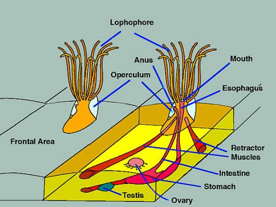
Bryozoan
Article(s): multiple - Bryozoa and relevant sub-groups of this phylum
Request: New image like this one
In the non-cutaway part of the pic, please place the operculum (white in the example) in front of the lophophore rather than behind - that's an inaccuracy in the example.
In the sample on the the left, please place the operculum (white in the example) in front of the lophophore rather than behind, as that where it is in real life. In the sample on the right, can you please represent the operculum as transparent with a dotted / dashed margin, so it's a "ghost" through which the rest can be seen. --Philcha (talk) 17:21, 21 August 2009 (UTC)- Please omit the labels and the lines (blue in the example) pointing to the corresponding parts of the anatomy.
- Assuming you make an SVG, please let me know how to download the SVG file so I can place the lines so as to use Template:Annotated image for the labels (see example of this technique at Annelid#Body_wall.2C_chetae_and_parapodia or Arthropod#Exoskeleton). I'll use Template:Annotated image to place labels on the file without lines, then add the lines and re-upload.
- Suggested filename "Ectoproct
Bryozoananatomy - encrusting" as there are other types of colony structure, see e.g. this pic of a non-encrusting colony with a branching structure. --Philcha (talk) 09:12, 5 August 2009 (UTC)- Suggested different filename because "Bryozoan" potentially ambiguous (see User_talk:Smith609#Bryozoa for details). --Philcha (talk) 23:13, 15 August 2009 (UTC)

My Attempt at it... — raeky (talk | edits) 03:41, 14 September 2009 (UTC)
- The raster is copyrighted, so you need to tweak it somehow so it won't resemble the original. ZooFari 00:16, 16 September 2009 (UTC)
- A few other tweaks needed:
- In the sample on the the left, please place the operculum (white in the example) in front of the lophophore rather than behind, as that where it is in real life. In the sample on the right, can you please represent the operculum as transparent with a dotted / dashed margin, so it's a "ghost" through which the rest can be seen.
- Please omit the labels and the lines (blue in the example) pointing to the corresponding parts of the anatomy.
- Assuming you make an SVG, please let me know how to download the SVG file so I can place the lines so as to use Template:Annotated image for the labels (see example of this technique at Annelid#Body_wall.2C_chetae_and_parapodia or Arthropod#Exoskeleton). I'll use Template:Annotated image to place labels in the right places without lines, then add the lines and re-upload the pic. --Philcha (talk) 19:46, 18 September 2009 (UTC)
- Alright I'll put some hours into it tomarow, it is SVG. I assume you'd just use this template as an example on how to put lines and labels with the Template:Annotated image, I've never done one before. — raeky (talk | edits) 16:20, 19 September 2009 (UTC)
- A few other tweaks needed:
- Ok, redid it so it would work better for the Annotated Image format requested. The guide for the lines is:
  Lophophore------
  Mouth-----------
                  ------------Anus
  operculum-------
                  ------------Gut/Stomach
  Retractor
  muscle----------
                  ------------Ovary
  Testes----------
                  ------------Funiculus
— raeky (talk | edits) 08:16, 27 September 2009 (UTC)
Electron shell diagrams
-
 Tc
Tc -
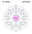 Ce
Ce -
 Ds
Ds


The electron shell diagrams for technetium, cerium and darmstadtium all need fixing.
- Technetium: 2, 8, 18, 15, 2.
- Cerium: 2, 8, 18, 19, 9, 2.
- Darmstadtium: 2, 8, 18, 32, 32, 16, 2
Thanks, 23191Pa (chat me, but mind the alphas!) 11:37, 9 October 2009 (UTC)
- On it. /Lokal_Profil 11:55, 10 October 2009 (UTC)
- Can you giva a source for the Ds configuration? I seem to see a mixture of the two (sometimes both) cited all over the web. /Lokal_Profil 12:02, 10 October 2009 (UTC)
- And I take it you mean "Technetium: 2, 8, 18, 13, 2." /Lokal_Profil 22:14, 10 October 2009 (UTC)
- I've updated Cerium and created images for the other two. For the other two I'll need some source supporting the change or a decision from e.g. WikiProject Elements (left a note there) to change to the new convention. This is mainly because I don't want to accidentally mess up an article, especially not if it is featured. Also I noticed that the Roentgenium image and infobox info doesn't agree so one of the two would have to change. /Lokal_Profil 23:04, 10 October 2009 (UTC)
- Here you are. [5]. There are links to technetium, cerium, darmstadtium and roentgenium. 23191Pa (chat me, but mind the alphas!) 06:41, 13 October 2009 (UTC)
- Was hoping for something more official but it seems to be at least as good a source as for the current configurations. I'll up the images later today or tomorrow. Meanwhile the text in Darmstadtium should probably be updated since it's currently saying "2, 8, 18, 32, 32, 17, 1" throughout. /Lokal_Profil 15:26, 13 October 2009 (UTC)
- Here you are. [5]. There are links to technetium, cerium, darmstadtium and roentgenium. 23191Pa (chat me, but mind the alphas!) 06:41, 13 October 2009 (UTC)
- I've updated Cerium and created images for the other two. For the other two I'll need some source supporting the change or a decision from e.g. WikiProject Elements (left a note there) to change to the new convention. This is mainly because I don't want to accidentally mess up an article, especially not if it is featured. Also I noticed that the Roentgenium image and infobox info doesn't agree so one of the two would have to change. /Lokal_Profil 23:04, 10 October 2009 (UTC)
- And I take it you mean "Technetium: 2, 8, 18, 13, 2." /Lokal_Profil 22:14, 10 October 2009 (UTC)
- Can you giva a source for the Ds configuration? I seem to see a mixture of the two (sometimes both) cited all over the web. /Lokal_Profil 12:02, 10 October 2009 (UTC)
-
 Site plan of the Neolithic burial chamber at Parc Cwm long cairn

Hi guys, I've tried to construct a site plan of the Neolithic burial chamber at Parc Cwm long cairn, but it's pretty poor to be honest. And I don't think it's particularly accurate, either, which is less than ideal.
An arial shot of the site is available here.
It would also benefit from having dimensions added. They are: 72 feet (22 m) north-south, and tapering from 43 feet (13 m) wide at its entrance (to the south), to about 20 feet (6 m) (to the north).
On the article I've noted various features as a key beneath the plan. It may look better if they are incorporated within the plan, but I'll leave that to you to decide - just a thought.
I have no preference as to colour/s, but the actual site is various shades of grey.
The article is in the process of acedemic peer review, prior to WP:FAC. The current plan is so poor that just about anything would be an improvement, so I'd really appreciate some help with this. Look forward to hearing from you. Cheers, Daicaregos (talk) 19:32, 10 October 2009 (UTC)
Graphist opinion(s): ![]() Request taken by Beao. I'll try. --Beao 23:36, 10 October 2009 (UTC)
Request taken by Beao. I'll try. --Beao 23:36, 10 October 2009 (UTC)
- Great. Thanks Beao. I look forward to seeing your plan. Please let me know if there's anything you need, or that I can help with. Cheers, Daicaregos (talk) 19:07, 11 October 2009 (UTC)

- Hi Beao, looks great - and a huge improvement on my feeble attempt. I have a couple of suggestions, though. Hope that's ok. a) The passageway is almost exactly alligned north-south, so could you move the compass point to reflect that? b) The eastern edge of the cromlech is as straight as the western edge. Can you amend? c) Would you be able to make the outside line into a double line, which would show the drystone retaining wall (see here: [[File:Parc Cwm, Gwyr - elevated.JPG]])? # 1 should point to this. d) The forecourt is a narrow bell shape. It doesn't show up in the arial shot too well, but may be seen better in these pictures: [[File:Parc le Breos, Gwyr y cwrt.JPG]] and [[File:Parc le Breos, Gwyr y cwrt o'r dde.JPG]]. e) Can you point # 3 to one of the sills at the entrance to one of the trancept chambers. One of the sills can be seen here: [[File:Parc le Breos, siambrau de.JPG]]. f) I like the measurement at the bottom of the plan. But I think the measurement (in feet) should be 50, rather than 10. g) Could you soften the southwest corner a little - where the straight line and the curve meet? h) Could you add a title: 'Site plan – Parc Cwm long cairn'.? Any questions - give me a shout. Cheers, Daicaregos (talk) 21:55, 11 October 2009 (UTC) (Moved from User talk:Beao)
- Updated. Comments? --Beao 13:40, 13 October 2009 (UTC)
- a) Done; b) The retaining wall on each side of the cromlech is quite straight. Could you straighten out the right side in your plan please; c) Done; d) Done; e) Done; f) Done; g) The eastern (left) and western (right) walls of the cromlech go on to form the south (bottom) edges in a gentle curve, rather than an angled corner. Could you soften them out please; h) Could you add a title: 'Site plan – Parc Cwm long cairn'. If not, no worries, just let me know; i) could you check the angle between the western (left) edge and the northern (top) edge of the cromlech, as I didn't realise the northern wall was so far from a west-west alignment. Thanks.
Nearly there, Beao. Thanks. Daicaregos (talk) 15:24, 13 October 2009 (UTC)- Updated. I don't think there's any need for a title. The image caption can say it, and it will look neater. I'm not sure if i got (i though. --Beao 18:53, 13 October 2009 (UTC)
- a) Done; b) Done; c) Done; d) Done; e) Done; f) Done; g) Done (love the rubble, by the way); h) ; i)
 Resolved Done.
That, my dear Beao, is what I would call a job well done (we'll have to wait and see what they think at WP:FAC). Thank you very much. Best, Daicaregos (talk) 20:55, 13 October 2009 (UTC)
- a)
- Updated. I don't think there's any need for a title. The image caption can say it, and it will look neater. I'm not sure if i got (i though. --Beao 18:53, 13 October 2009 (UTC)
- a)
- Updated. Comments? --Beao 13:40, 13 October 2009 (UTC)
- Hi Beao, looks great - and a huge improvement on my feeble attempt. I have a couple of suggestions, though. Hope that's ok. a) The passageway is almost exactly alligned north-south, so could you move the compass point to reflect that? b) The eastern edge of the cromlech is as straight as the western edge. Can you amend? c) Would you be able to make the outside line into a double line, which would show the drystone retaining wall (see here: [[File:Parc Cwm, Gwyr - elevated.JPG]])? # 1 should point to this. d) The forecourt is a narrow bell shape. It doesn't show up in the arial shot too well, but may be seen better in these pictures: [[File:Parc le Breos, Gwyr y cwrt.JPG]] and [[File:Parc le Breos, Gwyr y cwrt o'r dde.JPG]]. e) Can you point # 3 to one of the sills at the entrance to one of the trancept chambers. One of the sills can be seen here: [[File:Parc le Breos, siambrau de.JPG]]. f) I like the measurement at the bottom of the plan. But I think the measurement (in feet) should be 50, rather than 10. g) Could you soften the southwest corner a little - where the straight line and the curve meet? h) Could you add a title: 'Site plan – Parc Cwm long cairn'.? Any questions - give me a shout. Cheers, Daicaregos (talk) 21:55, 11 October 2009 (UTC) (Moved from User talk:Beao)
Cut thumbnail
-
 Painting National Treasures of Japan
Article(s): List of National Treasures of Japan (paintings)
Request: Why does the thumbnail appear cut by a few pixel (on the right)? Please fix it. bamse (talk) 12:37, 17 October 2009 (UTC)
Graphist opinion(s):
![]() Request taken by Andrew c.: seems simple enough ; the original file had the border, but was too large and caused a thumbnail error, so when the user shrunk it down, appears the right side was clipped. I've drawn on the borders by hand (though in retrospect, maybe I should have used the original large file)
Request taken by Andrew c.: seems simple enough ; the original file had the border, but was too large and caused a thumbnail error, so when the user shrunk it down, appears the right side was clipped. I've drawn on the borders by hand (though in retrospect, maybe I should have used the original large file)
![]() Done:-Andrew c [talk] 15:07, 17 October 2009 (UTC)
Thanks. bamse (talk) 22:19, 17 October 2009 (UTC)
Done:-Andrew c [talk] 15:07, 17 October 2009 (UTC)
Thanks. bamse (talk) 22:19, 17 October 2009 (UTC)
Hydrofoil
-
 Hydrofoil designs
 -
 Fully submerged hydrofoils self-stabilizing system


Article(s): Hydrofoil
Request: Convert into more conventionally drawn SVGs Tagishsimon (talk) 10:27, 18 September 2009 (UTC)
![]() Request taken by ZooFari.. I'll do number 2 first
Request taken by ZooFari.. I'll do number 2 first
- I've done number one, but I need to know if the side views are supposed to be angled that way, and I want the bottom notes checked. --Beao (talk) 17:10, 25 September 2009 (UTC)
- Number two is done, please feedback! --Beao (talk) 17:25, 5 October 2009 (UTC)
- Thanks. Both look fine to me. I'm grateful for your work on them - well done. I've added notes to the second image; hope you're okay with that. I suggest we deploy them on the article in question. --Tagishsimon (talk) 10:33, 16 October 2009 (UTC)
- Number two is done, please feedback! --Beao (talk) 17:25, 5 October 2009 (UTC)
Great work - much appreciated. Some minor comments: For File:Fully submerged hydrofoils self-stabilizing system.svg, you have two label both reading Water Height Sensor and Boom Sensor (as does the original). In reality, one of these (the top one) is the boom sensor and the other is the water level sensor. Suggest you amend both your labels. I would also change "electrical engine" to "electrical actuator", since actuator, for me, conveys more meaning. For the other image, I think the only thing I'm missing is a sketch of how the inverted T looks when bent - there is a tiny sketch in the original. But bottom line: excellent, and much appreciated. I'll call in again sometime next week and update the article with the images. --Tagishsimon
Layout of Westminster Abbey


Article(s): Westminster Abbey
Request: Please vectorize. Connormah (talk) 22:29, 21 September 2009 (UTC)
Graphist opinion(s): ![]() Request taken by Beao.
Request taken by Beao.
![]() Done --Beao 14:24, 14 October 2009 (UTC)
Done --Beao 14:24, 14 October 2009 (UTC)
- Great work. One thing, could you remove the white background? Connormah (talk) 22:38, 14 October 2009 (UTC)
Image Cropping
.svg)
Article(s): Coat of Arms of Manitoba
Request: I can't seem to crop this properly. Can someone assist me? Thank you. Connormah (talk) 01:36, 18 October 2009 (UTC)
Graphist opinion(s):
Reactor SVGs


Article(s): See Above.
Request: All 3 of these need made into SVG, a good project for someone to take on. — raeky (talk | edits) 22:29, 21 September 2009 (UTC)
Graphist opinion(s):
![]() Request taken by Beao.
Request taken by Beao.
Alternative Sam-Taegeuk
-
 To be redrawn into SVG
 -
 Use these colors
 -
 SVG
SVG


Article(s): Taegeuk
Request: Please vectorize the first images, using colors from the second image. Connormah (talk) 02:52, 20 October 2009 (UTC)
Graphist opinion(s):
![]() Request taken by ZooFari.
Request taken by ZooFari.
![]() Done. How's that?
Done. How's that?
Azoles
-
Structures of several azoles
-
 SVG
SVG

Article(s): Azole
Request: Re-create as SVG. Cybercobra (talk) 18:50, 20 October 2009 (UTC)
Graphist opinion(s):
![]() Request taken by ZooFari.
Request taken by ZooFari.
![]() Done. How's that? ZooFari 02:23, 21 October 2009 (UTC)
Done. How's that? ZooFari 02:23, 21 October 2009 (UTC)
- Slight typo: "imidazole" ends with an "e" not an "a". But otherwise excellent. SVG looks far superior. --Cybercobra (talk) 03:42, 21 October 2009 (UTC)
- Managed to fix it myself. Now if the new version would just freakin propagate... --Cybercobra (talk) 05:07, 21 October 2009 (UTC)
Editing text in several diagrams
-
 cross section of a mitochondrion, by LadyofHats
 -
 cross section of a endomembrane, by LadyofHats
 -
 diagram of the human circulatory system. This one is more optional, as it needs more work and can be resubmitted later.
 -
Edit for cell
-
 Edit for animal cell


.svg)
Article(s): WP:FPC These are pending Featured Pictures in need of quick edits!
Request: See the request on each nomination, then fix and post a copy with the caption Edit, or message me and I will do it.
For the first two, the cross sections, it is minor text edits.
- Inter membrane space to Intermembrane space.
- Decapitalize the V in Secretory Vesicle
- See the nomination. God this one is going to take work, so if you want to ignore it, fine.
Nezzadar ☎ 00:10, 21 October 2009 (UTC)
P.S. Please message me on my talk if you choose to work on these. Thanks.
Graphist opinion(s):
![]() Request taken by ZooFari.
Okay, there are the two edits with the edits you requested. Please see the nomination pages; I've posted some questions and comments about them. Let's continue any further discussion there, so I'll mark this section resolved. ZooFari 02:05, 21 October 2009 (UTC)
Request taken by ZooFari.
Okay, there are the two edits with the edits you requested. Please see the nomination pages; I've posted some questions and comments about them. Let's continue any further discussion there, so I'll mark this section resolved. ZooFari 02:05, 21 October 2009 (UTC)
Misleading image, Ampulla of Vater
-
 Incorrect image!

Article(s): Ampulla of Vater and others: Special:WhatLinksHere/File:Biliary_system.svg
Request: This image is incorrect, which may mislead. Also one of the labels is drawn in the wrong place (the liver label is not pointing at the liver) and the canvas is too large.
Let me just explain what I mean by wrong: The pancreatic duct should unite with the common bile duct at the sphincter of oddi, in/just before the major duodenal papilla, just like this image: here and this: File:Illu_pancrease.jpg
Other examples do exist: [6] [7]
I do apologise for posting a few requests recently, but you guys are amazing and I am slightly useless! (I'm not just saying that to suck up, but you always do a good job ^_^) Captain n00dle T/C 00:23, 21 October 2009 (UTC)
Graphist opinion(s): How is something like this. --Vishnu2011 (talk) 01:33, 21 October 2009 (UTC)
-
 Fixed Try 1!

![]() Done
Done
- I think that that looks a lot better! Could I just ask, is there a small amount of overlap with the box in the bottom right corner? (Common hepatic duct seems to stretch out of the box) Thank you very much Vishnu2011! ^_^ Captain n00dle T/C 10:10, 21 October 2009 (UTC)
- Looks like it was a bugged rendering to png by Wiki's software. I think its fixed now, from what I can see. --Vishnu2011 (talk) 15:41, 21 October 2009 (UTC)
- Ah yep, looking good ^_^ I will let you have the satisfaction of tagging this with done, Regards, Captain n00dle T/C 20:03, 21 October 2009 (UTC)
Color confinement (SVG-ize)
-
 See this image for an explanation
 -
 SVG
SVG

Article(s): Color confinement
Request: Un-uglify / SVG-ize Headbomb {ταλκκοντριβς – WP Physics} 05:38, 18 October 2009 (UTC)
Graphist opinion(s):
![]() Request taken by Lokal_Profil. /Lokal_Profil 16:09, 23 October 2009 (UTC)
Request taken by Lokal_Profil. /Lokal_Profil 16:09, 23 October 2009 (UTC)
- Have now done a first draft. Any specific requests for making it nicer? /Lokal_Profil 18:19, 23 October 2009 (UTC)
- Looks good enough for me. Thanks. (Delete/Upload over the old one?). Headbomb {ταλκκοντριβς – WP Physics} 21:08, 23 October 2009 (UTC)
Translation


Articels: Elections in Germany
Request: Make a translated version of this.
Translations:
VOLK: People or Voters Landtag: State legislature Ministerprasident: Minister-president Bundestag: Federal Diet or leave untranslated Bundesrat: Federal Council or leave untranslated Bundesverfassungsgericht: Federal Law Bundeskanzler: Federal Chancellor or just Chancellor Kabinett: Cabinet Bundesprasident: Federal President or President of Germany or just President Bundesversammlung: Federal Convention or Electoral college 76.117.247.55 (talk) 23:36, 15 September 2009 (UTC)
Oppinion: I've made an attempt to do this, as seen above. There are still a couple words not translated, Verfassungsgericht, Budesbene and Landesebene. If you let me know what those words mean I'll change those too. TastyCakes (talk) 15:56, 17 September 2009 (UTC)
- I've tried to translate it myself. Please let me know if it's ok. TastyCakes (talk) 16:22, 17 September 2009 (UTC)
- The two grey boxes should be "State Supreme Court" and "Federal Supreme Court" (I made a mistake in that in my list above). Also, can you remove the strange fringes on some of the boxes? 76.117.247.55 (talk) 22:00, 21 September 2009 (UTC)
- OK, fixed the translations. Not quite sure what the box fringe request is about. Do you want them all to have black lines around them, or no lines at all? --Slashme (talk) 08:34, 17 October 2009 (UTC)
I'll call this one done. 76.117.247.55 (talk) 00:00, 25 October 2009 (UTC)
Asunción Coat of Arms
.svg)
Article(s): Asunción
Request: Please vectorize Connormah (talk) 03:50, 16 October 2009 (UTC)
Graphist opinion(s): File already exists --Justass (talk) 03:09, 25 October 2009 (UTC)
WikiProject Biography ad
Request: I don't know much about these Wikipedia ads, but would it be possible to update this one using the current svg version of the icon? Could the border colour also be changed to a softer #AAAAAA? PC78 (talk) 22:21, 22 October 2009 (UTC)
Graphist opinion(s):
Comment:I'm not a graphic person, I just watch ^_^ But why not use a text ad? I created two that you could use as a text template: User:Captain-n00dle/Sandbox Regards Captain n00dle T/C 00:19, 23 October 2009 (UTC)
- Like I said, I don't know all that much about these ads, but this is part of a series of such templates; see Template:Wikipedia ads. PC78 (talk) 00:23, 23 October 2009 (UTC)
- Ah, they are all .gifs because some are animated. No worries! Thanks, Captain n00dle T/C 12:30, 23 October 2009 (UTC)
Flag/Coat of Arms of Zagreb, Croatia
-
Coat of arms Image
-
 COA
COA -
 Flag
Flag


![[1]](http://www.pinfinder.com/acatalog/TinkFantasylandDLRLandPin.jpg)
![[3]](http://www.theglassjunkie.com/images/glass-Fantasyland.JPG)
![[4]](http://www.captain-pot-noodle.com/stuff/424px-Brain_human_normal_inferior_view.svg.png)
![[6]](http://www.nsf.gov/news/mmg/media/images/pancreas_f.jpg)
![[7]](http://www.nlm.nih.gov/medlineplus/ency/images/ency/fullsize/19214.jpg)
Article(s): Zagreb
Request: Please vectorize, use CoA elements for flag. Connormah (talk) 02:18, 16 October 2009 (UTC)
Graphist opinion(s): Vectorized based on images from official city website [8], as you can see some colours and small details differ from image you presented, background blue, doors, windows, but I presume it's official look of COA :) --Justass (talk) 02:34, 25 October 2009 (UTC)