
Wikipedia:Graphics Lab/Illustration workshop/Archive/Jul 2021
 | This page, part of the Graphics Lab Wikiproject, is an archive of requests for 2021. Please do not edit the contents of this page. You can submit new requests here. |

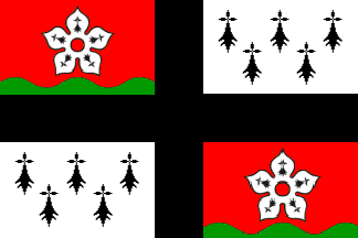
Flags of Pays d'Ancenis and Pays de Guérande
- Article(s)
- List of Breton flags
- Request
- Would someone please create SVG files of the flags of Pays d'Ancenis (as seen here) and Pays de Guérande (as seen here). Thanks. Snow Lion Fenian (talk) 22:09, 30 June 2021 (UTC)
- Discussion
Fix logo request
-
 Wikipedia in the Abkhazian Language
 -
 Corrected subtitle text
- Article(s)
- Wikipedia:Slogans
- Request
- Is there someone that can kindly fix font logo? Last word is out of border. Many thanks in advance!!! --93.35.184.189 (talk) 10:39, 30 June 2021 (UTC)
- Discussion
- I was able to fix this using Wikipedia's standard Linux Libertine font. Feel free to let me know if I should upload this somewhere else as well! I'm a new contributor. :)
 Done Floogan (talk) 06:26, 31 July 2021 (UTC)
- @Floogan: please, fix size to 135 × 155. Many, many and many thanks in advance!!! —5.169.119.43 (talk) 16:46, 31 July 2021 (UTC)
- {{Resolved}}
- @Floogan: please, fix size to 135 × 155. Many, many and many thanks in advance!!! —5.169.119.43 (talk) 16:46, 31 July 2021 (UTC)
Coat of arms of the British South Africa Company
-
 BSAC arms
 -
 Lion for helm
 -
 Springbok sample on the left


.svg)
- Article(s)
- Lion and Tusk
- Request
- Can an svg version of the BSAC's coat of arms be made please? Included are some samples for the Lion and Springbok supporters. The C of E God Save the Queen! (talk) 10:43, 6 July 2021 (UTC)
- Discussion
Ambox warning pn.svg

- Request
- The shadow of this image is cut off on the right, which becomes easily noticeable at larger sizes. Some of the other images this one is based off may have this issue too. See Commons:File:Ambox_warning_pn.svg#Summary. Can someone fix this? Thanks, DesertPipeline (talk) 11:55, 8 April 2021 (UTC)
- Discussion
I've noticed this before; would definitely be nice to resolve! (Of course, eventually someday we'll want to standardize all our symbols, and no guarantee this will be among the chosen.) {{u|Sdkb}} talk 07:08, 18 April 2021 (UTC)
- DesertPipeline, Sdkb I have looked at this file a bit. The original is 380*330 px and if one wants to be really sure nothing is clipped the document size has to be increased to 437,47*384,42 px. The triangel will still has the same size as now.
- Here is a PNG draft to show you the size and the yellow is just to more clearly see the shadow. It doesn't look like the shadow reaches that far out but this is what the program tells me it does. So making it any smaller might be visible sometimes as a clip.
- Here is a PNG draft to show you the size and the yellow is just to more clearly see the shadow. It doesn't look like the shadow reaches that far out but this is what the program tells me it does. So making it any smaller might be visible sometimes as a clip.
- I have now idea if changing the document size will have any impact or what kind of impact on all the places this and the others are used, this has to be looked in to before changing it. Also there is a local version kept here at Wikimedia which also makes a change more complicated and is nothing I have any knowledge of.
- Another option is to keep the document size but change the shadow to one without blur. The shadow can be darker or lighter. Draft without blur. Yellow just to compare with other draft.
- Another option is to keep the document size but change the shadow to one without blur. The shadow can be darker or lighter. Draft without blur. Yellow just to compare with other draft.
- If you want to anything more from me please always ping me, thanks. --Goran tek-en (talk) 17:25, 25 April 2021 (UTC)
- User:Goran tek-en: Thank you for your reply. Unfortunately, I cannot view any of the images, as they're hosted on Google Drive. Google Drive requires proprietary Javascript, and I don't like to visit Google websites or services anyway due to privacy issues. I don't know of any service where these images could be hosted which is reasonably ethical. However, I don't think it's a good idea to increase the size of the image, because this would likely cause issues with all its uses where it was expected to be a specific size. I think a better idea would be to just redraw the shadow and make it smaller so it fits within the image's borders at its current size. Are you able to do this? Thanks, DesertPipeline (talk) 02:20, 26 April 2021 (UTC)
- DesertPipeline Can you contact me by email from my user page and then I can send them to you. --Goran tek-en (talk) 12:38, 26 April 2021 (UTC)
- User:Goran tek-en: Sorry, I can't do that. Is it not possible for you to just redraw the shadow though? DesertPipeline (talk) 12:42, 26 April 2021 (UTC)
- DesertPipeline This is way to important to change without you seeing anything. As this is used in so many places is there some kind of consent to this Sdkb?
- Any suggestions on how you can view them as none of the regular ways work for you?
- Here. --always ping me--Goran tek-en (talk) 13:26, 26 April 2021 (UTC)
- Sdkb If you want the triangel+shadow to be centered the size of the triangel has to be reduced. It's hard when you add a shadow if that should or should not be included in the "centering" part, it's more about a feeling than any rules behind this.
- So would you prefer the the top or the bottom here. Top-new image size, bottom-keep image size. And the yellow is just to better see the shadows. --always ping me--Goran tek-en (talk) 15:54, 27 April 2021 (UTC)
- Sdkb If you want the triangel+shadow to be centered the size of the triangel has to be reduced. It's hard when you add a shadow if that should or should not be included in the "centering" part, it's more about a feeling than any rules behind this.
- DesertPipeline This is way to important to change without you seeing anything. As this is used in so many places is there some kind of consent to this Sdkb?
- User:Goran tek-en: Sorry, I can't do that. Is it not possible for you to just redraw the shadow though? DesertPipeline (talk) 12:42, 26 April 2021 (UTC)
- DesertPipeline Can you contact me by email from my user page and then I can send them to you. --Goran tek-en (talk) 12:38, 26 April 2021 (UTC)
- User:Goran tek-en: Thank you for your reply. Unfortunately, I cannot view any of the images, as they're hosted on Google Drive. Google Drive requires proprietary Javascript, and I don't like to visit Google websites or services anyway due to privacy issues. I don't know of any service where these images could be hosted which is reasonably ethical. However, I don't think it's a good idea to increase the size of the image, because this would likely cause issues with all its uses where it was expected to be a specific size. I think a better idea would be to just redraw the shadow and make it smaller so it fits within the image's borders at its current size. Are you able to do this? Thanks, DesertPipeline (talk) 02:20, 26 April 2021 (UTC)
@Goran tek-en: I like the soft shadow. {{u|Sdkb}} talk 17:22, 27 April 2021 (UTC)
- Sdkb But then the overall image size has to be increased. DesertPipeline What do you say? --always ping me--Goran tek-en (talk) 18:24, 27 April 2021 (UTC)
- User:Goran tek-en: I appreciate your help, but I'm not sure I understand what's going on exactly. Please can you explain why it's required to make the image larger? I feel like that's not a good idea, because again, there are uses on Wikipedia where a certain image size is expected. Is it impossible to not have the shadow cut off at the edge without resizing the image? As I said before, I think the best solution is to simply make the shadow smaller so it doesn't get cut off. If that's not possible, please can you explain why? I just need more context here. Thanks, DesertPipeline (talk) 02:00, 28 April 2021 (UTC)
- DesertPipeline In a vector program which is used to create a SVG file you can create " soft shadows" by the use of blur or gradient. They work differently but basically they thin out a color (grey for shadow mostly) to 0%, then it is fully transparent and this is furthest away from the object itself. In the present image that length is to short that is why it's clipped.
- So if we want to keep the image size and have a soft shadow we would have to decrease the warning triangel to make the shadow fit within the image size.
- Bottom image here is another solution.
- The last option is to remove the shadow all together. In most cases where this is used, does the shadow enhance the visual understanding or experience? Can you please link to some different ways of using it. --always ping me--Goran tek-en (talk) 12:47, 28 April 2021 (UTC)
- User:Goran tek-en: Examples of the use of this image can be found at https://en.wikipedia.org/w/index.php?title=Special%3AWhatLinksHere&target=File%3AAmbox+warning+pn.svg&namespace=10
- Can you upload on Wikipedia a version with increased image size to fit the shadow and a version without the shadow so it can be tested with some template examples? That would probably be the best idea. Thanks, DesertPipeline (talk) 10:02, 29 April 2021 (UTC)
- DesertPipeline In a vector program which is used to create a SVG file you can create " soft shadows" by the use of blur or gradient. They work differently but basically they thin out a color (grey for shadow mostly) to 0%, then it is fully transparent and this is furthest away from the object itself. In the present image that length is to short that is why it's clipped.
- User:Goran tek-en: I appreciate your help, but I'm not sure I understand what's going on exactly. Please can you explain why it's required to make the image larger? I feel like that's not a good idea, because again, there are uses on Wikipedia where a certain image size is expected. Is it impossible to not have the shadow cut off at the edge without resizing the image? As I said before, I think the best solution is to simply make the shadow smaller so it doesn't get cut off. If that's not possible, please can you explain why? I just need more context here. Thanks, DesertPipeline (talk) 02:00, 28 April 2021 (UTC)
DesertPipeline Now you can find them here Commons:file:Ambox warning pn-large.svg, Commons:file:Ambox warning pn-no-shadow-centered.svg. --always ping me--Goran tek-en (talk) 18:58, 1 May 2021 (UTC)
- User:Gorak tek-en: You need to tag them as public domain images in the same way the original is, or they'll be deleted after a week. I'm going to try to test the images now. Thanks, DesertPipeline (talk) 02:39, 2 May 2021 (UTC)
- User:Goran tek-en: Pinging again because I spelled your name wrong last time. DesertPipeline (talk) 02:40, 2 May 2021 (UTC)
- See my template sandbox for examples: User:DesertPipeline/templates/sandbox. Thanks, DesertPipeline (talk) 02:50, 2 May 2021 (UTC)
- talk:DesertPipeline|talk]]) 10:02, 29 April 2021 (UTC)
- DesertPipeline Yes I noticed that miss with license and categories, fixed. On your sandbox page I think you linked to the wrong image in "no shadow". Get back to me with your decision.
- Do you have knowledge on templates and how to create a variant on an existing? --always ping me--Goran tek-en (talk) 12:44, 2 May 2021 (UTC)
- User:Goran tek-en: I notice that File:Ambox warning pn-large.svg has an image size a lot larger than how far the shadow extends. Can you try replacing that file with one that is just large enough to accommodate the shadow, but no larger? I think that might work. Thanks, DesertPipeline (talk) 04:25, 3 May 2021 (UTC)
- DesertPipeline At the beginning of this request in the Discussion part I explained it:
- Here is a PNG draft to show you the size and the yellow is just to more clearly see the shadow. It doesn't look like the shadow reaches that far out but this is what the program tells me it does. So making it any smaller might be visible sometimes as a clip. --always ping me--Goran tek-en (talk) 09:34, 3 May 2021 (UTC)
- User:Goran tek-en: We can check by making it as small as the visible shadow and then increasing it if necessary. Also, you can revert to previous versions of files on Commons, so if we need to return to the original we can do it that way. Regards, DesertPipeline (talk) 03:58, 4 May 2021 (UTC)
- DesertPipeline
- New version uploaded of Ambox warning pn-large with smaller image size.
- I don't understand which file that should be reverted and if any you can do that yourself as you know what you want, I'm just a graphic worker. --always ping me--Goran tek-en (talk) 10:17, 4 May 2021 (UTC)
- User:Goran tek-en: Can you try decreasing the size of File:Ambox warning pn-large.svg to 388x332 from the centre? Thanks, DesertPipeline (talk) 12:25, 5 May 2021 (UTC)
- DesertPipeline
- User:Goran tek-en: We can check by making it as small as the visible shadow and then increasing it if necessary. Also, you can revert to previous versions of files on Commons, so if we need to return to the original we can do it that way. Regards, DesertPipeline (talk) 03:58, 4 May 2021 (UTC)
- DesertPipeline At the beginning of this request in the Discussion part I explained it:
- User:Goran tek-en: I notice that File:Ambox warning pn-large.svg has an image size a lot larger than how far the shadow extends. Can you try replacing that file with one that is just large enough to accommodate the shadow, but no larger? I think that might work. Thanks, DesertPipeline (talk) 04:25, 3 May 2021 (UTC)
- DesertPipeline Yes I noticed that miss with license and categories, fixed. On your sandbox page I think you linked to the wrong image in "no shadow". Get back to me with your decision.
- talk:DesertPipeline|talk]]) 10:02, 29 April 2021 (UTC)
DesertPipeline Then I would have to decrease the warning triangel with shadow, is that what you want? --always ping me--Goran tek-en (talk) 15:44, 5 May 2021 (UTC)
- User:Goran tek-en: I checked in GIMP and the entire image including the shadow should be visible at that size. Why do you say you would need to decrease the size of the image to do this? DesertPipeline (talk) 02:35, 6 May 2021 (UTC)
- DesertPipeline This file Commons:file:Ambox warning pn-large.svg is 416×356 px in image size and you want me to change it to 388x332 px, to me that means decreasing the image to 388x332 px? If you don't mean that you have to explain in some other way. --always ping me--Goran tek-en (talk) 16:29, 6 May 2021 (UTC)
- User:Goran tek-en: What I meant to say is that I'd like you to decrease the size of the image's borders so that the image size (not the size of the imagery in the image) becomes 388x332, from the centre so the imagery is still centred inside it. Does that make more sense? If not, I'll upload an example for you. Regards, DesertPipeline (talk) 05:16, 7 May 2021 (UTC)
- DesertPipeline This image is a png version of the svg and is 388*332 px in image size, is this what you want? --always ping me--Goran tek-en (talk) 14:27, 7 May 2021 (UTC)
- User:Goran tek-en: Unfortunately I can't view it as it's on a Google service. Can you upload it to Commons temporarily so I can view it, or do you want me to upload the example image I made there? DesertPipeline (talk) 02:41, 8 May 2021 (UTC)
- DesertPipeline I forgot, 388*332 px --always ping me--Goran tek-en (talk) 17:20, 8 May 2021 (UTC)
- User:Goran tek-en: I wasn't able to view that one either; sorry. I've uploaded an example to Wikipedia for you. It turns out that the size I suggested wasn't sufficient, so I increased it. You can see the size on the file's page: File:Ambox_warning_pn-large_example.png. Once you've made the change, let me know. Thanks, DesertPipeline (talk) 04:03, 9 May 2021 (UTC)
- DesertPipeline I forgot, 388*332 px --always ping me--Goran tek-en (talk) 17:20, 8 May 2021 (UTC)
- User:Goran tek-en: Unfortunately I can't view it as it's on a Google service. Can you upload it to Commons temporarily so I can view it, or do you want me to upload the example image I made there? DesertPipeline (talk) 02:41, 8 May 2021 (UTC)
- DesertPipeline This image is a png version of the svg and is 388*332 px in image size, is this what you want? --always ping me--Goran tek-en (talk) 14:27, 7 May 2021 (UTC)
- User:Goran tek-en: What I meant to say is that I'd like you to decrease the size of the image's borders so that the image size (not the size of the imagery in the image) becomes 388x332, from the centre so the imagery is still centred inside it. Does that make more sense? If not, I'll upload an example for you. Regards, DesertPipeline (talk) 05:16, 7 May 2021 (UTC)
- DesertPipeline This file Commons:file:Ambox warning pn-large.svg is 416×356 px in image size and you want me to change it to 388x332 px, to me that means decreasing the image to 388x332 px? If you don't mean that you have to explain in some other way. --always ping me--Goran tek-en (talk) 16:29, 6 May 2021 (UTC)
DesertPipeline I really can't understand that you could not view that, there is nothing strange at all, really.
Now we have three test versions Commons:file:398-338 Ambox warning pn.svg Commons:file:Ambox warning pn-large.svg, Commons:file:Ambox warning pn-no-shadow-centered.svg. The ones which will not be used should be deleted. --always ping me--Goran tek-en (talk) 16:47, 9 May 2021 (UTC)
- User:Goran tek-en It seems that with File:398-338 Ambox warning pn.svg, I can make it pretty much the same size as the original by adding two to whatever size the original is at. See here: User:DesertPipeline/templates/sandbox#Side-by-side_comparisons. Do you think it's possible to both ensure the shadow isn't cut off while not changing its size compared to the original? I suppose that's not logically possible. Let me know what you think of the comparisons anyway. Regards, DesertPipeline (talk) 03:45, 11 May 2021 (UTC)
- DesertPipeline To me it looks cut at the bottom and with this image size it might look cut sometimes.
- I still think the best would be to remove the shadow, keep size of triangel, center it, keep the image size. The shadow doesn't add any value to me when used like this. It would solve the issue for real. --always ping me--Goran tek-en (talk) 17:16, 11 May 2021 (UTC)
- User:Goran tek-en: Other ambox icons have shadows too, so if it's removed from this one it would be inconsistent. Also, what do you mean by "It looks cut at the bottom"? DesertPipeline (talk) 05:56, 12 May 2021 (UTC)
- DesertPipeline You asked me above Let me know what you think of the comparisons anyway. for this link User:DesertPipeline/templates/sandbox#Side-by-side_comparisons and to me "new 102px" looks cut in the bottom. --always ping me--Goran tek-en (talk) 17:54, 13 May 2021 (UTC)
- User:Goran tek-en: It seems that the original SVG is sized in such a way to have the bottom shadow not "end" if you look at the picture at the top of this thread. Do you mean that it would look better if the new one was resized vertically so the same is the case for it? DesertPipeline (talk) 02:39, 14 May 2021 (UTC)
- DesertPipeline To me there are only two options. 1: remove shadow on all but keep the outer image size. 2: or use Commons:file:Ambox warning pn-large.svg which has a larger outer image size. --always ping me--Goran tek-en (talk) 11:33, 15 May 2021 (UTC)
- User:Goran tek-en: Can you try reducing the vertical size of the image so the bottom shadow of the triangle is touching the bottom of the image? [[User:DesertPipeline|DesertPCommons:File:ipeline (talk) 12:49, 15 May 2021 (UTC)
- DesertPipeline If I do that then we are back to the same problem with a clipped shadow all the time so I can't see any meaning with that. --always ping me--Goran tek-en (talk) 14:35, 15 May 2021 (UTC)
- User:Goran tek-en: I thought you said it looks better if the bottom shadow is touching the bottom of the image? DesertPipeline (talk) 05:57, 16 May 2021 (UTC)
- DesertPipeline Either I wrote something wrong or you misunderstood me and I don't know where because that has never been my intention.
- What I tried to say is that here User:DesertPipeline/templates/sandbox#Side-by-side_comparisons "new 102px" looks cut at the bottom to me, not showing the full shadow. --always ping me--Goran tek-en (talk) 14:23, 16 May 2021 (UTC)
- User:Goran tek-en: To be honest I think the 398-338 image looks fine. I don't see any cut-off myself. It may be positioned slightly differently compared to the old one but I don't think that's something which can be avoided. Also, are you looking at the one on the left or the one on the right in my template sandbox? The one on the right is the new one.
I think we should ask for a wider opinion to see if people are okay with the change here, but I'm not sure where to go to do that. Do you know? DesertPipeline (talk) 03:54, 17 May 2021 (UTC)
- DesertPipeline Either I wrote something wrong or you misunderstood me and I don't know where because that has never been my intention.
- User:Goran tek-en: I thought you said it looks better if the bottom shadow is touching the bottom of the image? DesertPipeline (talk) 05:57, 16 May 2021 (UTC)
- DesertPipeline If I do that then we are back to the same problem with a clipped shadow all the time so I can't see any meaning with that. --always ping me--Goran tek-en (talk) 14:35, 15 May 2021 (UTC)
- User:Goran tek-en: Can you try reducing the vertical size of the image so the bottom shadow of the triangle is touching the bottom of the image? [[User:DesertPipeline|DesertPCommons:File:ipeline (talk) 12:49, 15 May 2021 (UTC)
- DesertPipeline To me there are only two options. 1: remove shadow on all but keep the outer image size. 2: or use Commons:file:Ambox warning pn-large.svg which has a larger outer image size. --always ping me--Goran tek-en (talk) 11:33, 15 May 2021 (UTC)
- User:Goran tek-en: It seems that the original SVG is sized in such a way to have the bottom shadow not "end" if you look at the picture at the top of this thread. Do you mean that it would look better if the new one was resized vertically so the same is the case for it? DesertPipeline (talk) 02:39, 14 May 2021 (UTC)
- DesertPipeline You asked me above Let me know what you think of the comparisons anyway. for this link User:DesertPipeline/templates/sandbox#Side-by-side_comparisons and to me "new 102px" looks cut in the bottom. --always ping me--Goran tek-en (talk) 17:54, 13 May 2021 (UTC)
- User:Goran tek-en: Other ambox icons have shadows too, so if it's removed from this one it would be inconsistent. Also, what do you mean by "It looks cut at the bottom"? DesertPipeline (talk) 05:56, 12 May 2021 (UTC)
- DesertPipeline To me it looks cut at the bottom and with this image size it might look cut sometimes.
DesertPipeline This is your project/request I just do graphic work and manly on commons so I'm sorry but I have no idea. --always ping me--Goran tek-en (talk) 17:06, 17 May 2021 (UTC)
- User:Goran tek-en: I downloaded Inkscape to attempt to edit it too. What do you think of this: File:Ambox_warning_pn-border_edit_2_test.svg? DesertPipeline (talk) 04:41, 20 May 2021 (UTC)
- And a comparison in my template sandbox: User:DesertPipeline/templates/sandbox#Original_and_test_edit_by_DesertPipeline_(both_100px) DesertPipeline (talk) 05:05, 20 May 2021 (UTC)
- DesertPipeline I don't understand, was not your idea to not have a cut shadow? --always ping me--Goran tek-en (talk) 15:09, 21 May 2021 (UTC)
- User:Goran tek-en: Do you mean that it's cut off at the right in my image, at the bottom, or both? Because if you mean the bottom only, I don't think that actually looks wrong – but maybe I'm just used to it. DesertPipeline (talk) 04:19, 22 May 2021 (UTC)
- DesertPipeline [1] here the left image is cut bottom and right. Right image is cut bottom and a little to the right. Both look bad to me.
- Read at the top under Request what you asked for. Fixing this issue, so I don't understand what you are doing now, sorry. --always ping me--Goran tek-en (talk) 15:31, 22 May 2021 (UTC)
- User:Goran tek-en: I think I understand what you mean by it being cut off at the bottom (because the shadow isn't fully in the image), but I'm not sure if it looks right to have the full bottom shadow visible. At least in my opinion the bottom looks fine. I don't know if it's actually cut off on the right still in my version; are you sure about that? I can't see it myself. DesertPipeline (talk) 07:32, 25 May 2021 (UTC)
- DesertPipeline We all see the same things a little different depending on a lot of things, so I can only say what I see. --always ping me--Goran tek-en (talk) 17:31, 25 May 2021 (UTC)
- User:Goran tek-en: I'm not exactly sure how to do it myself, so can you try centring your version of the one with the shadow so that the exclamation icon itself is centred, but not the shadow? As in, having the same amount of space on the left as on the right, as if there's an imaginary shadow of the exact same size on that side too. Also doing the same with the top – having the canvas be exactly as far away from the exclamation icon itself at the top as at the bottom. Also, it should be as close as possible to the top and right shadows as possible to reduce size differences between the current one and the new one. DesertPipeline (talk) 01:59, 26 May 2021 (UTC)
- DesertPipeline I'm sorry but to me this request has derailed. You are now asking for adjustments that will newer be seen or perceived by any one in the content that it will be used and it doesn't enhance the function of it either. There is no meaning to put in work for this kind of adjustment.
- If you want everything in the triangel to be centered within the image, then again I say, remove the shadow, center triangel and everything is fine. --always ping me--Goran tek-en (talk) 15:14, 26 May 2021 (UTC)
- User:Goran tek-en: What I mean is to increase the canvas size on the left and top so it's the same distance from the triangle itself as on the right and bottom. Centring the triangle might make the image look better. I've tried doing it myself but I can't seem to get it precisely right, so can you try and upload it as a new file for me to see how it looks? DesertPipeline (talk) 03:27, 27 May 2021 (UTC)
- DesertPipeline I'm sorry but to me this request has derailed. You are now asking for adjustments that will newer be seen or perceived by any one in the content that it will be used and it doesn't enhance the function of it either. There is no meaning to put in work for this kind of adjustment.
- User:Goran tek-en: I'm not exactly sure how to do it myself, so can you try centring your version of the one with the shadow so that the exclamation icon itself is centred, but not the shadow? As in, having the same amount of space on the left as on the right, as if there's an imaginary shadow of the exact same size on that side too. Also doing the same with the top – having the canvas be exactly as far away from the exclamation icon itself at the top as at the bottom. Also, it should be as close as possible to the top and right shadows as possible to reduce size differences between the current one and the new one. DesertPipeline (talk) 01:59, 26 May 2021 (UTC)
- DesertPipeline We all see the same things a little different depending on a lot of things, so I can only say what I see. --always ping me--Goran tek-en (talk) 17:31, 25 May 2021 (UTC)
- User:Goran tek-en: I think I understand what you mean by it being cut off at the bottom (because the shadow isn't fully in the image), but I'm not sure if it looks right to have the full bottom shadow visible. At least in my opinion the bottom looks fine. I don't know if it's actually cut off on the right still in my version; are you sure about that? I can't see it myself. DesertPipeline (talk) 07:32, 25 May 2021 (UTC)
- DesertPipeline [1] here the left image is cut bottom and right. Right image is cut bottom and a little to the right. Both look bad to me.
- User:Goran tek-en: Do you mean that it's cut off at the right in my image, at the bottom, or both? Because if you mean the bottom only, I don't think that actually looks wrong – but maybe I'm just used to it. DesertPipeline (talk) 04:19, 22 May 2021 (UTC)
- DesertPipeline I don't understand, was not your idea to not have a cut shadow? --always ping me--Goran tek-en (talk) 15:09, 21 May 2021 (UTC)
DesertPipeline You will have to clean up/delete among all those versions later on. 345-409 Ambox warning centered --always ping me--Goran tek-en (talk) 13:09, 28 May 2021 (UTC)
- User:Goran tek-en: Unfortunately that one is a lot smaller. What do you think we should do now? Do you want to try editing the one I made (File:Ambox_warning_pn-border_edit_2_test.svg) so that it looks correct in your view, then upload it as a new version of that file so that we don't add even more new files? DesertPipeline (talk) 11:30, 29 May 2021 (UTC)
- Addendum: Also, I don't know why, but the source code of my edit is apparently invalid.
- Regarding what changes you should make, I would recommend increasing the canvas size just enough for nothing to be cut off, or making the bottom shadow smaller. Whatever looks better. I think it's important that the general size of the image is preserved as much as possible here, so that all templates that use the image don't have to have their size adjusted (although I suppose that wouldn't be too much of a problem). However, excessive whitespace may still cause it to look wrong. I think this is quite tricky, frankly, and I'm sorry that this has been so complicated and unorganised. DesertPipeline (talk) 12:22, 29 May 2021 (UTC)
- DesertPipeline This is your request, I'm just a graphic worker and besides what I have said before (no shadow) I have nothing to add.
- The original image is 512×445 px.
- Your image File:Ambox_warning_pn-border_edit_2_test.svg is 390×330 px so it's much smaller.
- So once again, take the original image, remove the shadow, center and enlarge the triangel while keeping the image size. --always ping me--Goran tek-en (talk) 18:04, 29 May 2021 (UTC)
- User:Goran tek-en: So would you say there's no way to fix it properly without removing the shadow? Like I said earlier, I don't think we can do that as other Wikipedia icons have a shadow, so it would be inconsistent. Also, I have no idea how my version is so much smaller than the original. Do you know why it says the source code of my edit is invalid though? DesertPipeline (talk) 03:17, 30 May 2021 (UTC)
- DesertPipeline As this is your request I don't really now what your aim was with this. To my understanding it was the problem with the clipped shadow.
- We do have one version where the whole shadow is visible but the image is larger in px.
- We do have one version without shadow with same image size in px as original. What I mean as this clipped shadow is the same problem to all of them, I think, remove shadows on all of the. Upload new version and everything is fixed, no re linking nothing else you will have to do.
- I checked your image and the version you uploaded was a "true" Inkscape svg and that contains code which is not valid to W3C. I have uploaded a version which is saved as "Optimized" svg. That removes all the Inkscape specifics and cleans up the code in different ways depending on the settings. So the new version is valid W3C. --always ping me--Goran tek-en (talk) 09:21, 31 May 2021 (UTC)
- User:Goran tek-en: Thank you for fixing the image. Also, I think I know what the problem is: The bottom shadow looks weird on the left side. It just kind of stops. This is present in the original too. If that was changed, do you think it would look okay? DesertPipeline (talk) 09:41, 31 May 2021 (UTC)
- DesertPipeline I don't think it looks strange to the left, it's to the right and below is for me the whole discussion here.Goran tek-en (talk) 19:04, 31 May 2021 (UTC)
- User:Goran tek-en: Sorry, I meant the bottom left. The area where the shadow just stops. Below on the right and the right itself looks fine to me, but on the bottom left the way the shadow stops looks weird to me. Do you see what I mean? DesertPipeline (talk) 04:45, 1 June 2021 (UTC)
- DesertPipeline On which image, we have so many versions.Goran tek-en (talk) 15:12, 1 June 2021 (UTC)
- User:Goran tek-en: The one that I uploaded, File:Ambox_warning_pn-border_edit_2_test.svg. DesertPipeline (talk) 05:57, 2 June 2021 (UTC)
- DesertPipeline All the bottom.Goran tek-en (talk) 13:06, 2 June 2021 (UTC)
- User:Goran tek-en: You consider the bottom shadow in its entirety of that image to have a problem? DesertPipeline (talk) 13:08, 2 June 2021 (UTC)
- DesertPipeline Problem has to be defined first then. The bottom part with the shadow is clipped and doesn't look good to me.Goran tek-en (talk) 13:24, 2 June 2021 (UTC)
- User:Goran tek-en: Would you say it looks worse or better than the original one, File:Ambox warning pn.svg? Or the same? The issue I have is that if the canvas is expanded at the bottom to accommodate the entire bottom shadow, the image will be too large. Is there anything that can be done about that? DesertPipeline (talk) 13:28, 2 June 2021 (UTC)
- DesertPipeline They have different sizes already so I don't understand. The only way to get rid of this problem within keeping image size is to remove shadow (on all variations also) all together or add a hard shadow, no soft edges. There is not space enough for anything else and keeping the triangel as big as possible is much more important. --''always ping me''-- Goran_tek-en (talk) 17:10, 2 June 2021 (UTC)
- User:Goran tek-en: I'm not sure why the edit I made shows as smaller on its file page, but with the comparisons I did it seems to not be noticeably smaller than the original. Can you try increasing the canvas size only at the bottom for it then, just enough that the shadow isn't cut off, so we can see how that looks? DesertPipeline (talk) 03:41, 3 June 2021 (UTC)
- DesertPipeline They have different sizes already so I don't understand. The only way to get rid of this problem within keeping image size is to remove shadow (on all variations also) all together or add a hard shadow, no soft edges. There is not space enough for anything else and keeping the triangel as big as possible is much more important. --''always ping me''-- Goran_tek-en (talk) 17:10, 2 June 2021 (UTC)
- User:Goran tek-en: Would you say it looks worse or better than the original one, File:Ambox warning pn.svg? Or the same? The issue I have is that if the canvas is expanded at the bottom to accommodate the entire bottom shadow, the image will be too large. Is there anything that can be done about that? DesertPipeline (talk) 13:28, 2 June 2021 (UTC)
- DesertPipeline Problem has to be defined first then. The bottom part with the shadow is clipped and doesn't look good to me.Goran tek-en (talk) 13:24, 2 June 2021 (UTC)
- User:Goran tek-en: You consider the bottom shadow in its entirety of that image to have a problem? DesertPipeline (talk) 13:08, 2 June 2021 (UTC)
- DesertPipeline All the bottom.Goran tek-en (talk) 13:06, 2 June 2021 (UTC)
- User:Goran tek-en: The one that I uploaded, File:Ambox_warning_pn-border_edit_2_test.svg. DesertPipeline (talk) 05:57, 2 June 2021 (UTC)
- DesertPipeline On which image, we have so many versions.Goran tek-en (talk) 15:12, 1 June 2021 (UTC)
- User:Goran tek-en: Sorry, I meant the bottom left. The area where the shadow just stops. Below on the right and the right itself looks fine to me, but on the bottom left the way the shadow stops looks weird to me. Do you see what I mean? DesertPipeline (talk) 04:45, 1 June 2021 (UTC)
- DesertPipeline I don't think it looks strange to the left, it's to the right and below is for me the whole discussion here.Goran tek-en (talk) 19:04, 31 May 2021 (UTC)
- User:Goran tek-en: Thank you for fixing the image. Also, I think I know what the problem is: The bottom shadow looks weird on the left side. It just kind of stops. This is present in the original too. If that was changed, do you think it would look okay? DesertPipeline (talk) 09:41, 31 May 2021 (UTC)
- DesertPipeline As this is your request I don't really now what your aim was with this. To my understanding it was the problem with the clipped shadow.
- DesertPipeline This is your request, I'm just a graphic worker and besides what I have said before (no shadow) I have nothing to add.
DesertPipeline But we have done that before, you are just going round in circles, it doesn't get you any closer to a solution. --''always ping me''-- Goran_tek-en (talk) 18:27, 3 June 2021 (UTC)
- User:Goran tek-en: Oh. Can you link me the file that matches that description then please? DesertPipeline (talk) 04:52, 4 June 2021 (UTC)
- DesertPipeline What I also mean is that everything is tried and there is no new answer than what you already have. Really it's up to you to keep track of the versions, it's your request. Commons:File:Ambox warning pn-large.svg --''always ping me''-- Goran_tek-en (talk) 15:26, 6 June 2021 (UTC)
- User:Goran tek-en: I think that if the canvas size for that version was reduced so that it stops as soon as the shadows (on the right and bottom) end, with the same space on the other two sides as on the shadow sides, it might work. Did you already try that? I can't remember; I'm sorry. DesertPipeline (talk) 13:13, 8 June 2021 (UTC)
- DesertPipeline I can't do that because there is no exact point where the shadow ends to the right or downwards. That will depend on so many things which is out of my control that I can't achieve that. It depends on browsers, different libraries, resolution of the screen, the quality of the screen and a lot more which I have no knowledge of. The only thing I can be sure of with the shadow is the version were there is a lot of space which is set by the software telling me where the shadow ends. --''always ping me''-- Goran_tek-en (talk) 17:39, 8 June 2021 (UTC)
- User:Goran tek-en: I'm confused by this – how can it be that different browsers (etc.) will display the image differently? Isn't the data in an svg file an exact description of how something should appear? DesertPipeline (talk) 05:35, 11 June 2021 (UTC)
- DesertPipeline Yes and no. If you stay within a svg program (eg Inkscape), YES. When you print from a svg file today I would say it works very well. Viewing a svg file in a browser on a screen is another thing totally, so NO. This help page for svg gives you an idea of the problems that exist. A svg file has to be rendered to a raster version, often png, to be able to be viewed in a browser. Do read the section "librsvg" because that is very important but the whole page gives you an idea of what we are dealing with. A screen is made up of pixels as a raster image, a svg is a text (xml, and more) based file so it has to be converted, rendered. The quality of the screen and what it can show or not affects this also. Texts is an extra problem within a svg file so this is by no mean an straight forward thing. --always ping me-- Goran tek-en (talk) 17:48, 11 June 2021 (UTC)
- User:Goran tek-en: So with File:Ambox warning pn-large.svg, did you make the canvas as small as possible to accomodate the shadow as the source code of the image tells you where it stops? DesertPipeline (talk) 02:43, 12 June 2021 (UTC)
- DesertPipeline No this is smaller and what I visually would say is "safe" regarding no cut of the shadow. --always ping me-- Goran tek-en (talk) 18:31, 12 June 2021 (UTC)
- User:Goran tek-en: Sorry for not replying in a while. I'm just not sure what to suggest now because of this. Do you have any advice? DesertPipeline (talk) 12:38, 21 June 2021 (UTC)
- DesertPipeline No this is smaller and what I visually would say is "safe" regarding no cut of the shadow. --always ping me-- Goran tek-en (talk) 18:31, 12 June 2021 (UTC)
- User:Goran tek-en: So with File:Ambox warning pn-large.svg, did you make the canvas as small as possible to accomodate the shadow as the source code of the image tells you where it stops? DesertPipeline (talk) 02:43, 12 June 2021 (UTC)
- DesertPipeline Yes and no. If you stay within a svg program (eg Inkscape), YES. When you print from a svg file today I would say it works very well. Viewing a svg file in a browser on a screen is another thing totally, so NO. This help page for svg gives you an idea of the problems that exist. A svg file has to be rendered to a raster version, often png, to be able to be viewed in a browser. Do read the section "librsvg" because that is very important but the whole page gives you an idea of what we are dealing with. A screen is made up of pixels as a raster image, a svg is a text (xml, and more) based file so it has to be converted, rendered. The quality of the screen and what it can show or not affects this also. Texts is an extra problem within a svg file so this is by no mean an straight forward thing. --always ping me-- Goran tek-en (talk) 17:48, 11 June 2021 (UTC)
- User:Goran tek-en: I'm confused by this – how can it be that different browsers (etc.) will display the image differently? Isn't the data in an svg file an exact description of how something should appear? DesertPipeline (talk) 05:35, 11 June 2021 (UTC)
- DesertPipeline I can't do that because there is no exact point where the shadow ends to the right or downwards. That will depend on so many things which is out of my control that I can't achieve that. It depends on browsers, different libraries, resolution of the screen, the quality of the screen and a lot more which I have no knowledge of. The only thing I can be sure of with the shadow is the version were there is a lot of space which is set by the software telling me where the shadow ends. --''always ping me''-- Goran_tek-en (talk) 17:39, 8 June 2021 (UTC)
- User:Goran tek-en: I think that if the canvas size for that version was reduced so that it stops as soon as the shadows (on the right and bottom) end, with the same space on the other two sides as on the shadow sides, it might work. Did you already try that? I can't remember; I'm sorry. DesertPipeline (talk) 13:13, 8 June 2021 (UTC)
- DesertPipeline What I also mean is that everything is tried and there is no new answer than what you already have. Really it's up to you to keep track of the versions, it's your request. Commons:File:Ambox warning pn-large.svg --''always ping me''-- Goran_tek-en (talk) 15:26, 6 June 2021 (UTC)
DesertPipeline Just what I have said a couple of times. If you want a permanent solutions, to me you have two solutions to choose from;
- Remove shadow, keep image size, center and enlarge triangel. Do the same on all the different variations.
- Change to hard shadow, keep image size, center and enlarge triangel with hard shadow. Do the same on all the different variations. --always ping me-- Goran tek-en (talk) 14:26, 21 June 2021 (UTC)
- User:Goran tek-en: What does a hard shadow look like? Please could you upload to Commons an example of the warning triangle with a hard shadow? DesertPipeline (talk) 04:21, 22 June 2021 (UTC)
- Addendum: If you were to delete and remake the soft shadow, that wouldn't solve the problem of it appearing differently, right? Would making the shadow extend less far help at all? DesertPipeline (talk) 04:25, 22 June 2021 (UTC)
- DesertPipeline Ambox warning pn-hard-shadow. For the sizes it's used in I think no change would be visible. --always ping me-- Goran tek-en (talk) 16:57, 22 June 2021 (UTC)
- User:Goran tek-en: I'm very sorry for not replying in so long. I really appreciate all your work here. I'll try to get a discussion going about this elsewhere regarding which to use as a replacement as soon as possible. I think the hard shadow version might be the best option, but I'll see what others think. Thank you, DesertPipeline (talk) 04:51, 12 July 2021 (UTC)
- DesertPipeline Ambox warning pn-hard-shadow. For the sizes it's used in I think no change would be visible. --always ping me-- Goran tek-en (talk) 16:57, 22 June 2021 (UTC)
DesertPipeline That sounds like a good idea. Then we can close this and start up a new if needed so please put out {{tl|resolved|1=~~~~}} on this request so it can be archived, thanks. ![]() Done --always ping me-- Goran tek-en (talk) 17:41, 12 July 2021 (UTC)
Done --always ping me-- Goran tek-en (talk) 17:41, 12 July 2021 (UTC)
- User:Goran tek-en: Actually it would probably be best to leave this unarchived for the time being; once the discussion to replace the current Ambox warning pn.svg file has been concluded this can be archived. Although I just checked the hard shadow one in my template sandbox and it's not very noticeable – would you mind increasing the shadow size so at the bottom part touches (but doesn't go over) the right side of the image canvas? That might make it visible. See my template sandbox for the comparison: User:DesertPipeline/templates/sandbox#Original_and_hard_shadow_by_Goran_tek-en_(both_40px). Thanks, DesertPipeline (talk) 14:27, 13 July 2021 (UTC)
Image of the classical diffusion process

-
Description of first image
-
Description of second image (if needed)
-
Description of third image (if needed; don't request too many at once, though)
- Article(s)
- classical diffusion
- Request
As noted on the article talk page, classical diffusion is somewhat complex to explain, but trivially easy to understand with a single diagram. Unfortunately, I cannot find one in a free format, so I'm wondering if someone with some 3D skills might make an SVG - or four similar ones actually.
Here is an example of the image: classical diffusion from JET. Its really two images in one. There is a problem with this version; it shows a single particle orbiting a single straight line in the upper left, but for some reason shows the lines as curved in the lower right. While real reactors are typically curved, that's not a requirement, and having one straight and the other curved may confuse the reader for no reason. They should all be straight.
I say four images, but two of them are just slight modifications of the two seen here. Each should have a second version where the helical orbit is "tighter" around the magnetic line. In the second image showing the collision, it would miss instead. This illustrates how having a higher magnetic field reduces the diffusion rate: with a higher field the orbits get smaller and their chance of collision goes down. It's basically the area of the circle in the helix, so if the radius is half, diffusion is 1/4. If you can illustrate one "circle" to show the relative areas, more power to you!
Maury Markowitz (talk) 14:10, 10 May 2021 (UTC)
- Discussion
Maury Markowitz It would have been great if you used the "▶ New request ◀" link above as it provides us with necessary info and code.
![]() Request taken by Goran tek-en (talk) 17:42, 21 May 2021 (UTC).
Request taken by Goran tek-en (talk) 17:42, 21 May 2021 (UTC).
- I think I can help you but I will need your assistance as you have the knowledge. Can you please link to other similar images that you think is more correct, they don't need to be free, I just want to have a look to better understand what you want. --always ping me--Goran tek-en (talk) 17:42, 21 May 2021 (UTC)
- Maury Markowitz I haven't heard from you but I need your help now. I think the black and white illustrations are hard to understand so this draft is a bit different. This is the first part just so we can agree on it. This draft is a PNG version of the original SVG file I'm working in and will upload to commons. Draft-1. --always ping me--Goran tek-en (talk) 18:02, 25 May 2021 (UTC)
- @Goran tek-en:, sorry was at lake house. Well, not sorry really :-)
- Yes, that diagram you made is exactly it! The blue arrow should be labelled B, which is the symbol for the magnetic field. Maybe label at the lower left end? There should also be a dimension arrow running from the center of the blue arrow to the red path labelled r, for radius. I would also thin out the blue arrow, so the shaft isn't as wide (radius). Here's a version I clipped from a book, but it uses weird units.
- Now make a second version with the blue arrow exactly as it is in this image, with the shaft of the original width, indicating a stronger field. In this version, the red helix is smaller, tighter to the blue arrow. This is because in a stronger field, the particle orbits more tightly. The reason for having two similar diagrams will become clear in a bit.
- That's it for the first two diagrams, those two will end up in dozens of articles (and likely some books!). Maury Markowitz (talk)
- Maury Markowitz Lake house sounds nice, I have added the code which using "▶ New request ◀" link above is giving us when properly used.
- Is it not possible to keep the width of the blue arrow as it is in this first draft and then make it wider in the next? It would save me quite a lot of work if I didn't have to make this first thinner. --always ping me--Goran tek-en (talk) 16:40, 26 May 2021 (UTC)
- Maury Markowitz I would need your feedback on my question above.Goran tek-en (talk) 15:11, 1 June 2021 (UTC)
- Maury Markowitz Lake house sounds nice, I have added the code which using "▶ New request ◀" link above is giving us when properly used.
@Goran tek-en: Sure, feel free to keep the arrow larger in the first one! Maury Markowitz (talk) 15:27, 1 June 2021 (UTC)
- Maury Markowitz Here are the two first versions as drafts. In 2 I made the B arrow more distinct, darker in color. Does that work to indicate a stronger magnetic field, if not I will do something else.
- Goran tek-en (talk) 19:03, 1 June 2021 (UTC)
- Maury Markowitz I would need your feedback on the post above, thanks. --''always ping me''-- Goran_tek-en (talk) 15:30, 6 June 2021 (UTC)
@Goran tek-en: Hello again - sorry for my tardy replies. Yes, I think the two versions you have now work fine. So, next modification (sorry, two more to go!). Do you see the "r" vector? Imagine it was pointing at the particle as it went through one rotation. It would trace out a spiral, like a short fusilli. The basic idea behind diffusion is that if that path ever intersects with the one from a neighbouring particle on a parallel path, they can collide. So you can see how when r is smaller, like the second version of the images, they undergo r^2 less collisions. So would it be possible to make a "lightly shaded" spiral of that sort in those two images? Maury Markowitz (talk) 16:01, 11 June 2021 (UTC)
- Maury Markowitz So there should not be any collisions but adding a spiral to them? --always ping me-- Goran tek-en (talk) 19:44, 11 June 2021 (UTC)
- @Goran tek-en: For now yes, the collisions will be the last step! I hope I didn't misrepresent this task at the start, I see you do lots of images for other people and I don't want to take too much time that might be better spent elsewhere. Maury Markowitz (talk) 20:08, 11 June 2021 (UTC)
- Maury Markowitz You don't take up my time, it was I who wanted to do this request. I do like doing illustrations for "scientific" stuff. Every request takes the time it needs so there is no problem here.
- I'm not sure I really understood but here is a draft-1-2 so you can check if I understood. --always ping me-- Goran tek-en (talk) 18:30, 13 June 2021 (UTC)
- Maury Markowitz You don't take up my time, it was I who wanted to do this request. I do like doing illustrations for "scientific" stuff. Every request takes the time it needs so there is no problem here.
- @Goran tek-en: For now yes, the collisions will be the last step! I hope I didn't misrepresent this task at the start, I see you do lots of images for other people and I don't want to take too much time that might be better spent elsewhere. Maury Markowitz (talk) 20:08, 11 June 2021 (UTC)
- I was thinking just "one orbit" being shaded in, but in retrospect, your solution definitely looks better.
- Ok, so now the last part, the actual collisions! For both of these images place two such arrows-and-orbits parallel to each other. I would suggest starting with the "weak field" case with the wider orbit. Place a second copy of the same illustration next to the first so the two blue arrows are parallel. Now move the new one closer and closer to the original until they slightly overlap. A collision can occur when the shaded areas you added overlap, meaning that at some point in their orbits the two particles might end up in the same place at the same time.
- Once you have a distance that works, make a similar illustration of the "strong field" case, but keep the distance between the two blue arrows the same as it was originally. That means the two shaded areas do not overlap, and thus collisions are not possible. This illustrates that with everything else being the same, increasing the field reduces collisions.
- It might be worthwhile to show an actual collision? This would be a bit of work though, because you would have to move the dots representing the particles so they touch. And put a "explosion!" graphic behind it.
- It's the last two illustrations that are ultimately going in this article, but they will all be useful in other articles as well. Maury Markowitz (talk) 13:00, 17 June 2021 (UTC)
- Maury Markowitz Please always ping me as I wont see this otherwise.
- This draft is just so you can see if I understood you correctly.
- This is a 2 dimensional illustration showing a 3 dimensional object/event so the depth is usually known as Z, approximately layers. higher Z value (relative to other Z values in this illustration) means something is further away and lower is closer depth-buffers-and-the-z-axis. What I need to know is if those two objects (one object=arrow-orbits-particle) are in the same depth, the same Z number in your wanted illustration? This is so I can know which parts of the orbits is covering each other. In the draft I show you here the object down to the right has a lower Z value and is closer covering the first one.
- Draft-3. Don't think about the cut arrow. --always ping me-- Goran tek-en (talk) 17:48, 20 June 2021 (UTC)
- Maury Markowitz Please always ping me as I wont see this otherwise.
@Goran tek-en: draft 3 is perfect. The only remaining bit is to make the exact same image with the B lines at the same distance but the stronger field. Stronger field means shorter r and less grey so they don't overlap. Maury Markowitz (talk) 16:23, 30 June 2021 (UTC)
- Maury Markowitz But you didn't answer my questions/concerns about 3-dimensional. I will have to know to be able to make it look correct. --always ping me-- Goran tek-en (talk) 17:56, 30 June 2021 (UTC)
@Goran tek-en: Sorry, I cannot answer that question, I don't understand it. My only possible answer: take draft 3 and make the grey helix smaller in r. Maury Markowitz (talk) 17:58, 30 June 2021 (UTC)
- Maury Markowitz Now there are 4 drafts for you.
- Weak
- Strong
- Together side
- Together down --always ping me-- Goran tek-en (talk) 18:31, 2 July 2021 (UTC)
Fantastic! And I love the collision! Superb work, it goes in as soon as I get home! Maury Markowitz (talk) 13:29, 3 July 2021 (UTC)
- Maury Markowitz You forgot to ping me so I haven't seen this. You will have to tell which versions you want uploaded (I will upload you don't have the original files) and for each I will need the following;
- Name of the file
- Description (/language)
- Captions/s (/language)
- Category/ies at commons
- to be able to upload it at commons. If you don'y know about Captions read here. --always ping me-- --always ping me-- Goran tek-en (talk) 11:51, 7 July 2021 (UTC)
- Maury Markowitz Does this make it easier for the viewer to understand differences between weak and strong field, draft-mag-field. --always ping me-- Goran tek-en (talk) 18:03, 9 July 2021 (UTC)
@Goran tek-en: Ok, here goes. I like the ones above called Weak, Strong and draft-mag-field. I think those are the only three needed.
Names of file: "ion paths in a [weak|strong] magnetic field".[jpg/etc], "ion collisions in weak and strong magnetic fields compared".[jpg/etc]
Captions: I think they can be the same as the file name in this case? I'm not sure we need anything more in these cases. Maybe in the last one "ion collisions in weak (left) and strong (right) magnetic fields compared" to further clarify.
Description: I'll do that after they're uploaded, that seems easier.
Categories: hmmm. 'Nuclear fusion reactors' for sure, 'Magnetic field lines' seems good too. Beyond that, I don't see anything too relevant. Maury Markowitz (talk) 15:25, 12 July 2021 (UTC)
- Maury Markowitz I would need the original link for this image, classical diffusion from JET before I can upload them. --always ping me-- Goran tek-en (talk) 20:36, 13 July 2021 (UTC)
- @Goran tek-en: The original image was clipped from "Piece of the Sun". Google calls it page 73, but there are no page numbers and the index suggests that's actually page 104. Maury Markowitz (talk) 11:56, 14 July 2021 (UTC)
- Maury Markowitz Now you can find them here Commons:file:Ion paths in a weak magnetic field.svg, Commons:file:Ion paths in a strong magnetic field.svg, Commons:file:Ion collisions in weak and strong magnetic fields compared.svg.
- If you are happy with this please put the code {{resolved|~~~~}} on this request so it can be archived, thanks. Done --always ping me-- --always ping me-- Goran tek-en (talk) 19:59, 14 July 2021 (UTC)
- @Goran tek-en: Adding the text
{{re.solved|1=~~~~}}(without the ".") will cause the bot to archive this thread, even if it is inside nowiki. — Pbrks (talk) 14:14, 15 July 2021 (UTC)- Maury Markowitz Thanks for that info, I didn't know. --always ping me-- Goran tek-en (talk) 18:02, 17 July 2021 (UTC)
- @Goran tek-en: Adding the text
- @Goran tek-en: The original image was clipped from "Piece of the Sun". Google calls it page 73, but there are no page numbers and the index suggests that's actually page 104. Maury Markowitz (talk) 11:56, 14 July 2021 (UTC)
Template : Lanchester Valley Railway RDT # Route Map
I printed out a copy as I had a request for it from a colleague, but the resultant print-out is totally spoilt by a number of blank horizontal spacings. I remember this happening a couple of years ago and someone corrected that fault.
Article(s)
Template: Lanchester Valley Railway RDT
Request
Can someone with the requisite computer knowledge please correct the fault.
Xenophon Philosopher (talk) 14:41, 1 August 2021 (UTC)
- Xenophon Philosopher You didn't link to the image and I can't find it. Please link to it and ping me, thanks. --always ping me-- Goran tek-en (talk) 13:19, 3 August 2021 (UTC)
- How do I take a print-out of the Route Map then show a link to it? I did confirm it was Template : Lanchester Valley Railway RDT
- Xenophon Philosopher (talk) 13:20, 4 August 2021 (UTC)
- Xenophon Philosopher Please always ping me or I won't see this.
- I'm sorry but I don't understand. You talk about a print out (print on paper). Then you link to a template page Template : Lanchester Valley Railway RDT so that doesn't make sense to me. If you want help regarding a file I need that file, if you need help with a print on paper there is no way I can help you on distance. Sorry if I misunderstand you again. --always ping me-- Goran tek-en (talk) 14:08, 17 August 2021 (
- Xenophon Philosopher Please always ping me or I won't see this.
- Xenophon Philosopher (talk) 13:20, 4 August 2021 (UTC)
No need to worry further as another person on a different part of the website has already corrected the problem and the hard-copy print out has been made and passed on to my colleague. Xenophon Philosopher (talk) 14:53, 17 August 2021 (UTC)
- Xenophon Philosopher Then it would be proper of you to mark this as "Done" and "resolved" so it can be archived. --always ping me-- Goran tek-en (talk) 18:16, 17 August 2021 (UTC)
![]() Done Xenophon Philosopher (talk) 07:15, 18 August 2021 (UTC)
{{resolved}}
Done Xenophon Philosopher (talk) 07:15, 18 August 2021 (UTC)
{{resolved}}
Fixing the gradient and shadow of Information icon dark green.svg
- Request
- Please can someone fix the gradient and shadow of File:Information icon dark green.svg to match File:Information icon green.svg? The shadow should be the same sort of "weight" as the light green variant, and the gradient should match the light green variant in the sense of visibility of the gradient difference. I hope that makes sense. Thanks, DesertPipeline (talk) 06:09, 15 August 2021 (UTC)
- Discussion
![]() Request taken by --always ping me-- Goran tek-en (talk) 14:01, 17 August 2021 (UTC).
Request taken by --always ping me-- Goran tek-en (talk) 14:01, 17 August 2021 (UTC).
DesertPipeline New version uploaded. The gradient part is not that easy so I hope it's fine. The shadow is now the same on both images but they appear differently as the colors are different in the images. Just ping me if you are not happy, thanks.![]() Done --always ping me-- Goran tek-en (talk) 14:01, 17 August 2021 (UTC)
Done --always ping me-- Goran tek-en (talk) 14:01, 17 August 2021 (UTC)
- User:Goran tek-en: It looks fine to me. Thanks :) DesertPipeline (talk) 16:31, 17 August 2021 (UTC)
{{resolved}}
Greenhouse gas emissions by personal wealth
- Article(s)
- Individual action on climate change
- Request
- On the left hand side of page XV of the Executive Summary at https://www.unep.org/emissions-gap-report-2020 there is a bar chart showing how (on average) rich people emit more greenhouse gas. I think such a chart would help illustrate the text in the above article. If you accept this request please could you make it easy to update the height of the bars and the horizontal line when new stats come out. And easy to translate the text. I think the word "capita" could be "person" and the diagonal shading could be emitted. Also the top "/per capita" is not needed I think. However the different colored people icons are needed to show the 10% includes the 1%. Use your skill and judgement re colors etc. Please could you write the data source in small maybe grey text maybe at the bottom. Chidgk1 (talk) 07:41, 17 August 2021 (UTC)
- Discussion
° I wouldn't be able to start the project for a few days, so I'm not accepting now.- ° Preliminarily, I notice the right side of that Fig. ES.8 does an interesting job of portraying both overall and per-person emissions, though it may be confusing to many non-techy readers. It's essentially a vari-wide chart converted to circular representation. I think it possibly makes a mistake in not representing the overlap between the middle-40% and the bottom 50%, but it may be worth considering.
- ° I don't think a rectangular vari-wide chart would visualize very well, because the "1%" rectangle would be 1x15 (tall and very thin), and the "50%" rectangle would be 0.14x50 (very short and very wide). Here's a rough draft, though: https://www.dropbox.com/s/w6bqtrt5hpp2jt1/variwide%20percentile%20earners.png?dl=0
- Just some thoughts on alternatives, before anyone gets started. —RCraig09 (talk) 16:09, 17 August 2021 (UTC)
- Yes right hand side too confusing for average reader (me) and I agree variwide not good. I just noticed that it is unfortunately only CO2 - strange as I imagine richest 10% eat most beef from methane belching cows - still if wording and bar height easy to change it can be updated by someone without graphic skills if better data becomes available in future. Chidgk1 (talk) 18:52, 17 August 2021 (UTC)

Suggested caption: The emissions of the richest 1% of the global population account for more than twice the combined share of the poorest 50%. Compliance with the 1.5°C goal of the Paris Agreement would require the richest 1% to reduce their current emissions by at least a factor of 30, while per-person emissions of the poorest 50% could increase by a factor of about three.
- I think a Venn diagram, with circles instead of columns/bars, might convey the relative sizes better, plus allow the 1% circle to be contained within the 10% circle, and the middle-40% and bottom-50% circles to overlap. Possibly, emissions per person could be on one side of the image, and total emissions per category on the other side of the image. —RCraig09 (talk) 04:28, 18 August 2021 (UTC)
- It is hard for me to imagine that without a rough sketch so perhaps I am wrong and what you are suggesting is actually simple when we see it. But it sounds complex and I wanted something really simple and easy. That is why I suggested just taking the original diagram and simplifying it. The article is about individual action - so the aim is for Tesla to sell more Model Y SUVs :-) Chidgk1 (talk) 05:45, 18 August 2021 (UTC)
- I think a Venn diagram, with circles instead of columns/bars, might convey the relative sizes better, plus allow the 1% circle to be contained within the 10% circle, and the middle-40% and bottom-50% circles to overlap. Possibly, emissions per person could be on one side of the image, and total emissions per category on the other side of the image. —RCraig09 (talk) 04:28, 18 August 2021 (UTC)
![]() Request taken. —RCraig09 (talk) 17:52, 18 August 2021 (UTC)
Request taken. —RCraig09 (talk) 17:52, 18 August 2021 (UTC)
- After much graphic design experimentation, I think the above chart is clearer than the source's original figures. The new chart conveys both relative raw amounts of CO2, and relative per person amounts of CO2, and enables an easy comparison of the two. A quotation from the source, and detailed explanation of how the SVG chart was made, are in the file description page. Chidgk1, let me know if you think changes are needed. —RCraig09 (talk) 03:31, 19 August 2021 (UTC)
- Ah nice - I had not imagined that - I like the colors and simplicity and the per person 1% being contained in the per person 10% and top being at the top and text in the middle. But I am afraid I have a couple of questions and probably several tweaks.
- After much graphic design experimentation, I think the above chart is clearer than the source's original figures. The new chart conveys both relative raw amounts of CO2, and relative per person amounts of CO2, and enables an easy comparison of the two. A quotation from the source, and detailed explanation of how the SVG chart was made, are in the file description page. Chidgk1, let me know if you think changes are needed. —RCraig09 (talk) 03:31, 19 August 2021 (UTC)
Questions:
Q1 What are the light grey ovals and do we need them?
- The ellipses visually organize the circles into two separate sets. Without the ellipses, it looked like a 2x4 array.
Q2 I just realised that the report is confusing re "middle 40%". So I took a fresh look at their right hand diagram and it seems they mean 50% to 90% - is that right? If so I think our blue and green circles should be separate - is that right?
- Eureka! I thought the overlap was too quirky for such an important report. The total of the 10%+40%+50% values is 99 (essentially 100), so it's now clear they did not intend the last two to overlap. I will change the diagram.
Q3 The advantage of their left hand chart is the line showing the target - I don't suppose there is a good looking way of adding that? Another circle maybe empty just a ring? Perhaps a ring round the green circle?
- I considered the emissions target, but couldn't come up with a space-efficient solution. The target is a different issue from the compare-the-income-categories thrust of the drawing. Note the quotation I placed on the file description page, which places that target in a meaningful comparison to income categories. I envision some of that text being added to the caption.
Tweaks: (may be more to follow after answers)
T1 Please add the data source in an unobtrusive way (e.g. small grey) because some people will likely get it from a Google image search directly and not see the caption
- My perception is that sourcing is generally not done inside the graphic itself, but instead relies on the Commons file description page and any captions. I've never seen the consideration of Google searches be discussed on Wikipedia/Wikimedia in a sourcing context.
T2 Please add the data year - 2015 if I remember right
- 2015 it was. I intend to include it in the next version.
Chidgk1 (talk) 14:35, 19 August 2021 (UTC)
- Questions answered inline above. I will amend the image within a day or so. —RCraig09 (talk) 15:42, 19 August 2021 (UTC)
- I just couldn't wait! Version 2 is uploaded. "(2015)" is added. Overlap is removed. Also, I changed "Middle 40%" to "Next 40%" to remove the misimpression that the "middle 40%" is centered around the 50th percentile. —16:48, 19 August . . . Suggested caption is added above. —RCraig09 (talk) 16:56, 19 August 2021 (UTC)
{{resolved}} —RCraig09 (talk) 14:55, 20 August 2021 (UTC)
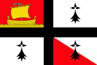
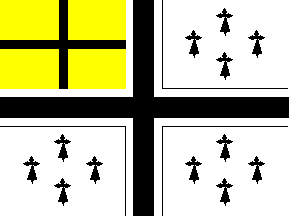
Flags of Pays Bigouden and Pays de Retz
-
 Pays Bigouden (PNG)
 -
 Pays de Retz (PNG)
 -
 Ermine spots


- Article(s)
- List of Breton flags
- Request
- Could someone please redraw the above PNG versions of the flags of Pays Bigouden and Pays de Retz as SVG please. And while we're here, is there any chance someone could also create an SVG file of the former version of the flag of Pays de Retz, as seen here. Thanks. Snow Lion Fenian (talk) 14:59, 25 June 2021 (UTC)
- Discussion
- The device is known as the "ermine spot" and could be copied from the attached file. I'll take a shot at drawing the flags over the next week. Cheers, Mliu92 (talk) 14:44, 26 July 2021 (UTC)
Flags of Pays d'Ancenis and Pays de Guérande
{{resolved}}
- Article(s)
- List of Breton flags
- Request
- Would someone please create SVG files of the flags of Pays d'Ancenis (as seen here) and Pays de Guérande (as seen here). Thanks. Snow Lion Fenian (talk) 13:13, 24 August 2021 (UTC)
- Discussion
- Done Tsange (Talk) 20:06, 27 August 2021 (UTC)
- @Tsange: That's great work, and thank you for your time. Snow Lion Fenian (talk) 12:39, 29 August 2021 (UTC)
-
 1
1 -
 2
2

