
Wikipedia:Featured picture candidates/Hypothetical Ancestral Mollusc
Diagram of a hypothetical ancestral mollusc[edit]
Voting period is over. Please don't add any new votes. Voting period ends on 22 Sep 2014 at 06:13:08 (UTC)

- Reason
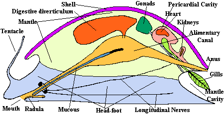
- This is a revision of a previous nomination of this image from May of 2013. Previous nomination failed principally on grounds of its file size and layout-- both problems have been resolved: image is now below 2,700KB (yay, efficiency!) and I have learned how to adjust the text layout (yay, practice and experience!). More than this, the image is now more detailed, accurate, and, I hope, interesting. Am still taking suggestions for further improvements.
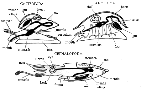
Biologists have always depicted this creature in either profile view or overhead, sometimes from underneath– but with no actual animal to work with, they have never tried to go further than this, and many of the 2-D illustrations are dull and sometimes not very informative (the Internet is replete with those: see here, here, and here for a few examples).
I have depicted the gametes leaving the gonad, traveling across the pericardium, and down the metanephridia, but am not certain this "works" in the image. Also, am not sure it is rendering correctly in all platforms, so please let me know if anyone has any difficulties viewing it or if any organs or parts seems missing or fragmented. These should all be fixed, but you never know. - Articles in which this image appears
- Mollusc
- FP category for this image
- wp:Featured pictures/Sciences/Biology
- Creator
- KDS444 Nomination through my Wikipedia account (KDS4444) of an image submitted through my Wikimedia Commons account (KDS444).
- Support as nominator – KDS4444Talk 06:13, 12 September 2014 (UTC)
- Support - Wow. — Crisco 1492 (talk) 08:07, 12 September 2014 (UTC)
- Support - Wooow. Hafspajen (talk) 10:47, 12 September 2014 (UTC)
- Support - a great improvement from last time. It is, from a graphics standpoint, very impressive. However, since I am not an expert on molluscs, I cannot comment on the scientific accuracy. dllu (t,c) 19:17, 12 September 2014 (UTC)
- Support. As per above, I'm not qualified to judge the scientific accuracy but it's an extremely well drawn diagram. Ðiliff «» (Talk) 21:00, 12 September 2014 (UTC)
- Comments. For me, the smaller text labels are uncomfortable or impossible to read at normal viewing size, say in the media viewer. When I go to the raw SVG at http://upload.wikimedia.org/wikipedia/commons/3/32/Archimollusc-en.svg, the text reverts to a size far too small for the proportions of the picture, with huge line spacing, such that none of the labels line up intelligibly with the lines. 86.160.86.83 (talk) 23:49, 12 September 2014 (UTC)
- It wouldn't have been my first choice, but I have now converted the text to paths: all of the words should be appearing in their correct size & proportions in all browsers and in all formats (PNG as well as SVG). Yes? KDS4444Talk 14:56, 13 September 2014 (UTC)
- Now the text in the SVG view seems to show correctly. However, in the view in Media Viewer, some of the text is still too small. The words "Cerebral", "Pedal" and "Pleural" can just be read (possibly very slightly better than before), but they look uncomfortably and disproportionately small. The word "Gametes" cannot be read. "Incurrent/Excurrent water" could also very usefully be slightly bigger. 86.160.86.83 (talk) 19:32, 13 September 2014 (UTC)
-
- The text "Gametes" is still uncomfortably small for me at Media Viewer size. Also, I am unclear why it is, uniquely, in italics. Also, the positioning generally of the text in relation to the connecting lines is messy and inconsistent. This is a fussy comment that I would not mention if this had not been nominated as a featured picture. 217.44.215.14 (talk) 01:30, 15 September 2014 (UTC)
- I had made "gametes" italic and slightly smaller because these were only cells, not organs or body parts, but in the interests of legibility, I have removed those characteristics and it is now the same size as all other text. I need more direction on what you mean by "messy and inconsistent" with regard to the placement of text and lines generally: I made the text either align-right, -center, or -left depending on its position on the page, and placed lines from each organ/ part to its corresponding label— something about how I have done that isn't working for you, and I want to know what it is so I can take a look. Please explain if you can. Thanks! (and don't worry about nit-picking: honestly, I wish I got more of these kinds of small requests because they represent things that I do not notice but which should be changed and are often easy to do so). KDS4444Talk 08:04, 15 September 2014 (UTC)
- Please see this (or this if the first link ceases to work). This is how it looks for me in Media Viewer. I highlighted two of the callouts that show large spacing discrepancy. I disagree that Media Viewer should show the checkerboard background. I raised this before at the MV page, but no one seemed very interested, as I recall. Potentially there is a problem of knowing which colour to make the background if it is not specified in the file. 217.44.215.14 (talk) 12:01, 15 September 2014 (UTC)
- I raised the MV issue again here, in case anyone here is interested in comtributing. 217.44.215.14 (talk) 13:20, 15 September 2014 (UTC)
- NOW I understand. I have now snugged up the lines and text that you highlighted, and went around the entire image doing the same thing to any I felt weren't well placed. Thank you for pointing this out— this is the kind of thing I would not have noticed but which needed addressing. Please let me know if there are any others you feel I should adjust, or any other aspects that you would like to see changed. Also note that I have now placed a white background behind the image so that there will be no more checkerboards visible through it (I hate them, too). KDS4444Talk 19:02, 15 September 2014 (UTC)
Comment Source parameter in the file description needs some refs (something like "own work based on...", not just "own work"). Brandmeistertalk 12:34, 13 September 2014 (UTC)
- Done. Let me know if you would like to see additional specific citations/ sources, though a complete list of images I at some point consulted would require 15 or 20 more. KDS4444Talk 14:56, 13 September 2014 (UTC)
- Support Ok. Brandmeistertalk 15:12, 13 September 2014 (UTC)
- Great diagram! I just have a few comments. I think it would be a little more professional to change "Paired Ganglia: Cerebral, Pedal, and Pleural" into "Cerebral ganglia, Pedal ganglia, and Pleural ganglia". Also I think you point to the same anterior tentacle twice, but that's a minor quibble. Quite a nice one here! Mattximus (talk) 00:39, 14 September 2014 (UTC)
- Support That is a gorgeous diagram, and serves a very useful purpose in pointing out the key features. It might be good to emphasize the 3D-ness by having the line for for the rearmost of the two pedal ganglia be obscured by the front of the nerve ring, but that might be confusuing, so use your judgement. Adam Cuerden (talk) 11:42, 21 September 2014 (UTC)
- You know, I was looking at it just now, and I was thinking the exact same thing. Gimme a minute here and let me see what I can do about this! KDS4444Talk 12:18, 21 September 2014 (UTC)
- Okay, so here is what I have done: I have placed the annotation lines for the pleural and pedal ganglia in correct position for a 3-D image, which has meant putting them behind the shell layer. I think this actually looks pretty good this way. I also went ahead and did the same thing for the lines for the metanephridia so that they, too, are in correct position for a 3-D image. While I was at it, I went ahead and added some "body bumps" to the animal's far side, and changed some of the annotation lines so that they appear as Ys rather than Vs (which I think is useful in a few places). Let me know if you think otherwise, or if there are any other points of the diagram that could use improvement (and thank you for the suggestion regarding the placement of the lines, Adam). KDS4444Talk 12:27, 21 September 2014 (UTC)+
- Looks very good, but it does mean a couple more tweaks are in order: I'd do the same thing with Cerebal ganglia, for consistency, possibly Statocysts, and maybe Osphradia, though that one passes through so little of the layer that it's barely necessary.. "Two pair of untorted..." points to the near side of the lower nerve cord pair, but the far side of the upper; better to consistently point to the near one. Or point to all four as two "Y"s? A couple of the body bumps are over the top of the pedal retractor muscles (the ones on the left), which seems wrong. Adam Cuerden (talk) 13:44, 21 September 2014 (UTC)
-
- That looks very, very good. Adam Cuerden (talk) 18:30, 21 September 2014 (UTC)
Promoted File:Archimollusc-en.svg --Armbrust The Homunculus 12:38, 22 September 2014 (UTC)