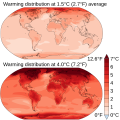
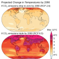
File:Projected Change in Temperatures.svg

Size of this PNG preview of this SVG file: 600 × 600 pixels. Other resolutions: 240 × 240 pixels | 480 × 480 pixels | 768 × 768 pixels | 1,024 × 1,024 pixels | 2,048 × 2,048 pixels | 960 × 960 pixels.
Original file (SVG file, nominally 960 × 960 pixels, file size: 1.07 MB)
File history
Click on a date/time to view the file as it appeared at that time.
| Date/Time | Thumbnail | Dimensions | User | Comment | |
|---|---|---|---|---|---|
| current | 11:43, 1 August 2023 |  | 960 × 960 (1.07 MB) | Jirka Dl | File uploaded using svgtranslate tool (https://svgtranslate.toolforge.org/). Added translation for cs. |
| 19:55, 18 August 2021 |  | 960 × 960 (1.07 MB) | Efbrazil | Updated to AR6 | |
| 16:00, 13 May 2020 |  | 960 × 960 (1.74 MB) | Nyq | Decapitalized common nouns | |
| 18:25, 30 March 2020 |  | 960 × 960 (1.74 MB) | Efbrazil | Very fiddly tweak, changed positioning / size of CO2 subscript | |
| 17:17, 30 March 2020 |  | 960 × 960 (1.74 MB) | Efbrazil | Dropping space between RCP and number as per review | |
| 18:04, 9 March 2020 |  | 960 × 960 (1.74 MB) | Efbrazil | Uploaded own work with UploadWizard |
File usage
The following pages on the English Wikipedia use this file (pages on other projects are not listed):
Global file usage
The following other wikis use this file:
- Usage on ar.wikipedia.org
- Usage on az.wikipedia.org
- Usage on bn.wikipedia.org
- Usage on es.wikipedia.org
- Usage on eu.wikipedia.org
- Usage on fa.wikipedia.org
- Usage on fr.wikipedia.org
- Usage on it.wikipedia.org
- Usage on kn.wikipedia.org
- Usage on ko.wikipedia.org
- Usage on mk.wikipedia.org
- Usage on pt.wikipedia.org
- Usage on rw.wikipedia.org
- Usage on tr.wikipedia.org
- Usage on zh.wikipedia.org
