
File:1850- Warming stripes - global average surface temperature.svg

Size of this PNG preview of this SVG file: 800 × 450 pixels. Other resolutions: 320 × 180 pixels | 640 × 360 pixels | 1,024 × 576 pixels | 1,280 × 720 pixels | 2,560 × 1,440 pixels | 1,200 × 675 pixels.
Original file (SVG file, nominally 1,200 × 675 pixels, file size: 10 KB)
| This is a file from the Wikimedia Commons. Information from its description page there is shown below. Commons is a freely licensed media file repository. You can help. |
Summary
| Description |
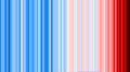
English: Warming stripes graphic showing global average surface temperature starting in 1850
|
| Date | |
| Source | Own work |
| Author | RCraig09 |
Related files
-
 20190705 Warming stripes - Berkeley Earth (world) - avg above- and below-ice readings.png — PNG predecessor: Since this 2019 upload, global temperatures have risen and broken the red color scale on the upside.
 -
 20240311 Warming stripes BEHIND line chart - global surface temperature.svg —
uses the present chart as background, behind the line chart
_-_avg_above-_and_below-ice_readings.png)

Licensing
I, the copyright holder of this work, hereby publish it under the following license:
This file is licensed under the Creative Commons Attribution-Share Alike 4.0 International license.
- You are free:
- to share – to copy, distribute and transmit the work
- to remix – to adapt the work
- Under the following conditions:
- attribution – You must give appropriate credit, provide a link to the license, and indicate if changes were made. You may do so in any reasonable manner, but not in any way that suggests the licensor endorses you or your use.
- share alike – If you remix, transform, or build upon the material, you must distribute your contributions under the same or compatible license as the original.
File history
Click on a date/time to view the file as it appeared at that time.
| Date/Time | Thumbnail | Dimensions | User | Comment | |
|---|---|---|---|---|---|
| current | 04:58, 12 March 2024 | | 1,200 × 675 (10 KB) | RCraig09 | Uploaded own work with UploadWizard |
File usage
The following pages on the English Wikipedia use this file (pages on other projects are not listed):
Global file usage
The following other wikis use this file:
- Usage on eo.wikipedia.org
- Usage on gl.wikipedia.org
- Usage on it.wikipedia.org
- Usage on ro.wikipedia.org
- Usage on uk.wikipedia.org